Ananta
Website design for Ananta Wellness, a Reiki, tarot, crystal healing and life coaching practice: a soft, unhurried site that feels like the first breath of a session.
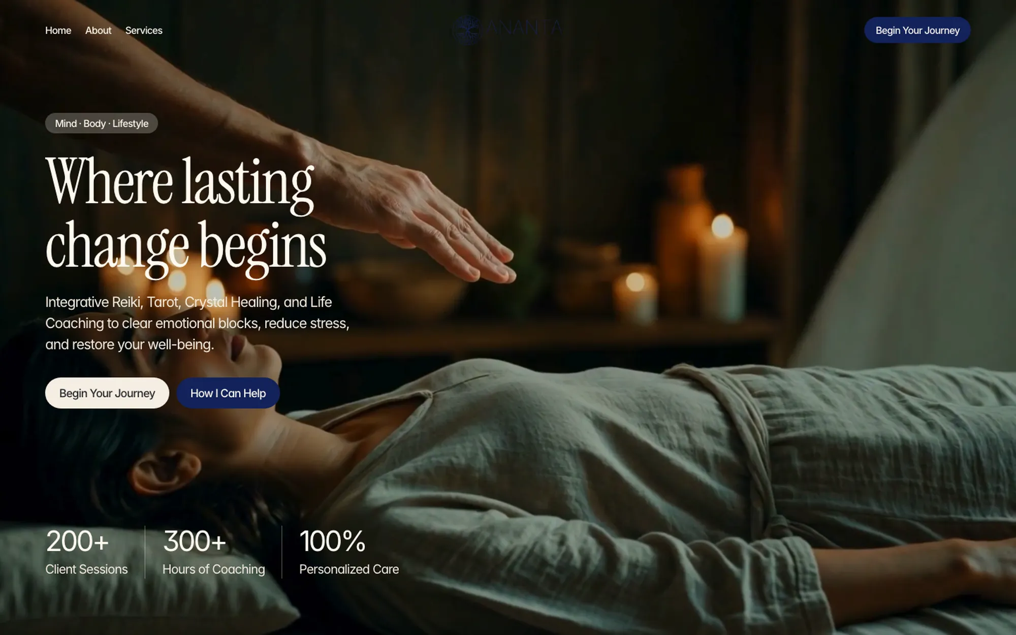
The brief
Healing work runs on trust. The site had to feel calm and personal before a visitor reads a word.
Warm cream pages, one deep navy, a light serif for headlines and soft, candle-lit photography. The page moves from a promise, to the person behind the practice, to four services and a simple three-step way to begin.
The website, live
anantawellness.co.in
The window below is the real site, so scroll inside it and switch to mobile. Saved screens are kept alongside.
Saved screens · captured September 2026.
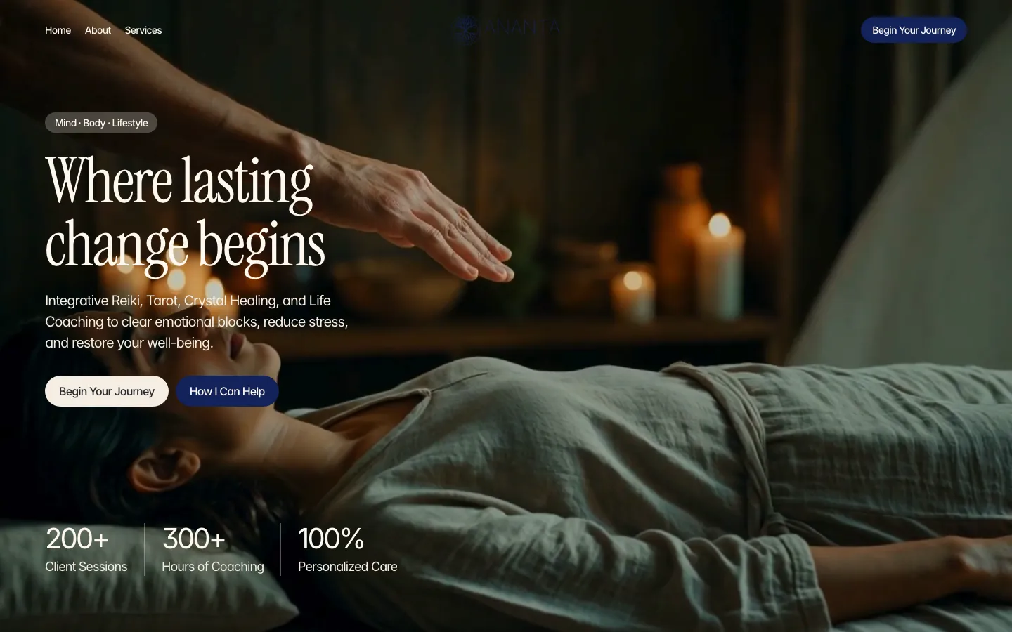
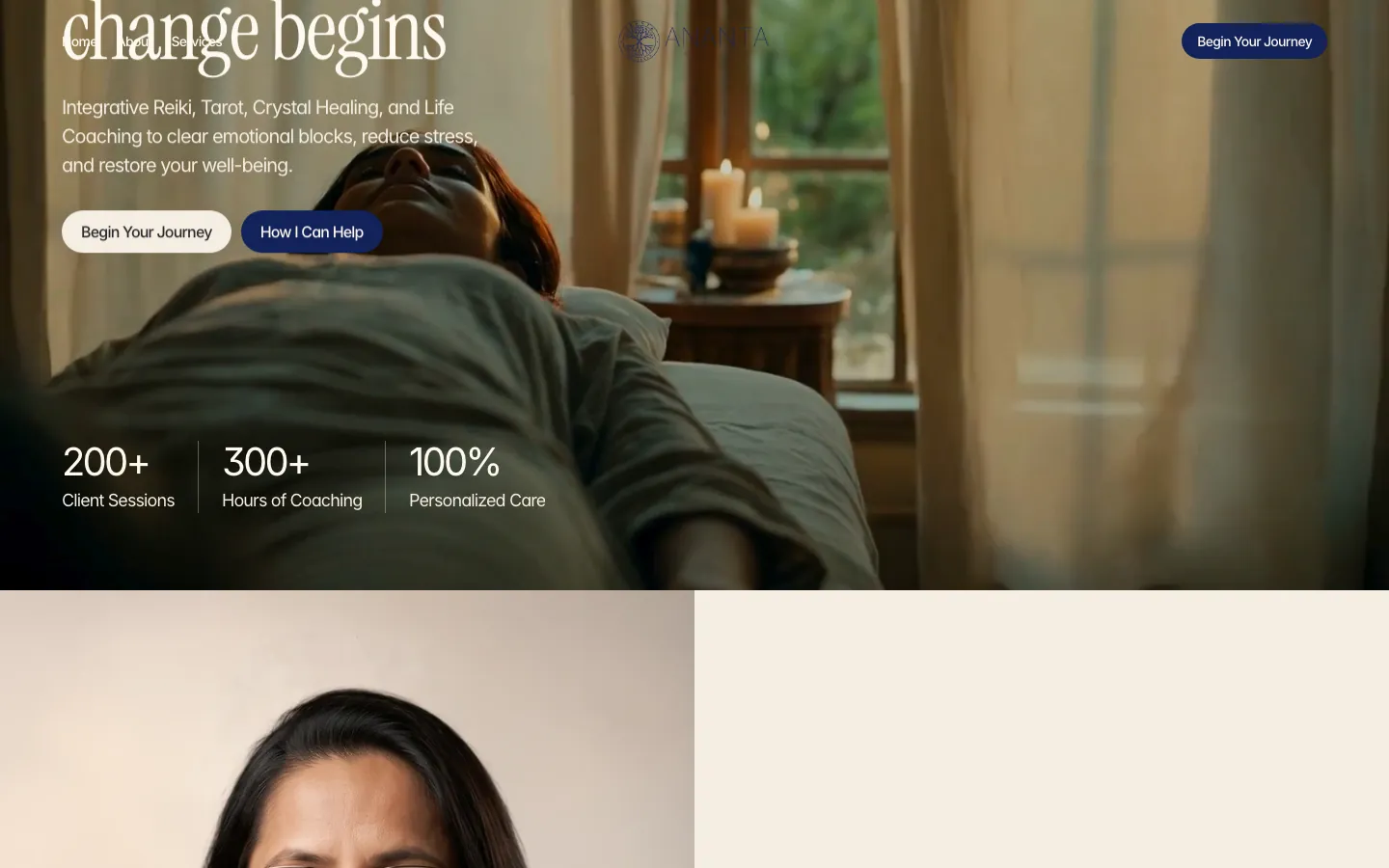
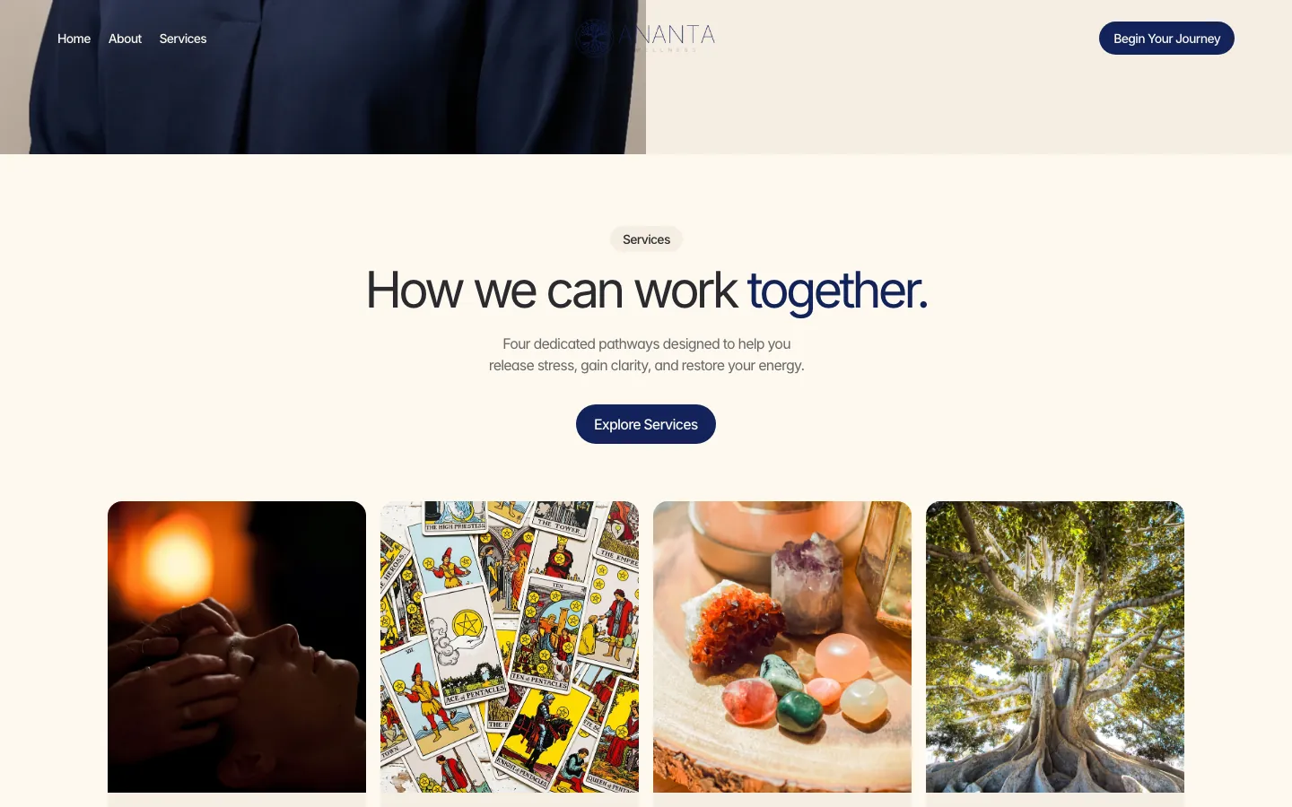
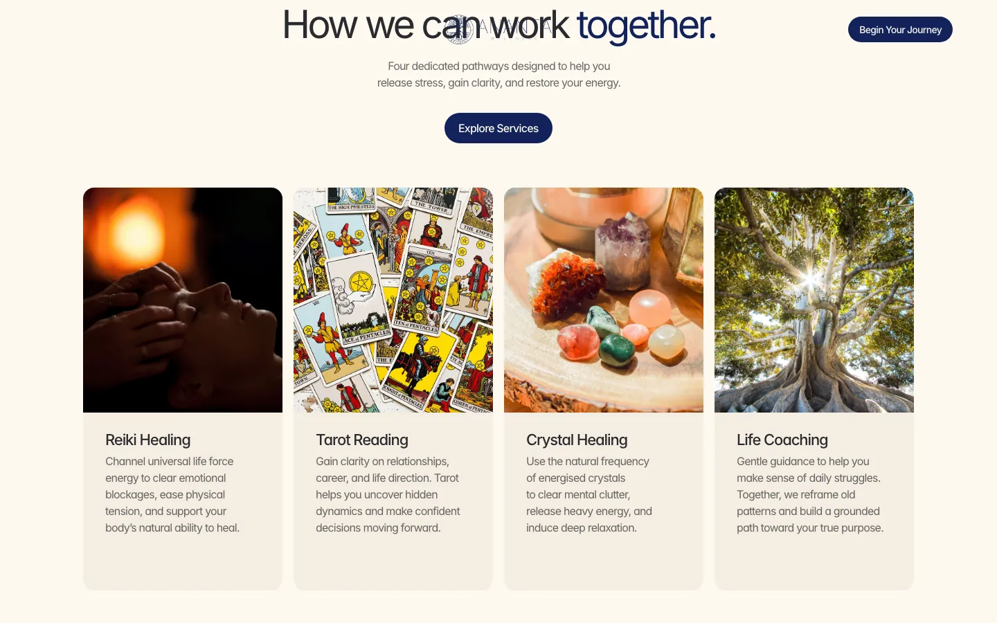
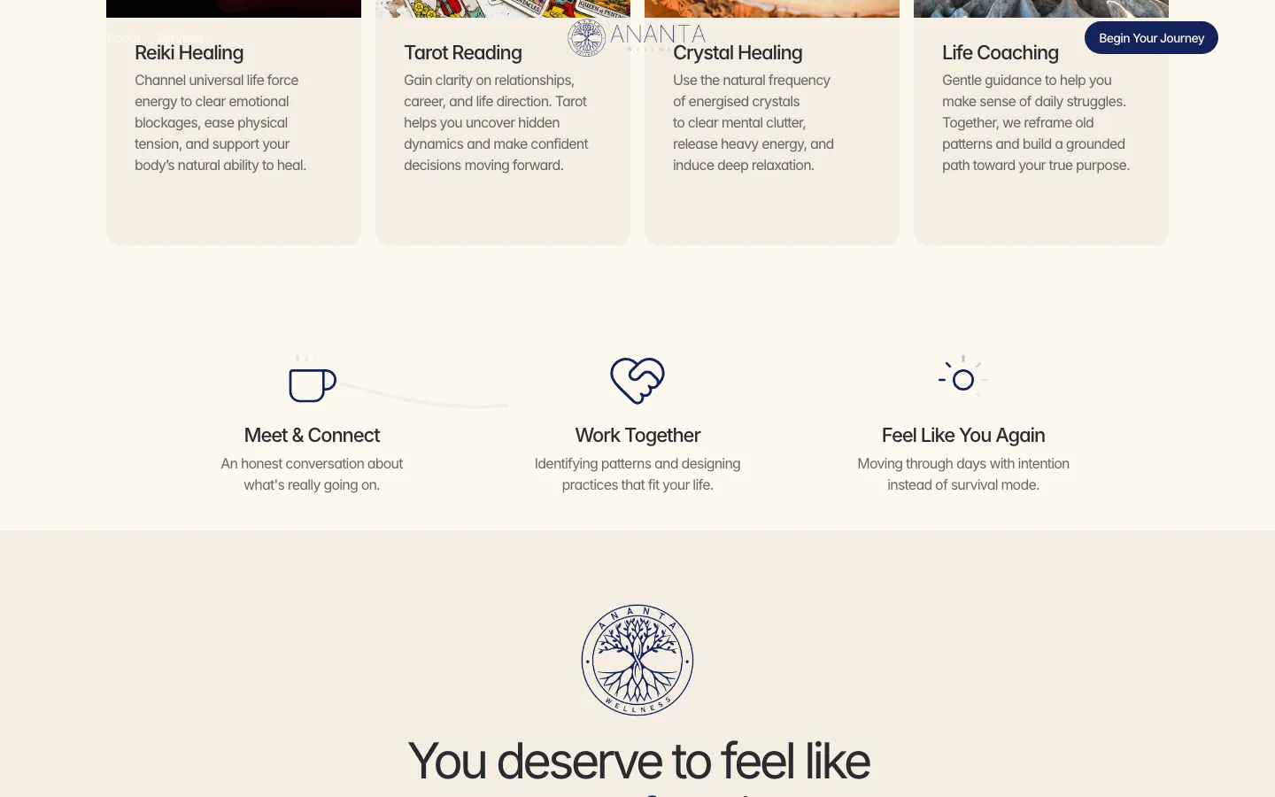
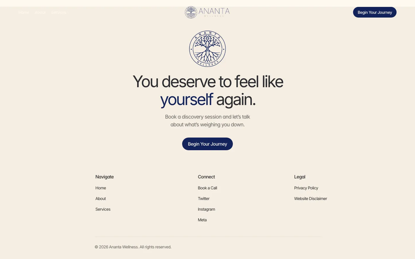
Home page · section by section
Promise, person, practice
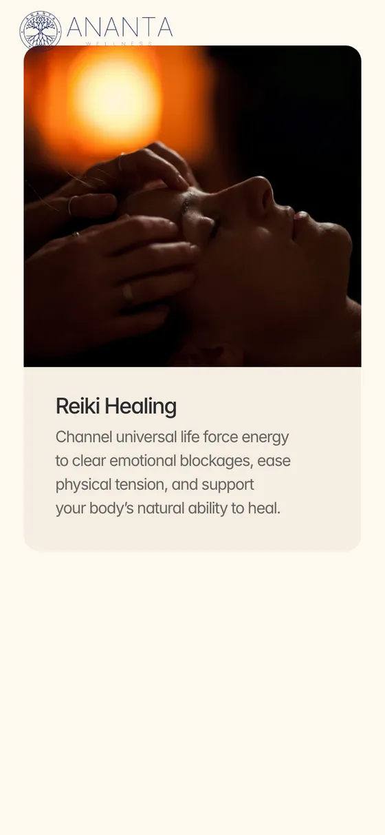
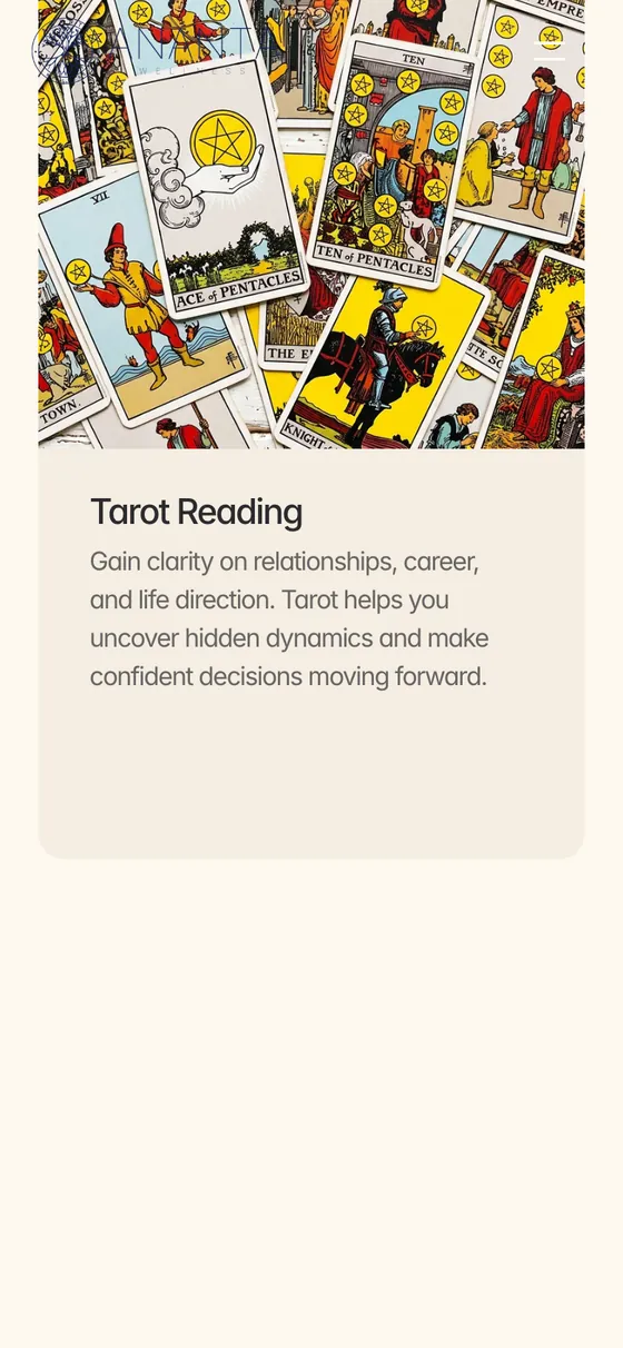
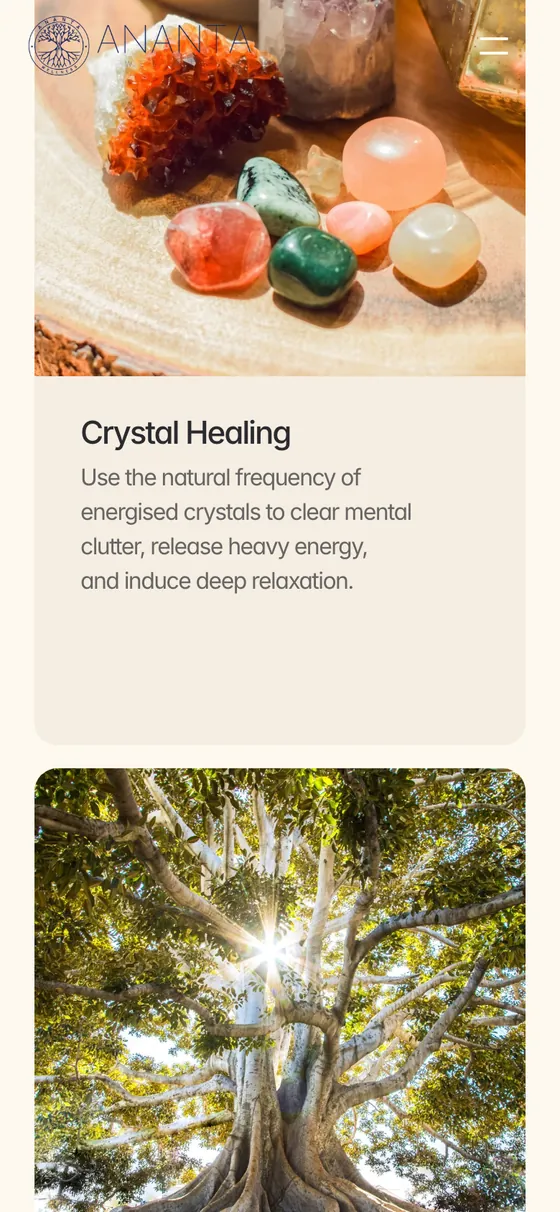
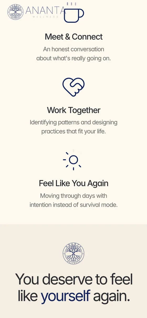
The home page reads like a first conversation: what changes, who will guide you, the four ways to work together, and how to begin.
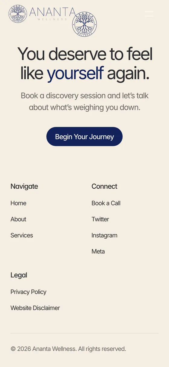
On mobile
The same calm at phone width: stacked numbers, one service card at a time and a single clear call to begin.
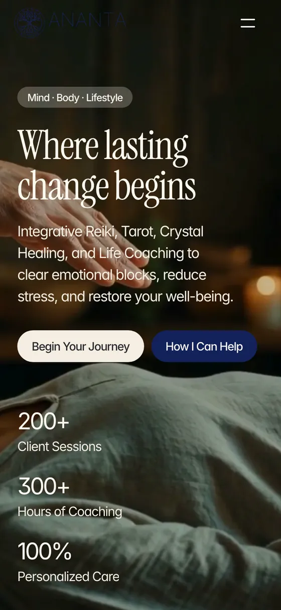
What I did
Page designs
The home page and its sections, from hero to footer.
Responsive layouts
Desktop and mobile versions of every section.
UI components
Service cards, counters, the three-step process and calls to action.
Visual direction
Warm cream and deep navy, a light serif, and soft, candle-lit photography.