IREPworkspaces
Building a managed-workspace brand from zero, for IREP's new venture in India: the identity and brand kit, the website, the sales and investor decks, and a steady voice on LinkedIn.
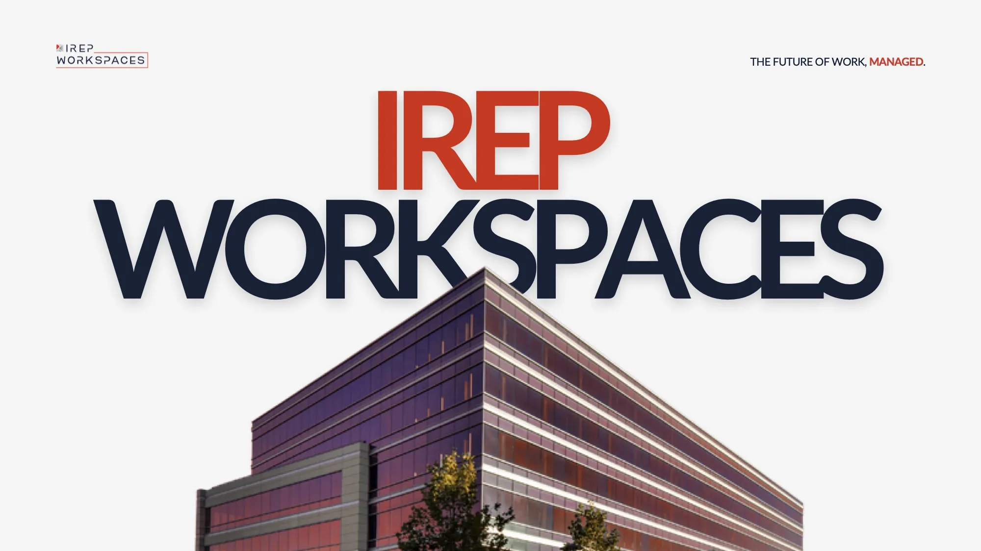
The brief
IREPworkspaces is the managed-office venture of IREP (International Real Estate Partners), launched with India Accelerator across Delhi NCR.
It needed a brand that could stand next to a global parent and still feel local, and a set of documents to sell space to companies and the venture to investors. I joined as its first designer and built the whole system: where global excellence meets local presence.
The identity
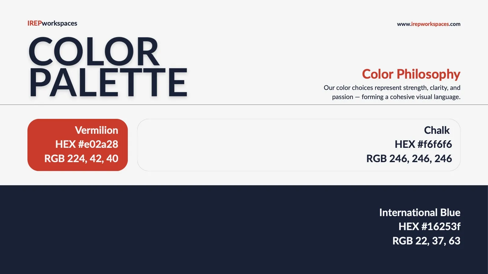
International Blue for trust, one sharp Vermilion for emphasis, and heavy Lato capitals that read like a skyline.

#16253F#E02A28#C1C6C8#F6F6F6The future of work, managed.
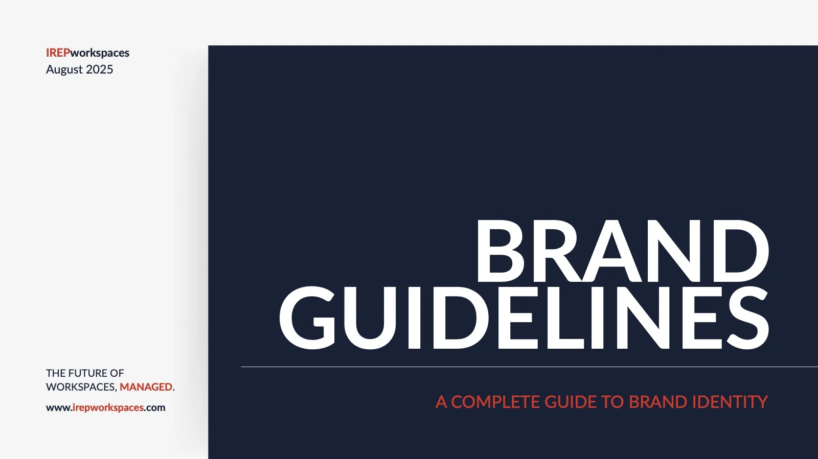
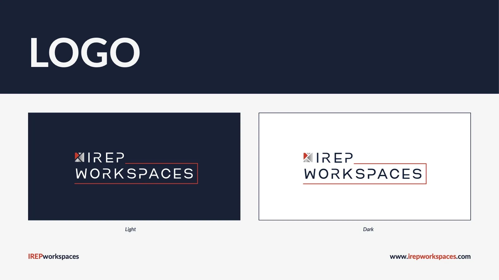
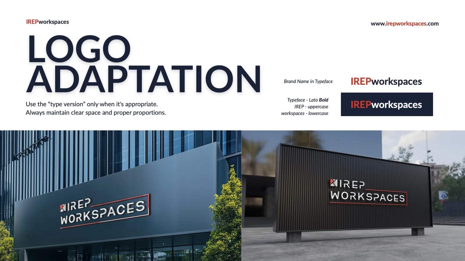
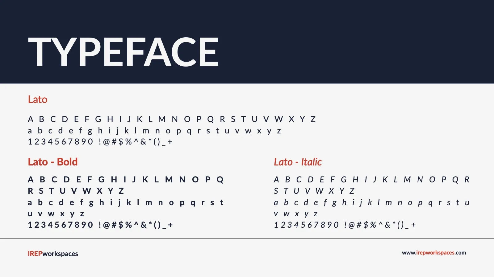
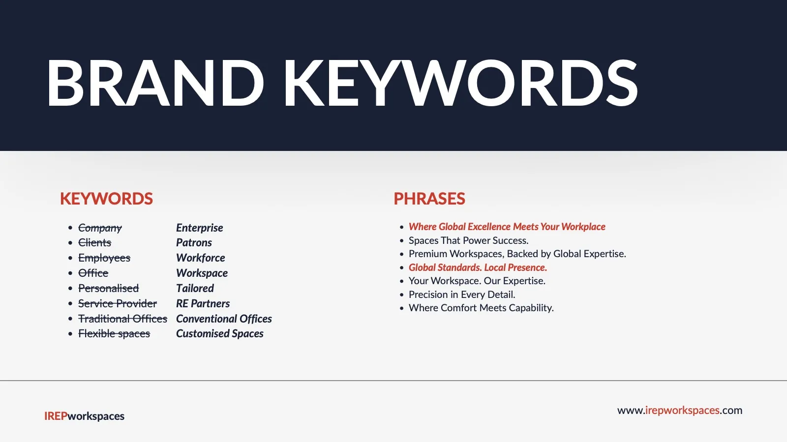
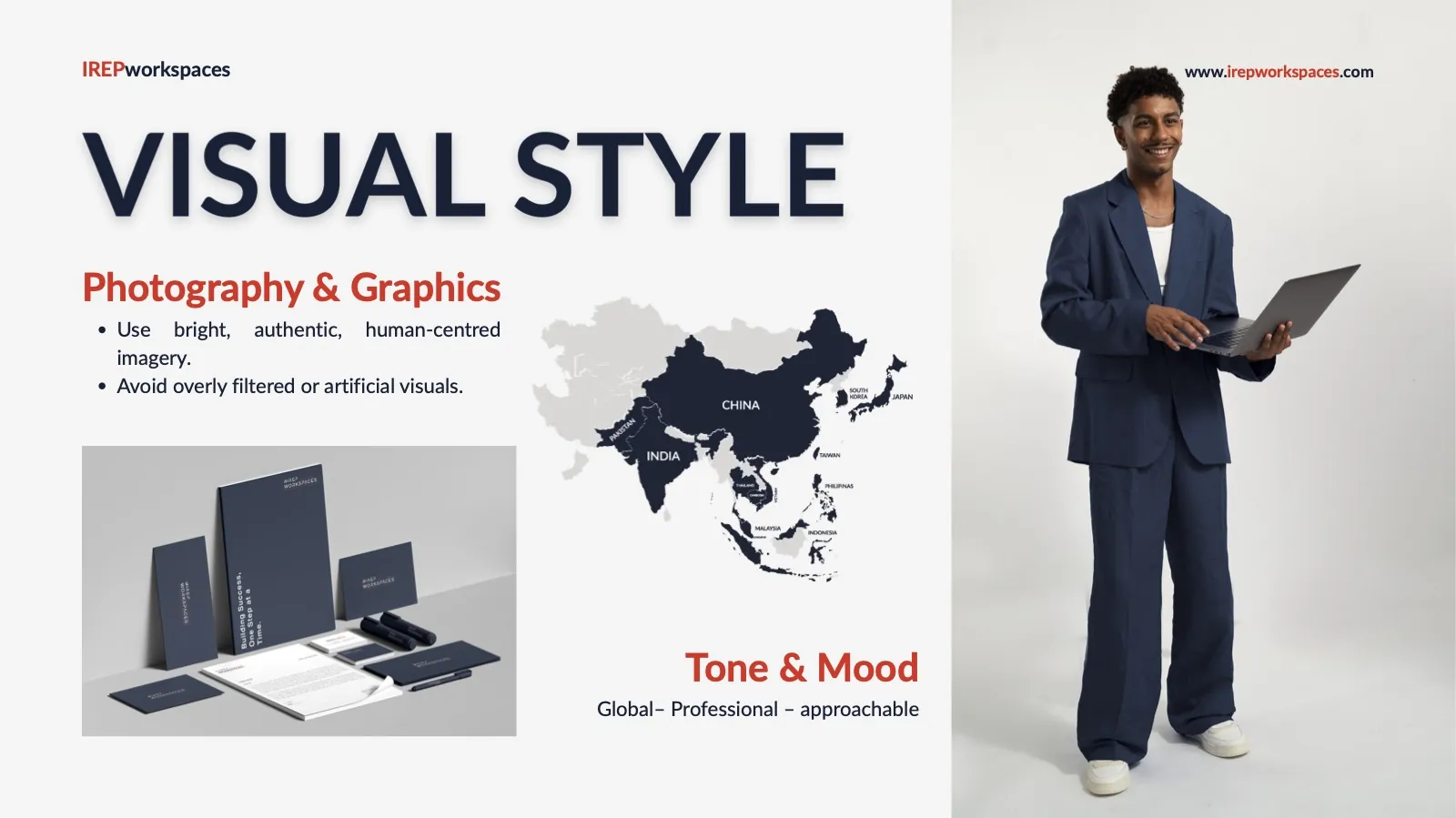
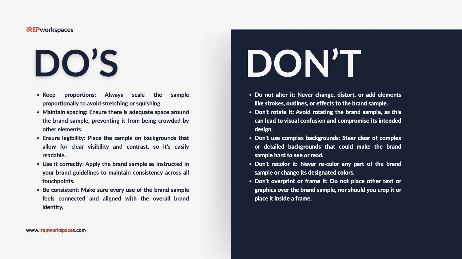
Tagline & footer line on every pageBrand guidelines · 15 pages
The rules that keep every touchpoint consistent: logo use, colour, type, tone and the do's and don'ts.
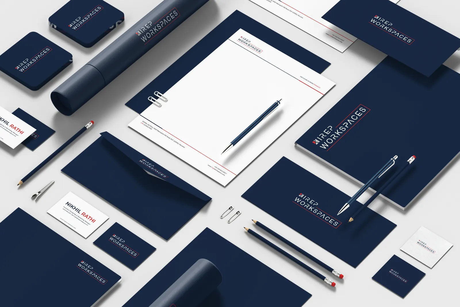
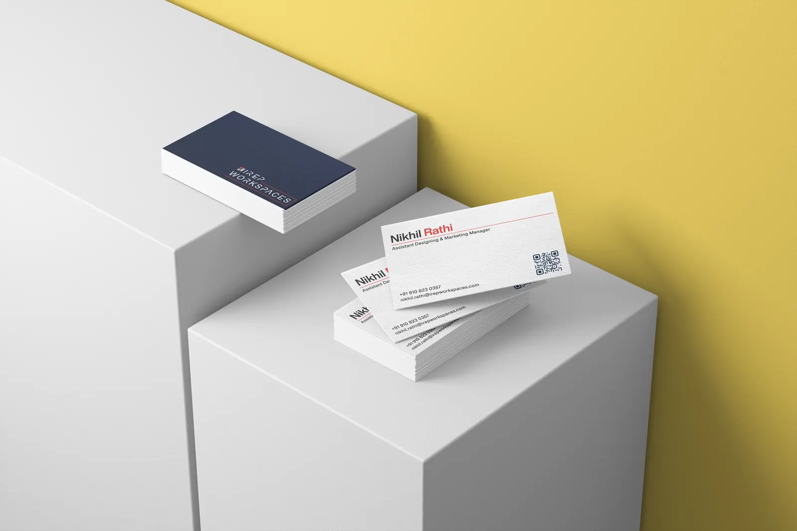
Brand kit
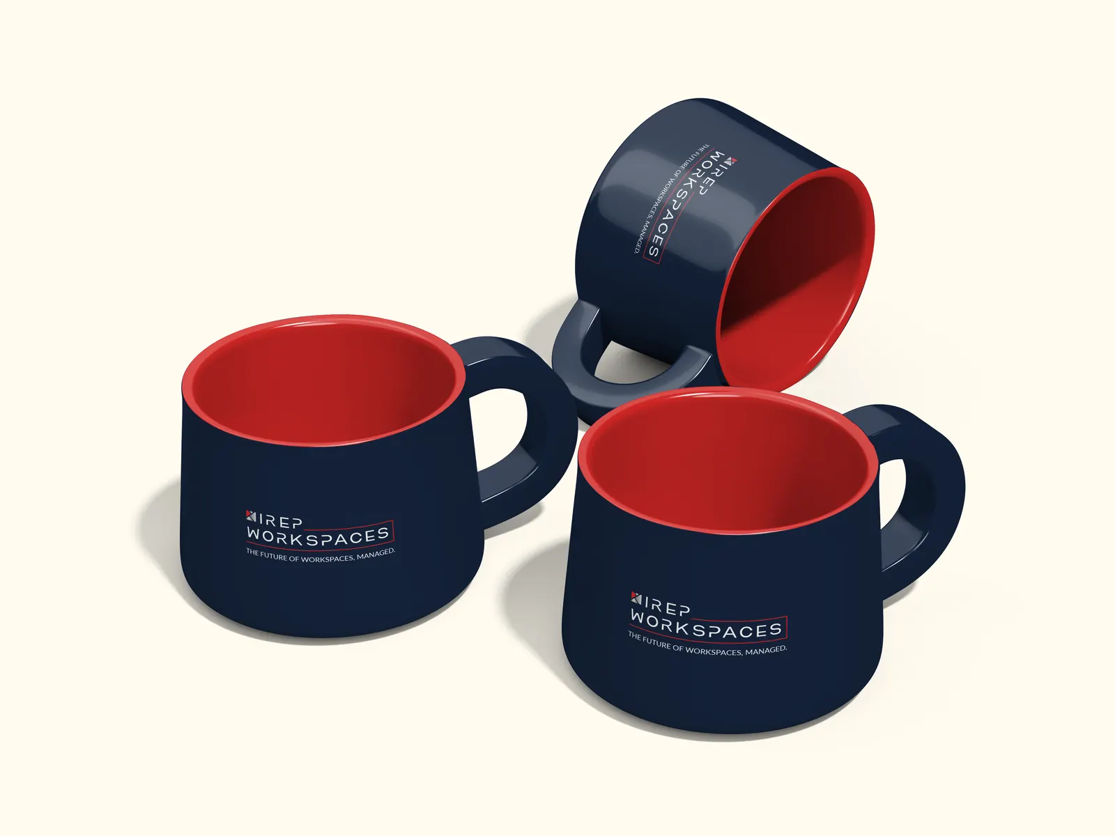
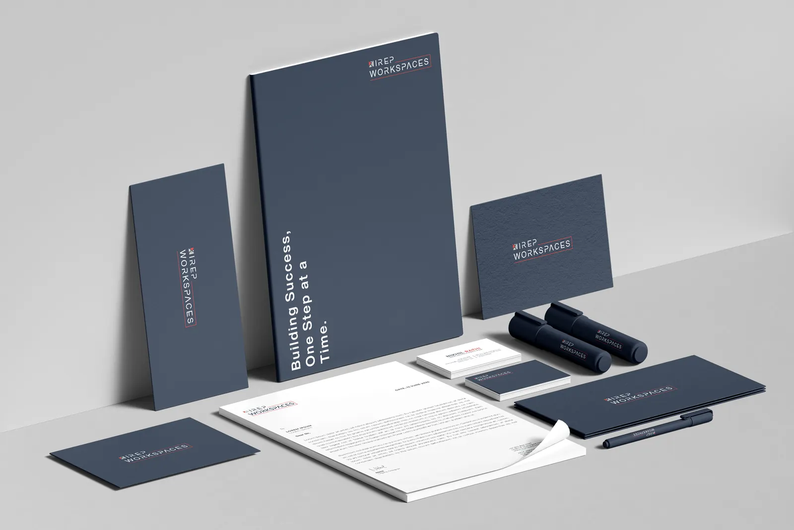
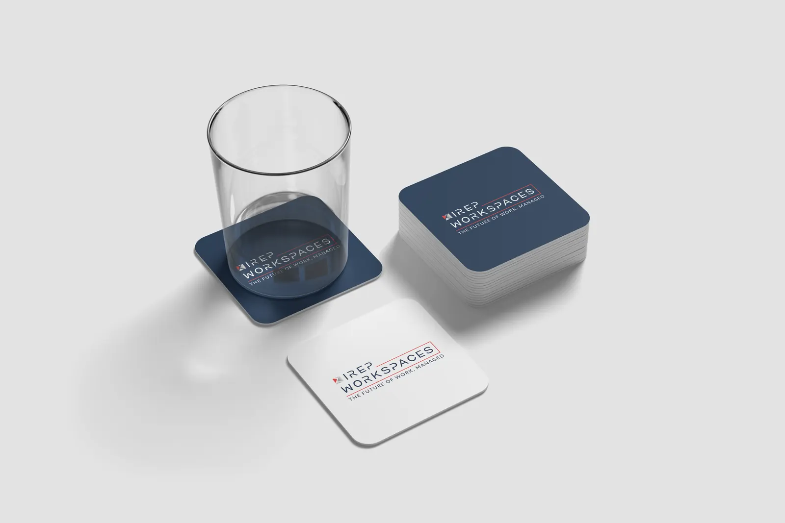
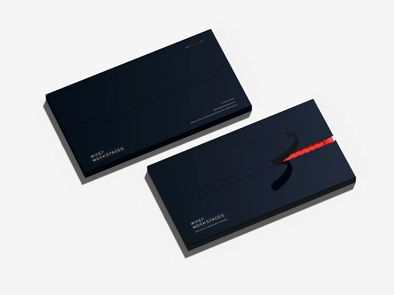
From the reception desk to the parking lot: stationery, cards, mugs, coasters and envelopes, all in one navy-and-red voice.
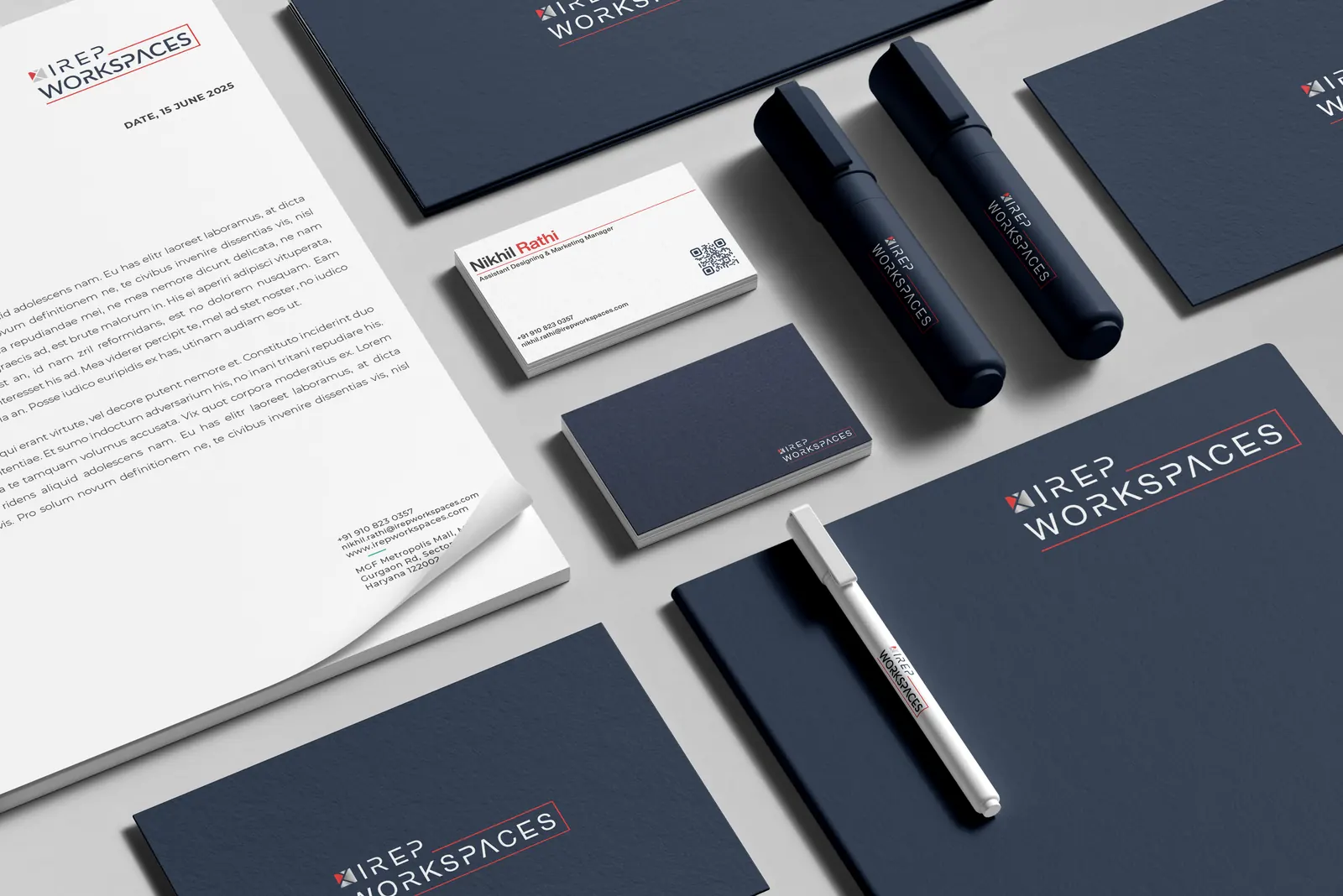
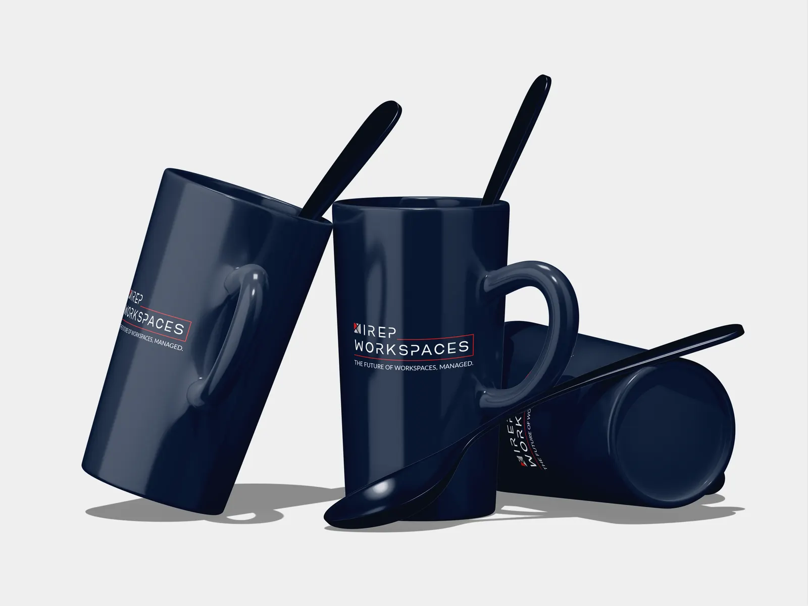
Company profile · 20 pages
The sales document
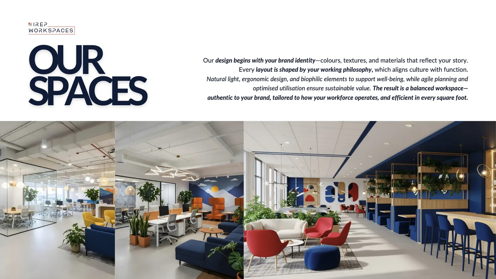
Who IREPworkspaces is, where it operates and what a company gets, told as a clean left-to-right read: big claim, short proof, one picture.
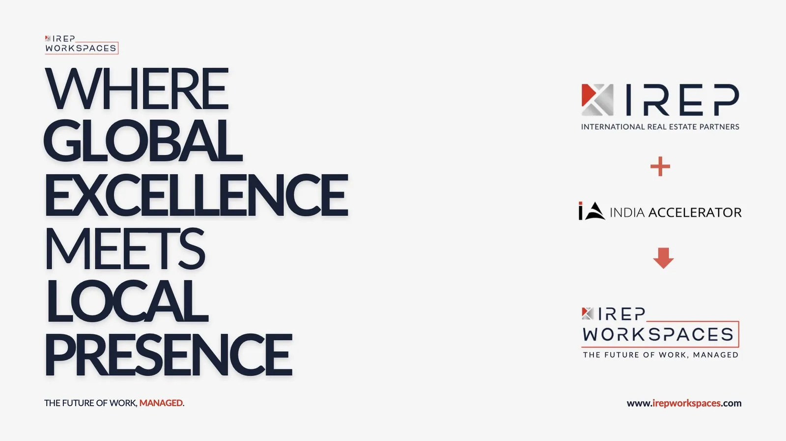
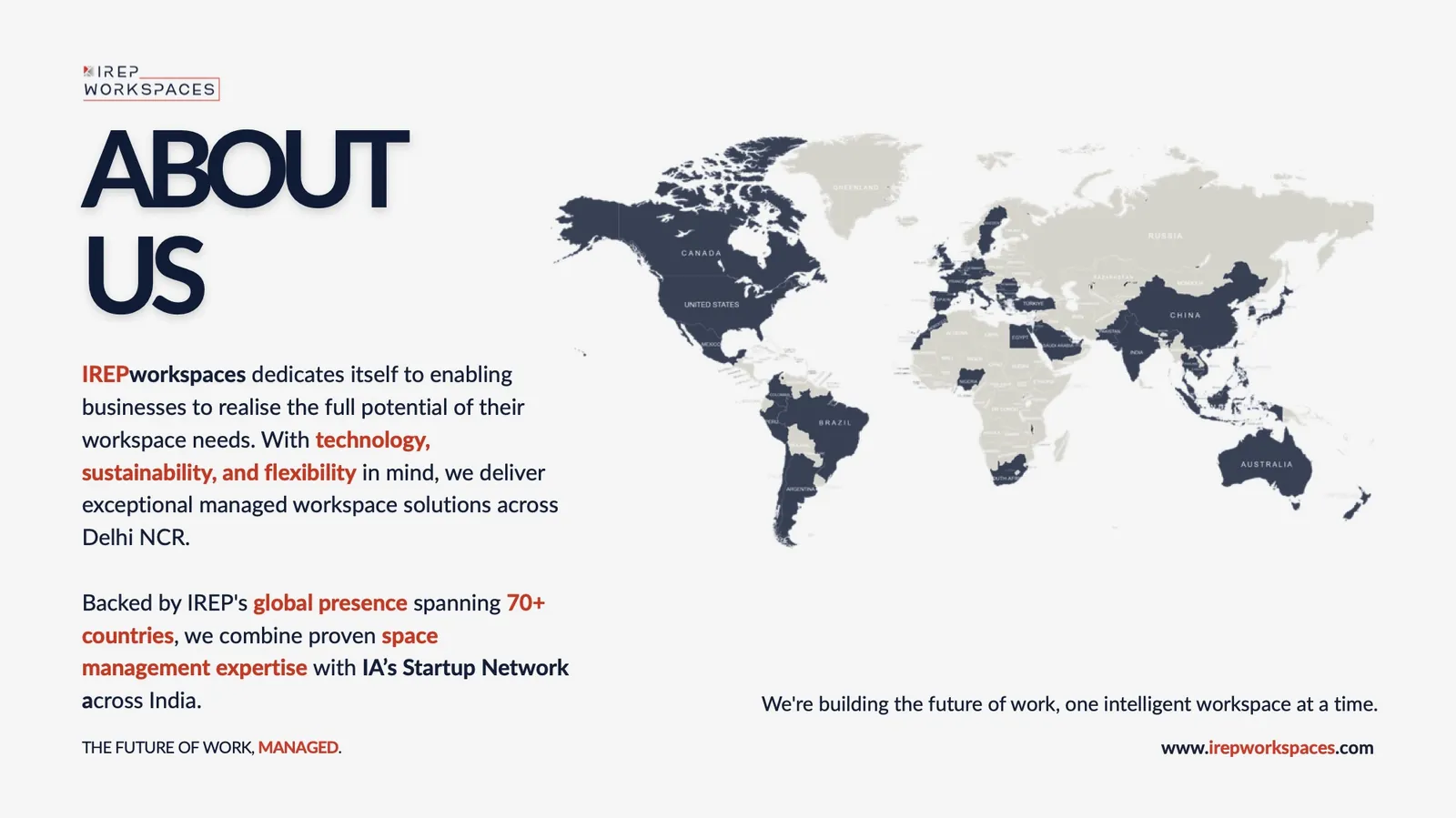
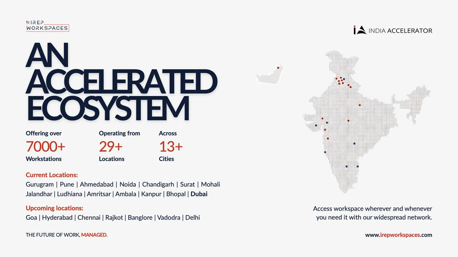
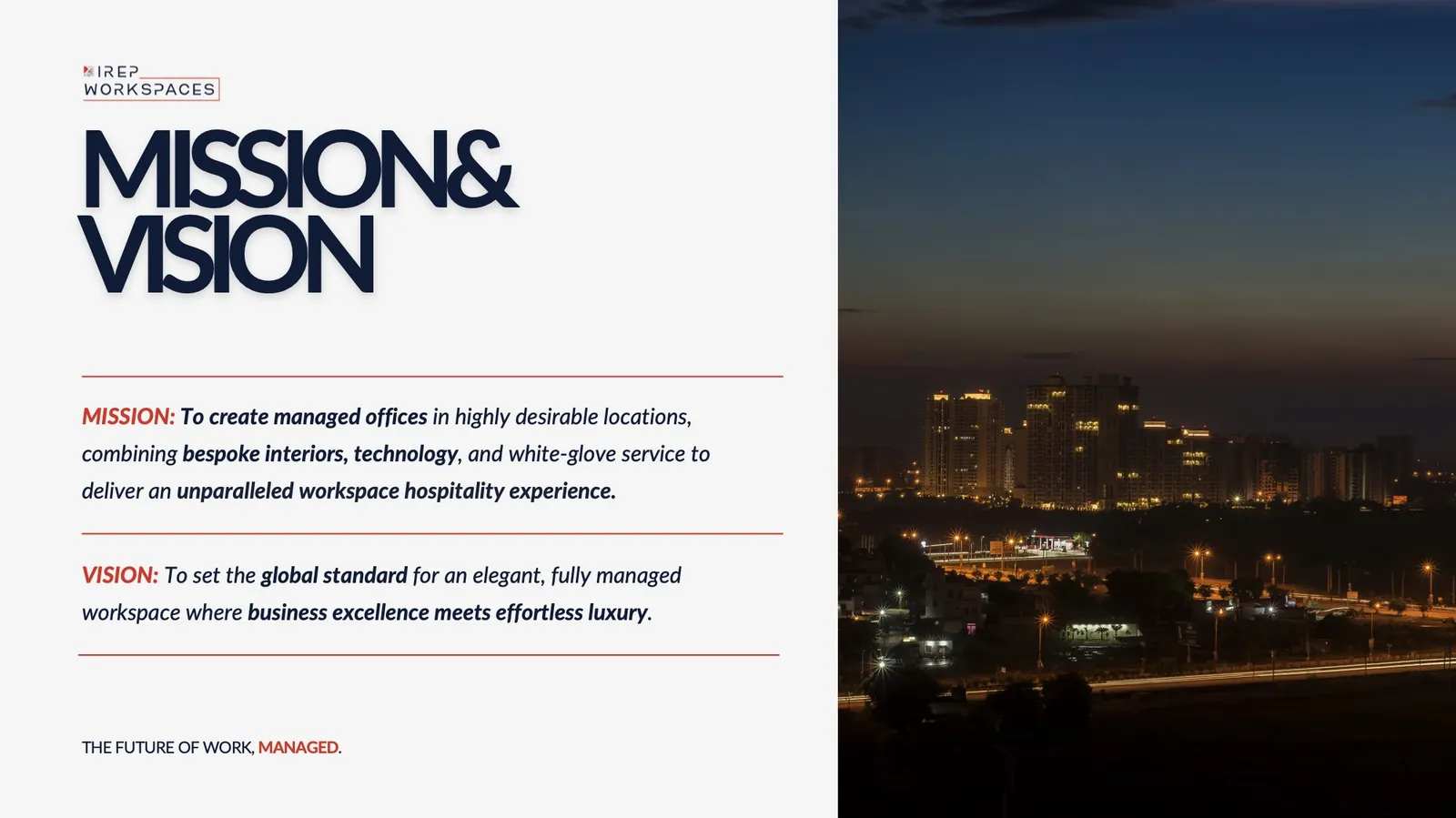
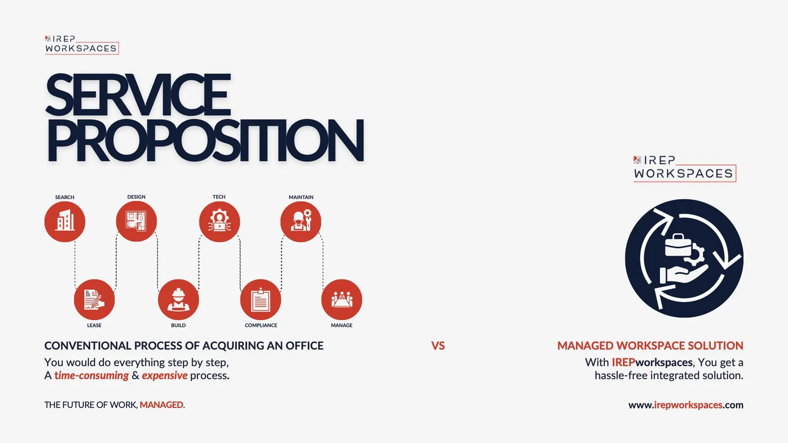
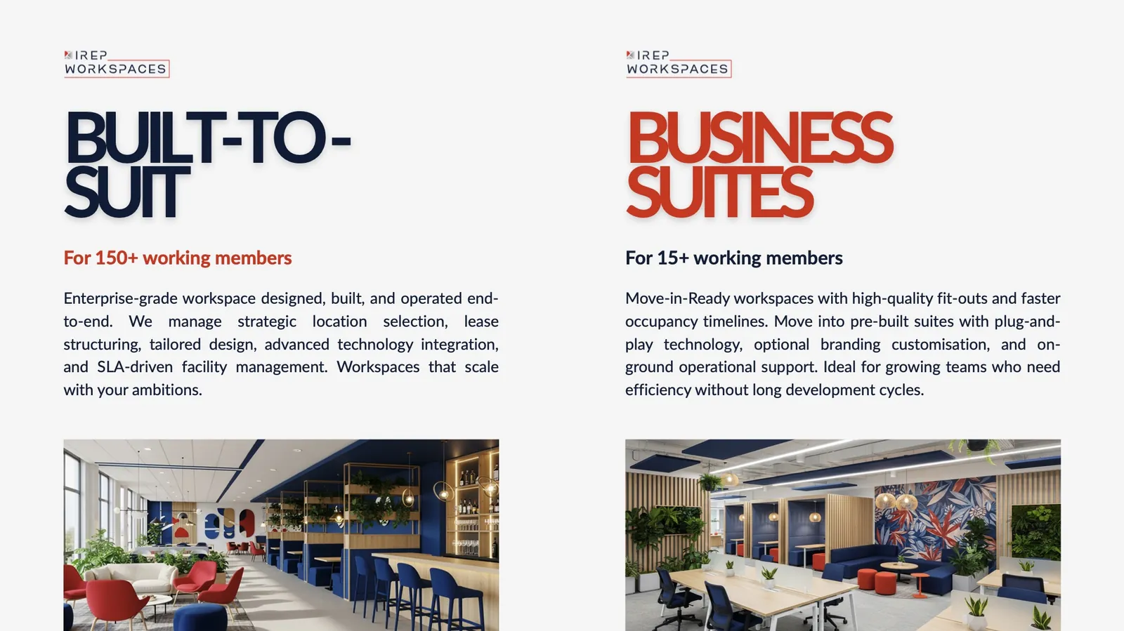
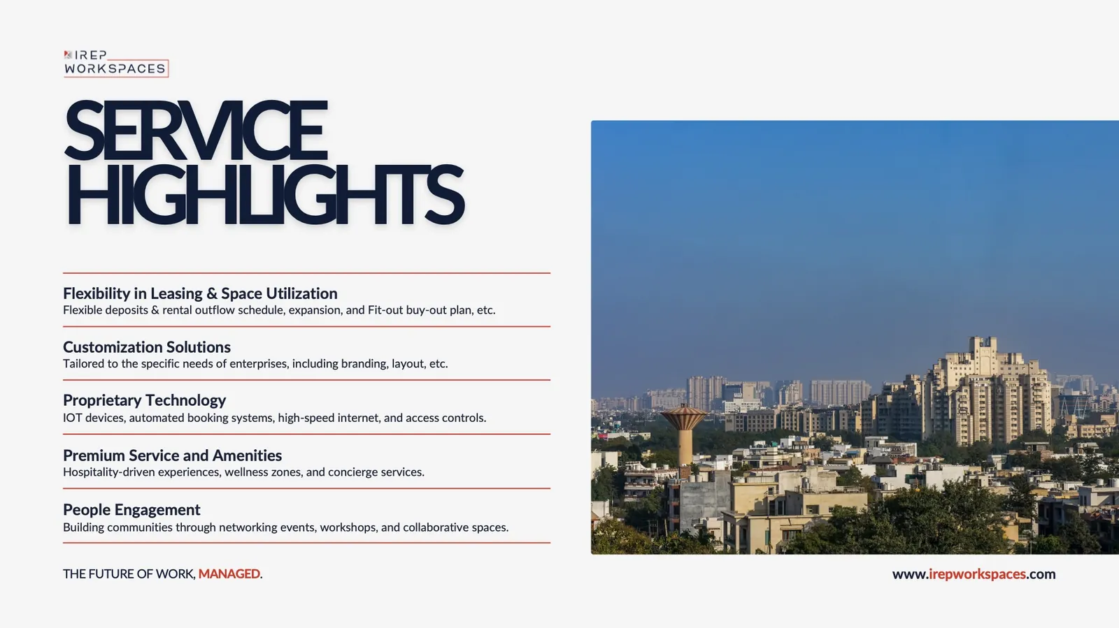
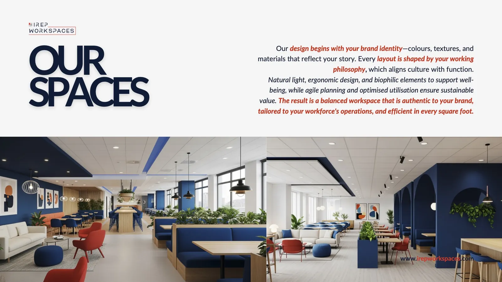
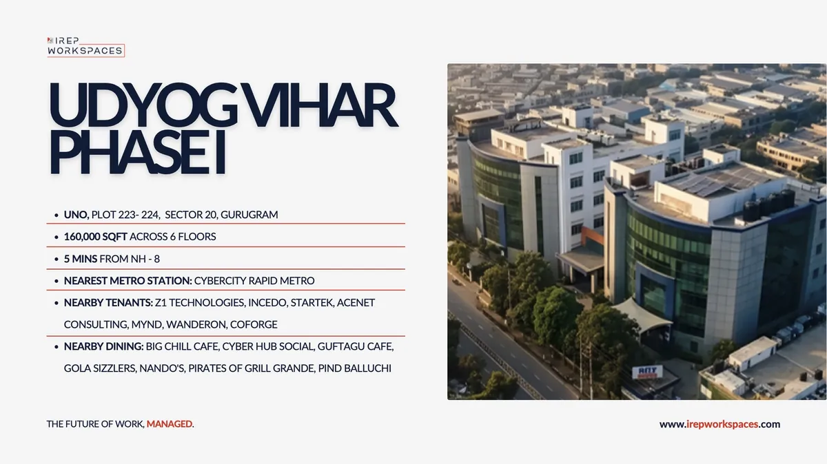
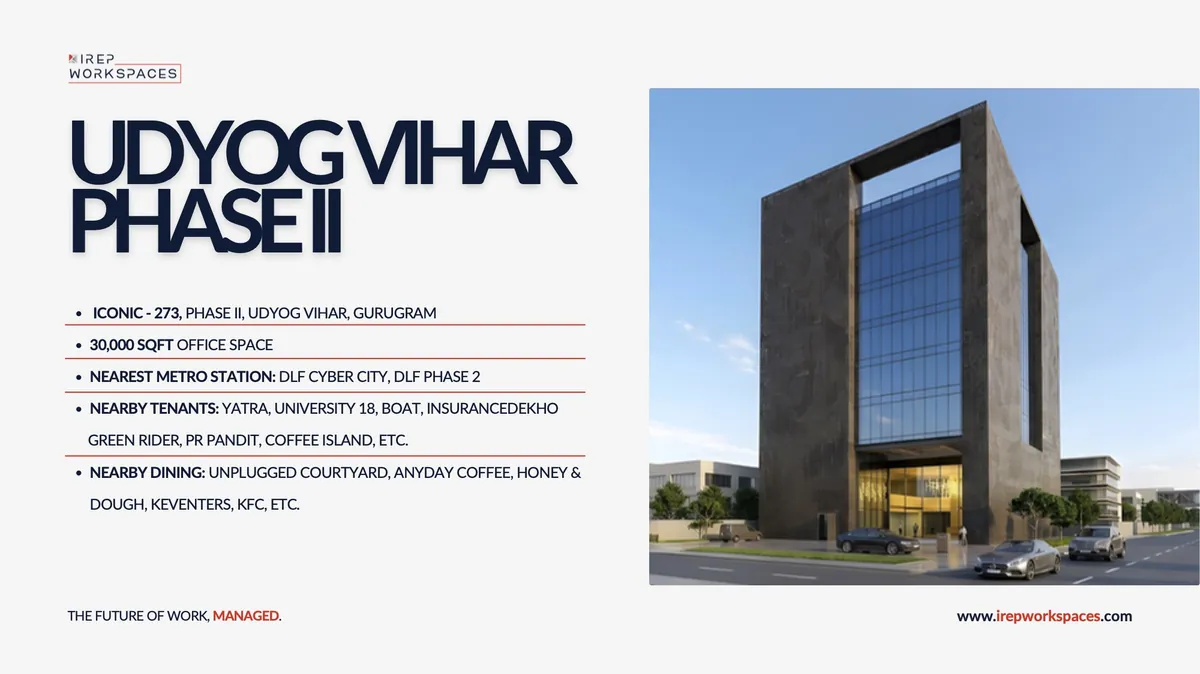
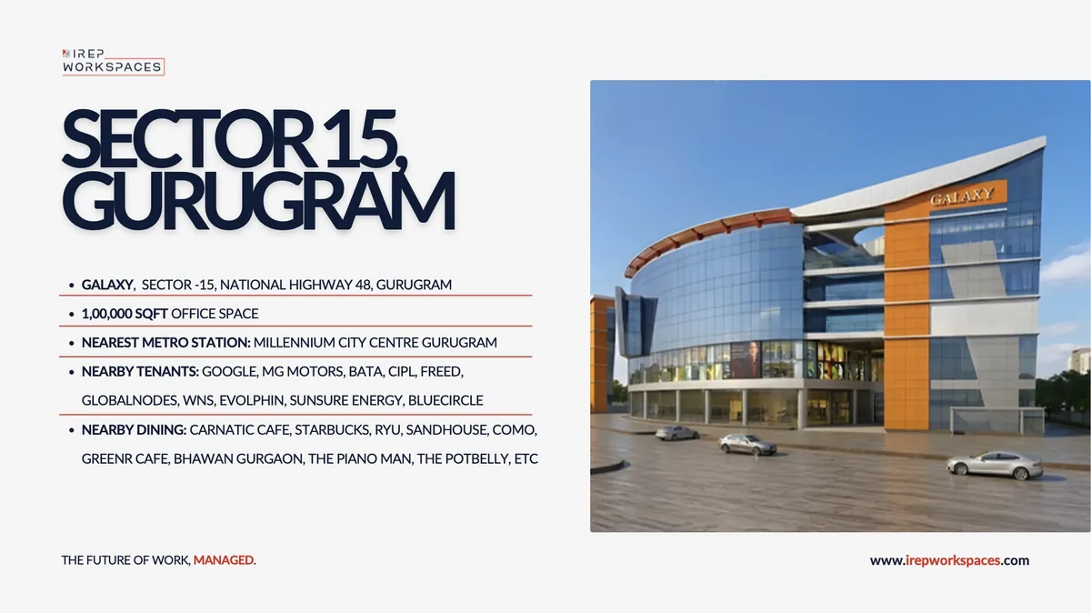
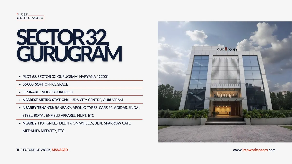
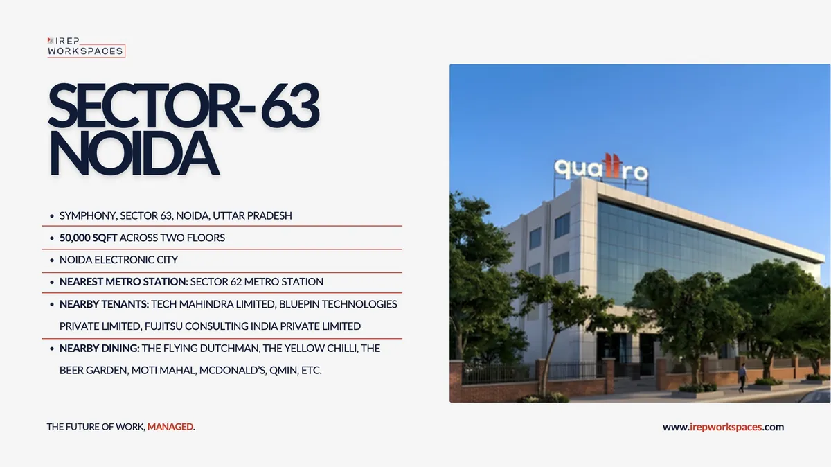
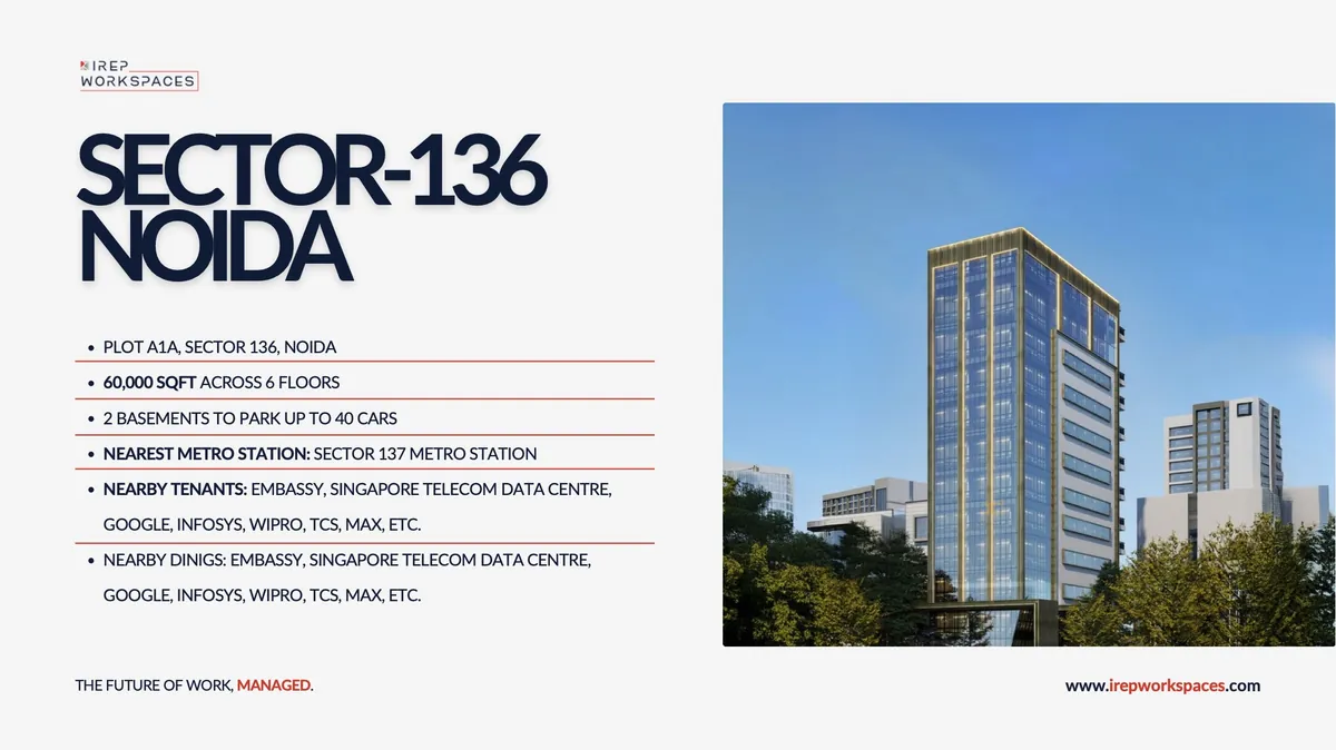
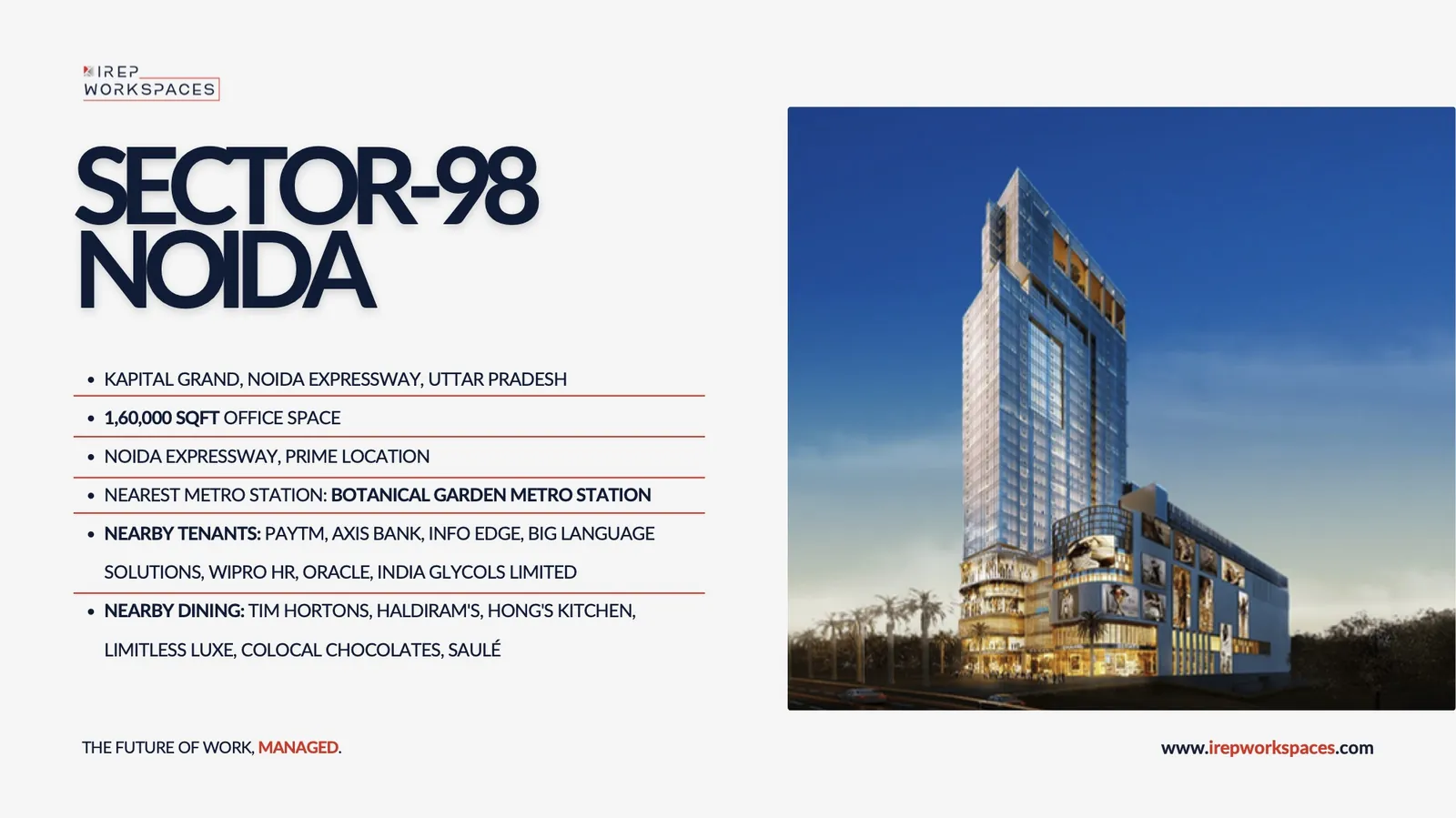
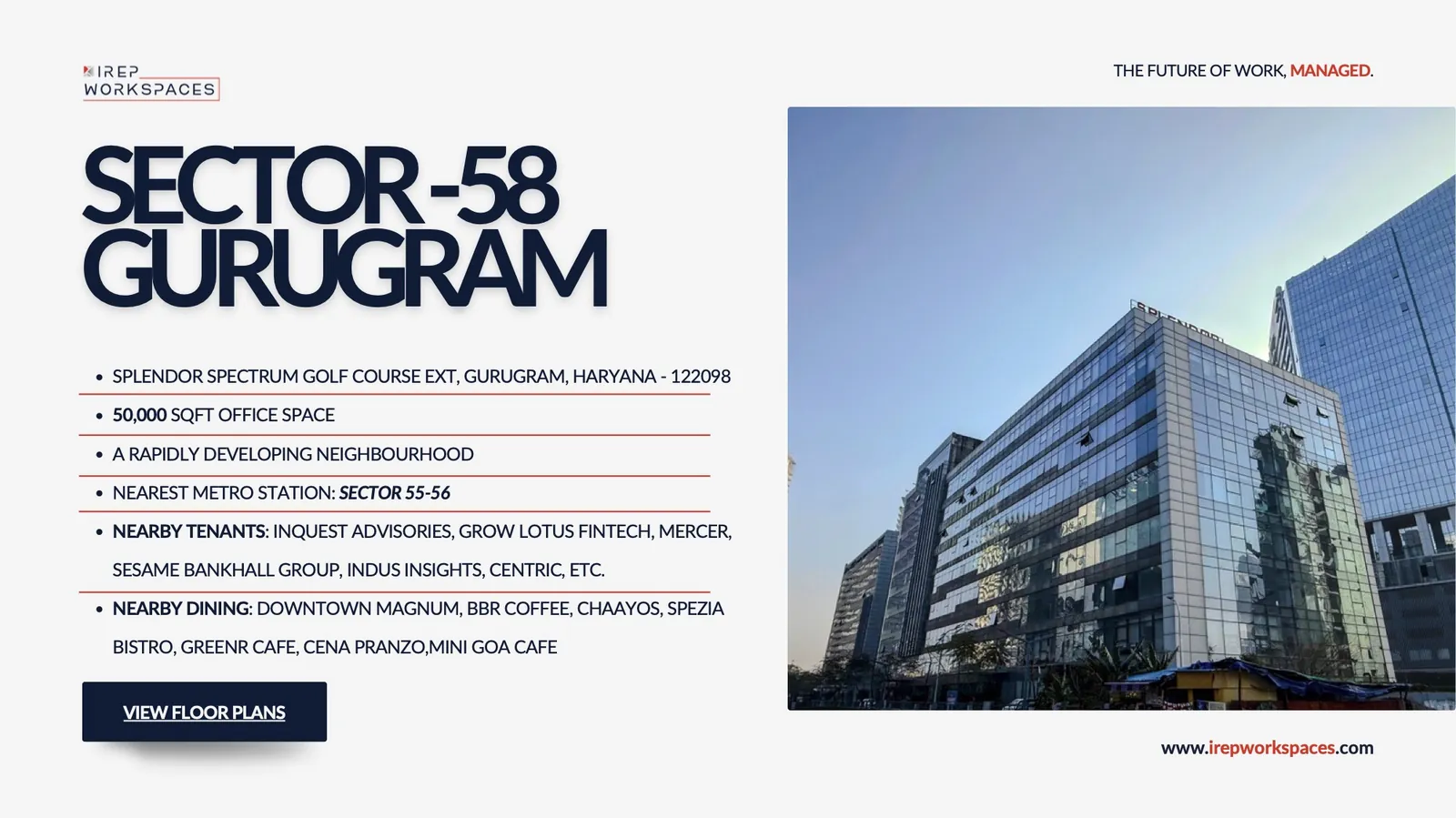
One template, every building
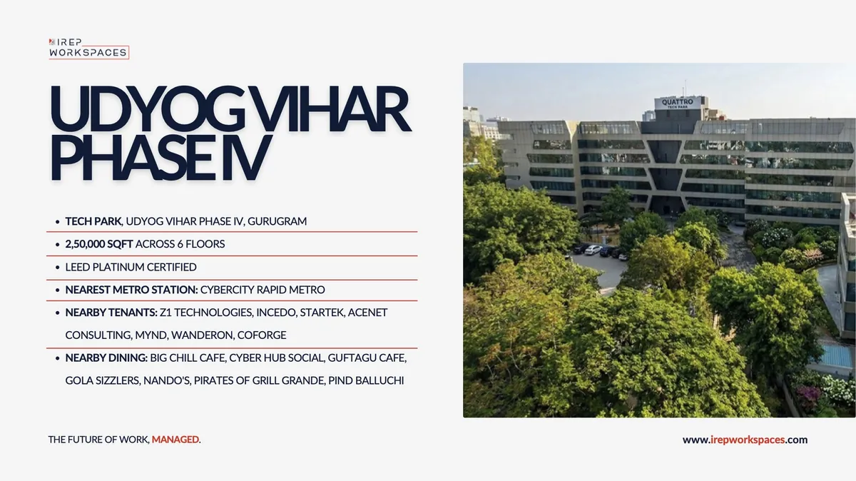
Seven centres, one layout: headline, red-ruled facts, hero photo. A new building drops in without a redesign.
Investor pitch deck · 26 pages
Same system, a harder audience
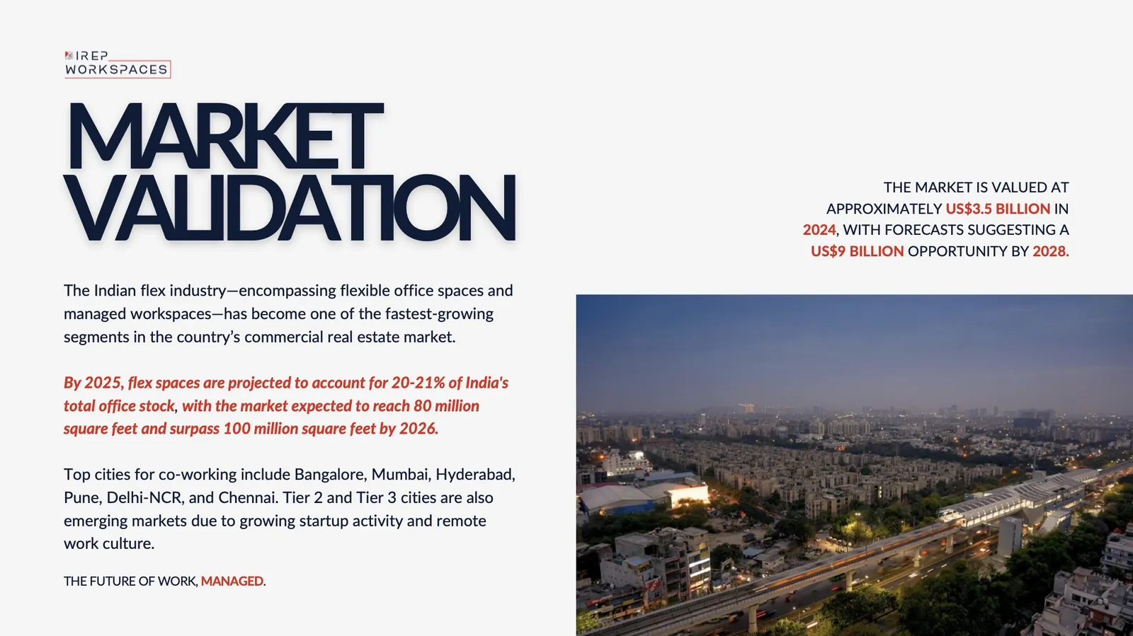
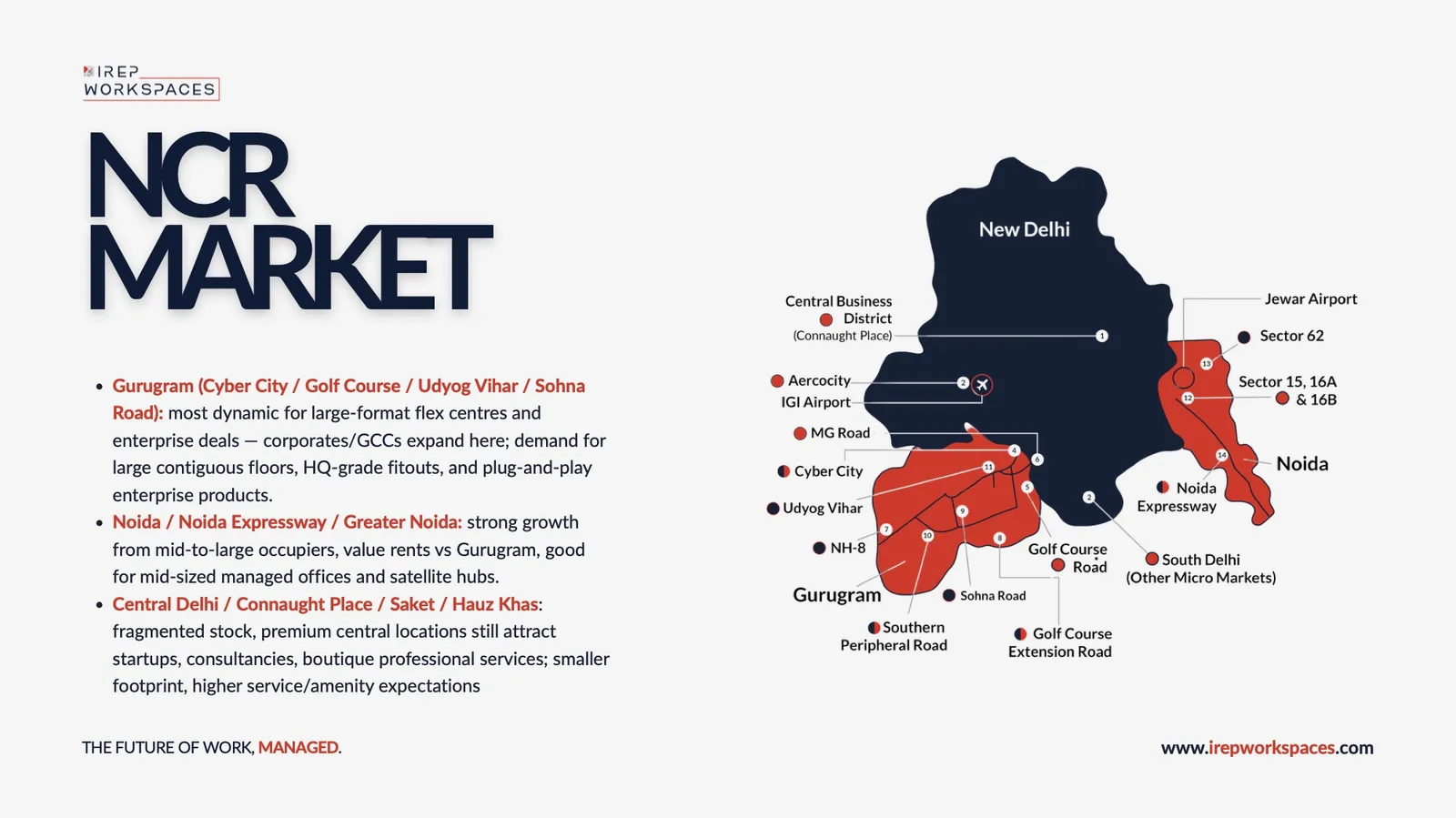
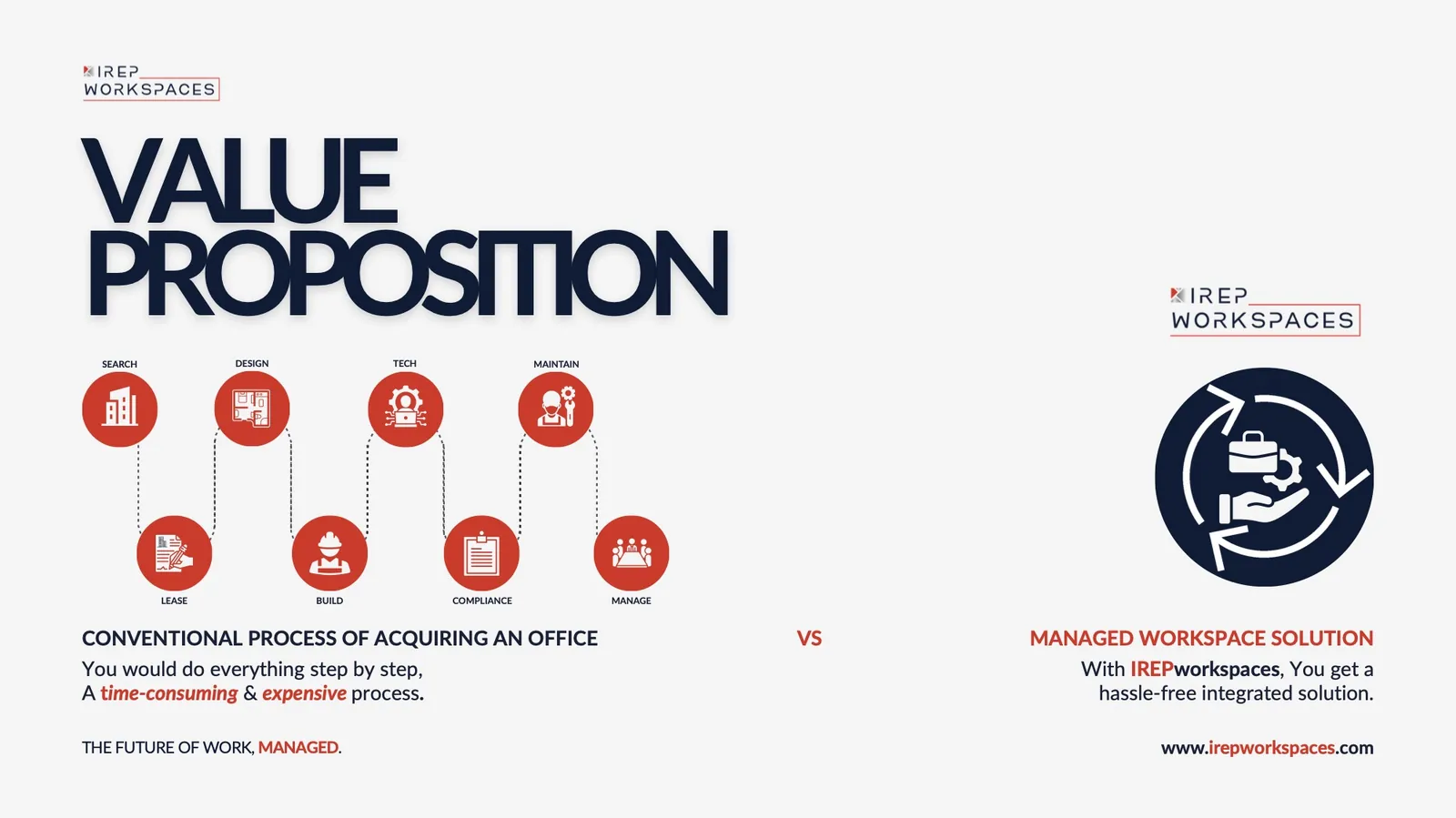
The profile's grammar, pushed toward numbers: market size, a map of the NCR office market, and the case for managed space.
Website
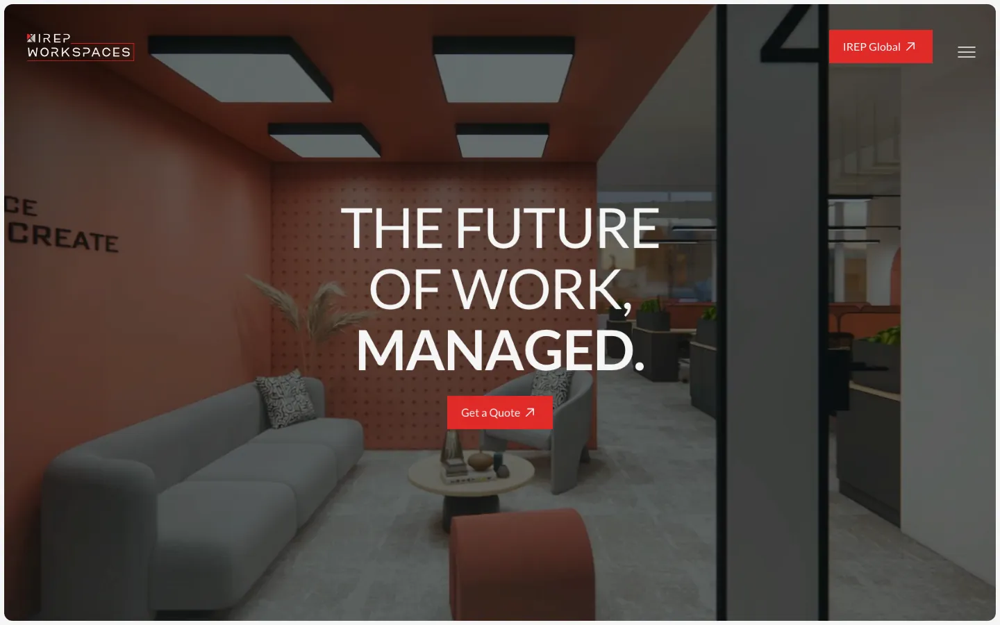
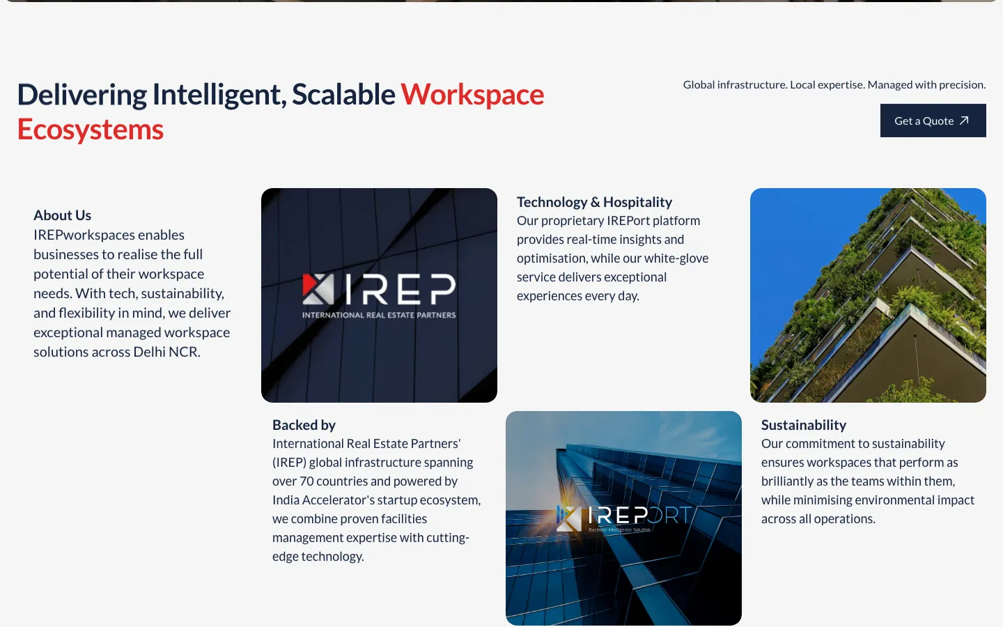
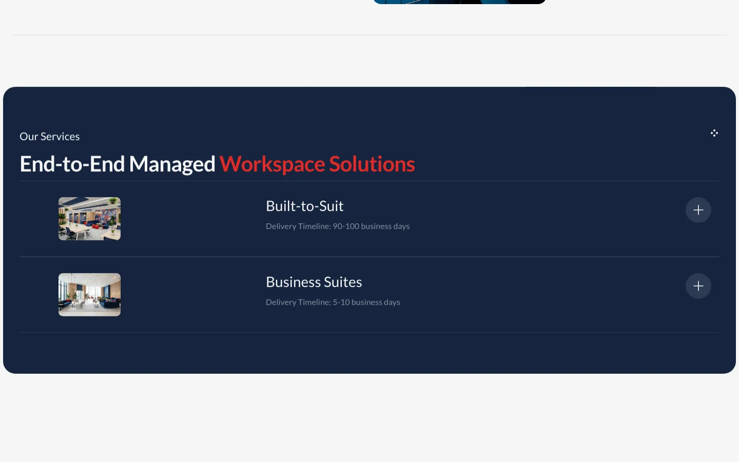
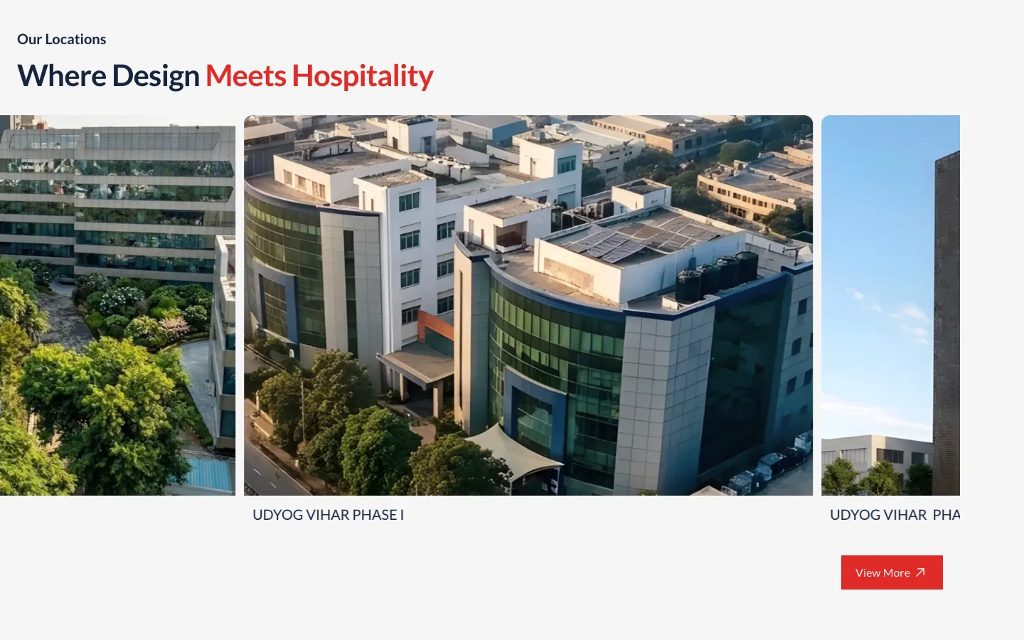
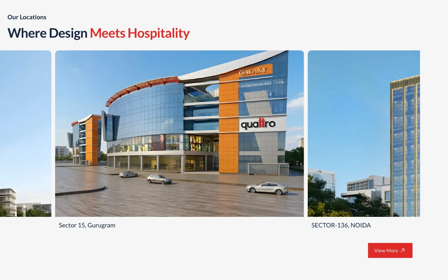
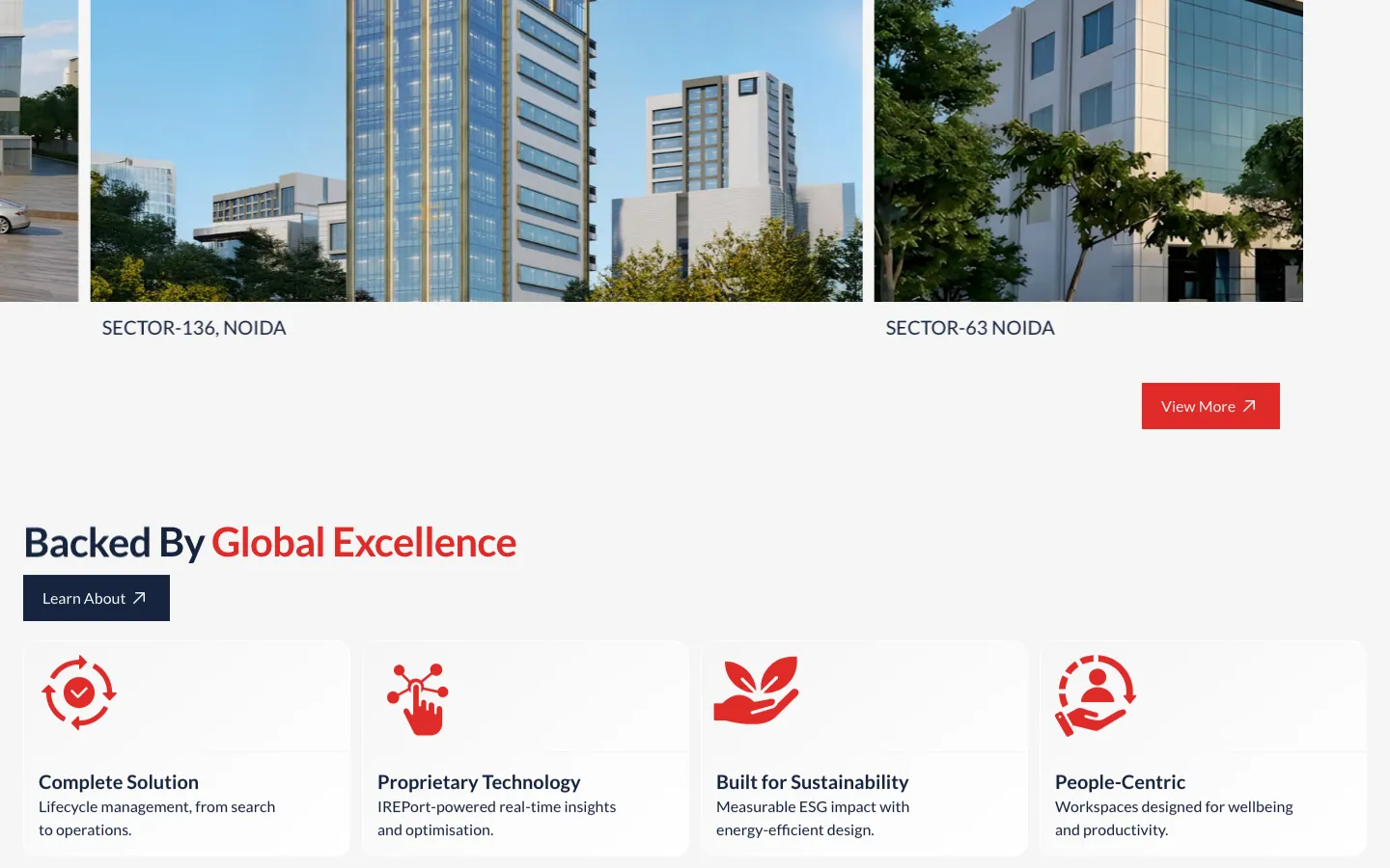
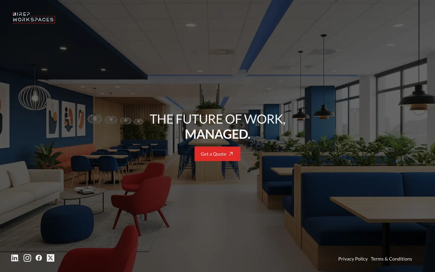
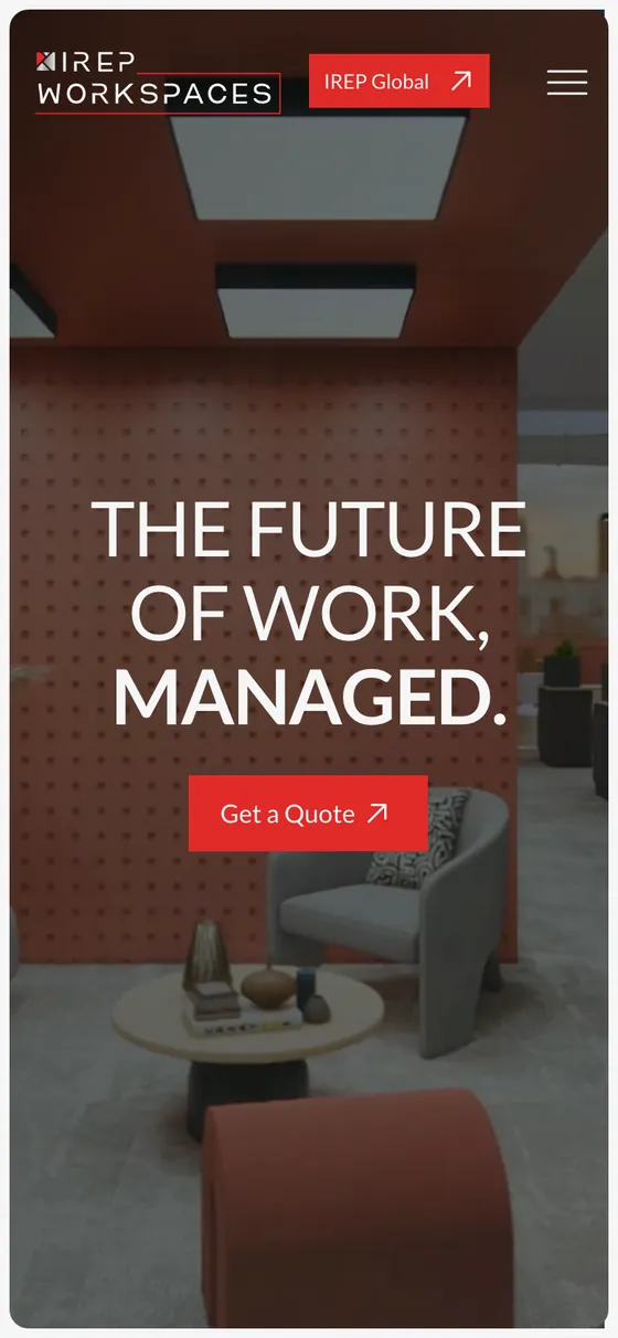
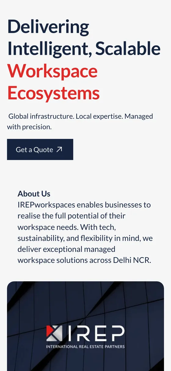
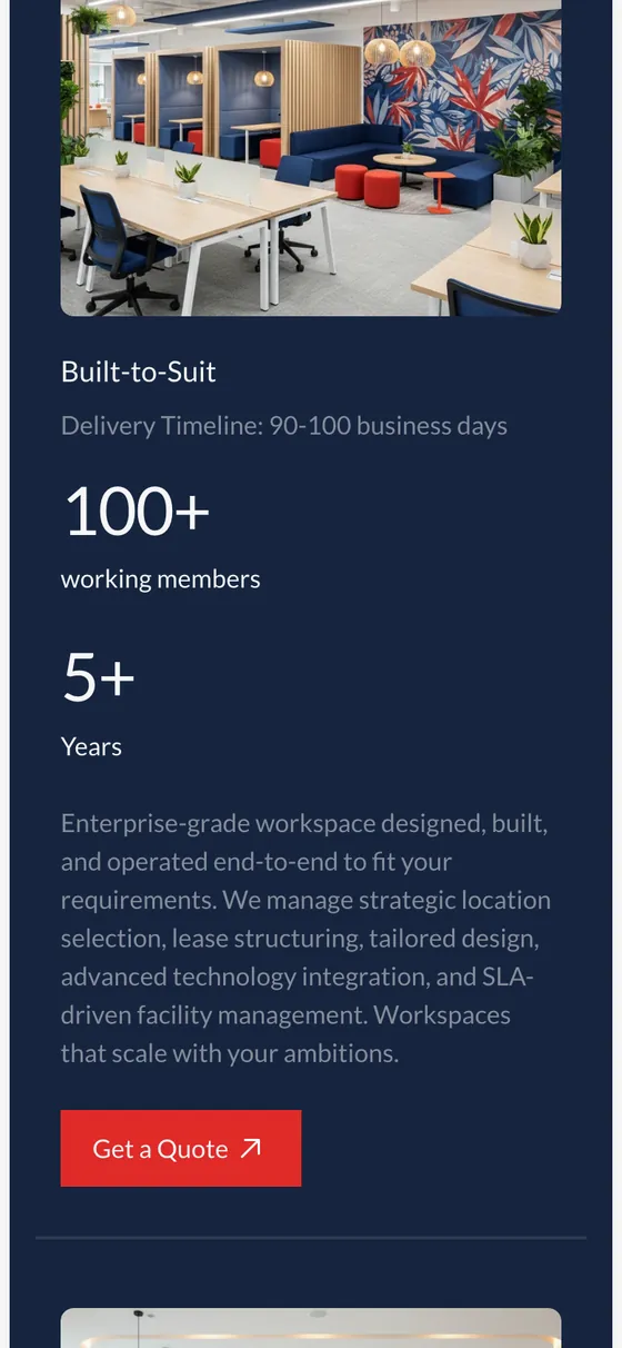
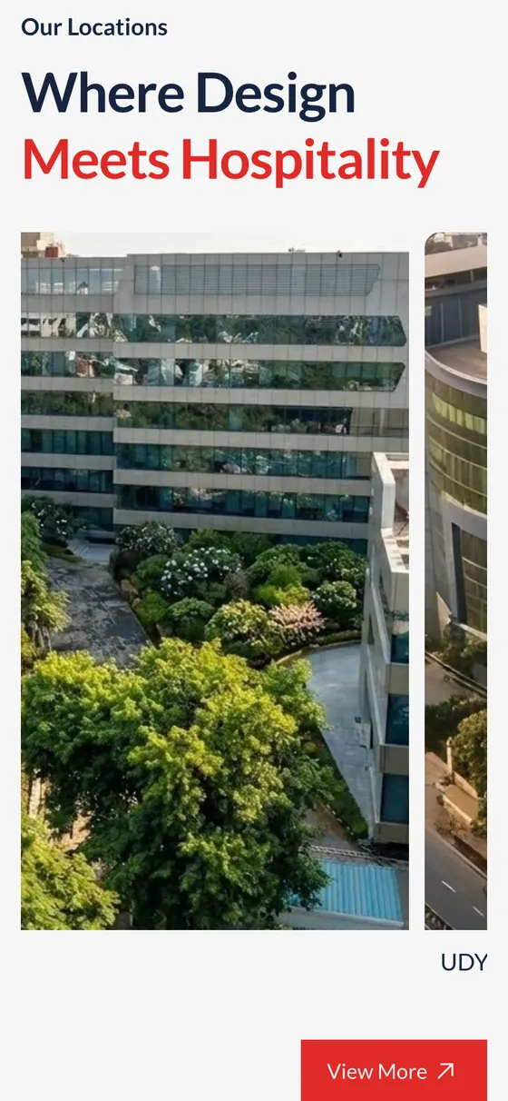
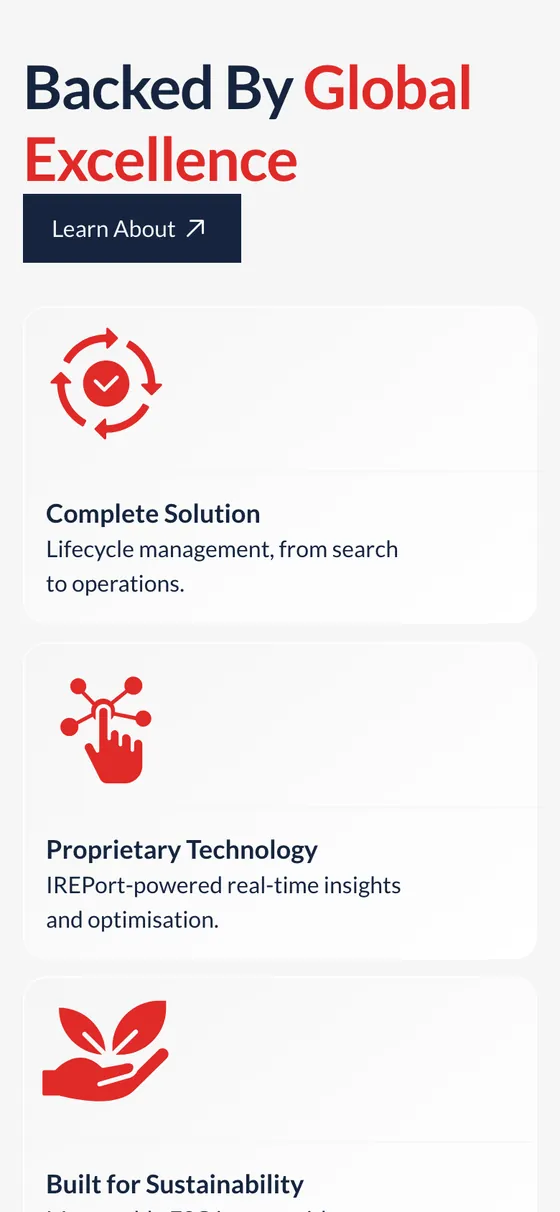
The brand, live: the decks' grammar turned into irepworkspaces.com.
The window below is the real site, so scroll inside it. A refresh is on the way, and this frame will always show whatever is live; the launch version stays in the archive.
Launch version · captured September 2026, before the refresh.
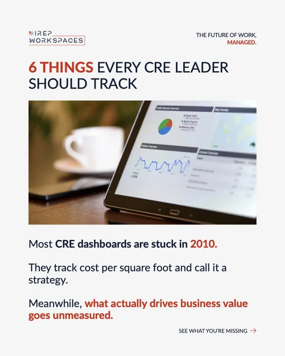
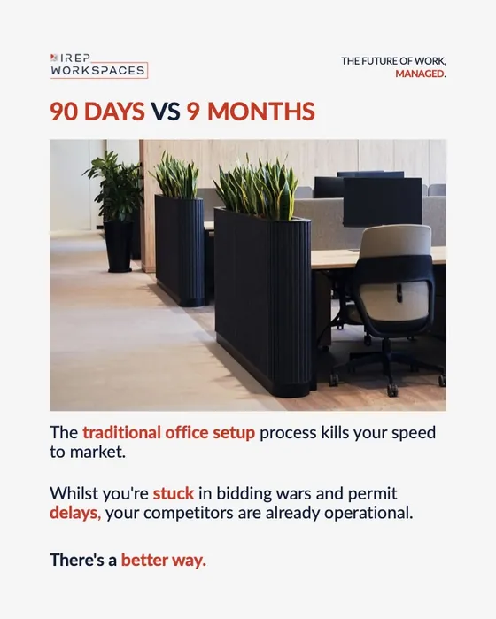
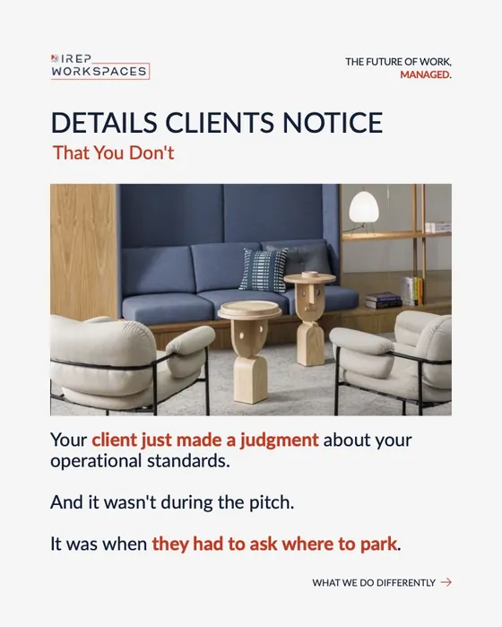
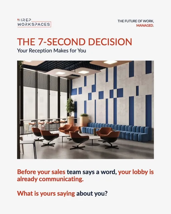
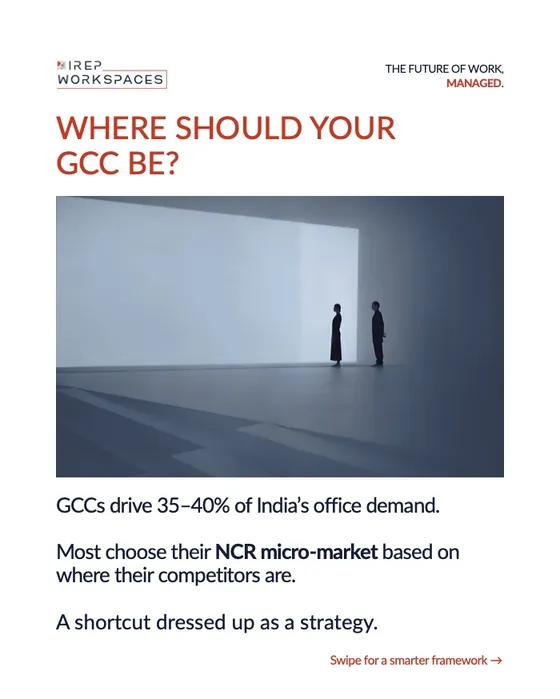
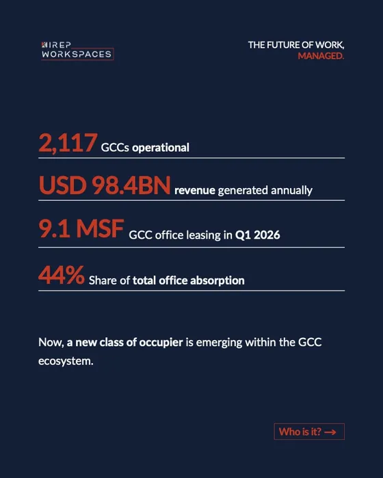
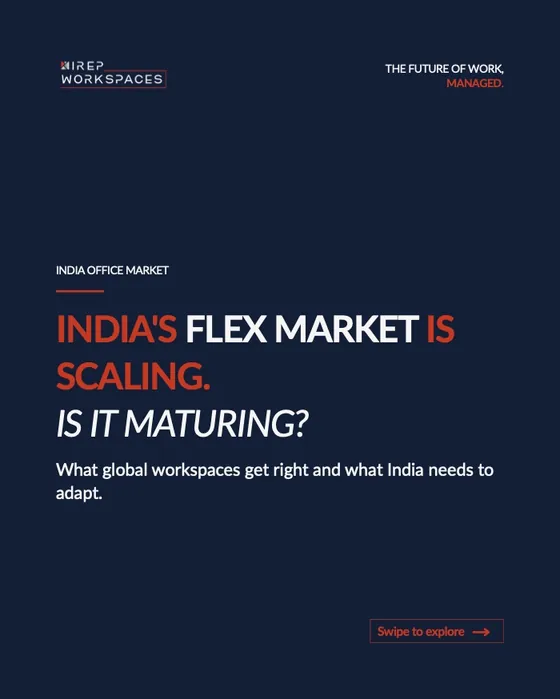
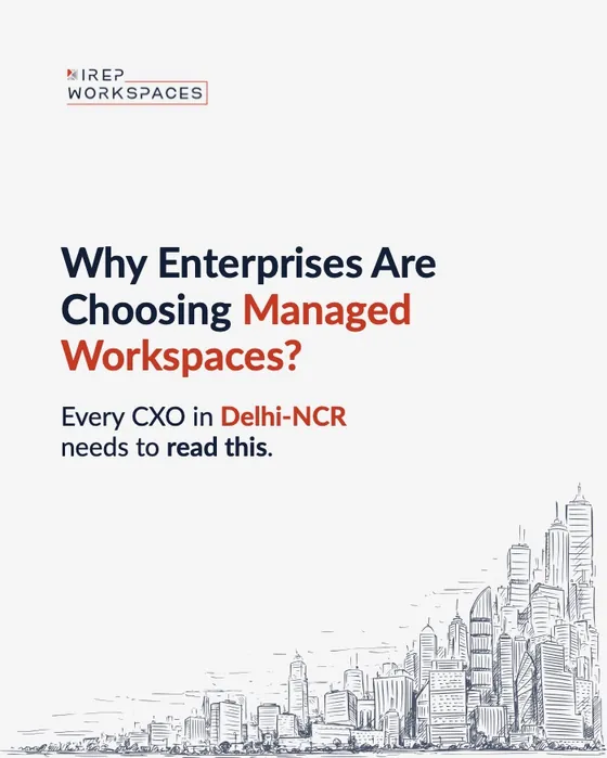
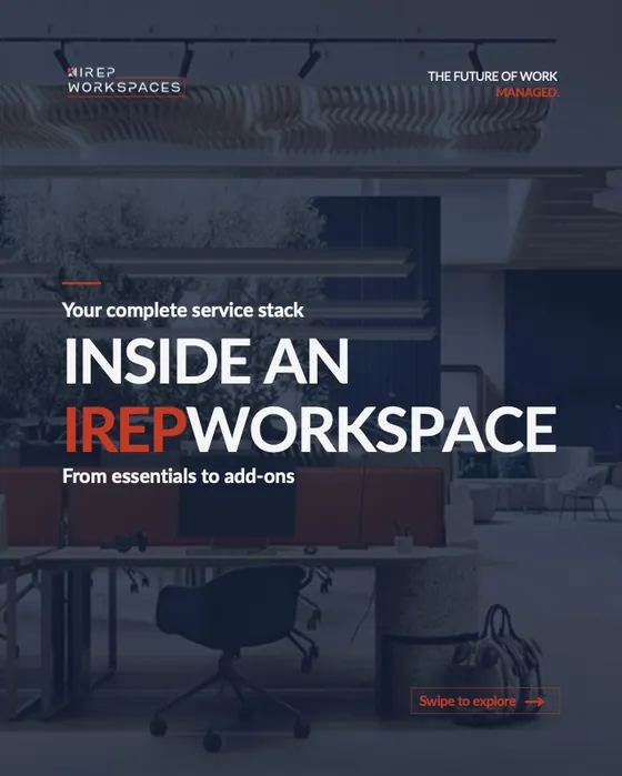
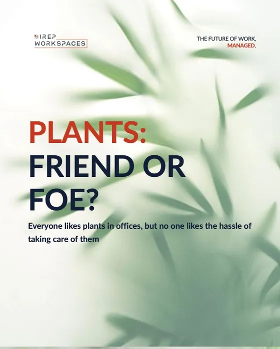
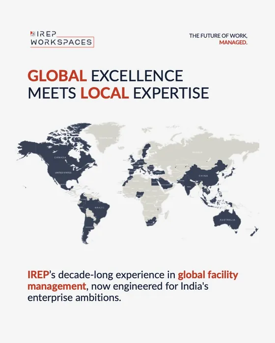
30+ posts and carousels: market explainers, location launches and service breakdowns, all on one grid.
A recurring template (logo top left, tagline top right, one idea per slide) let the page publish every week without the feed ever looking off-brand.
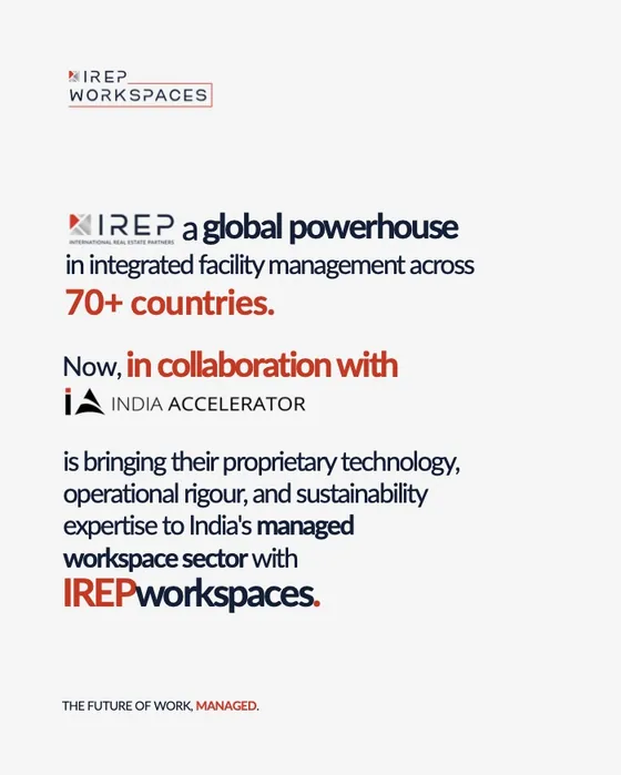 6 slides
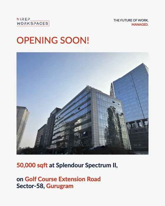 5 slides
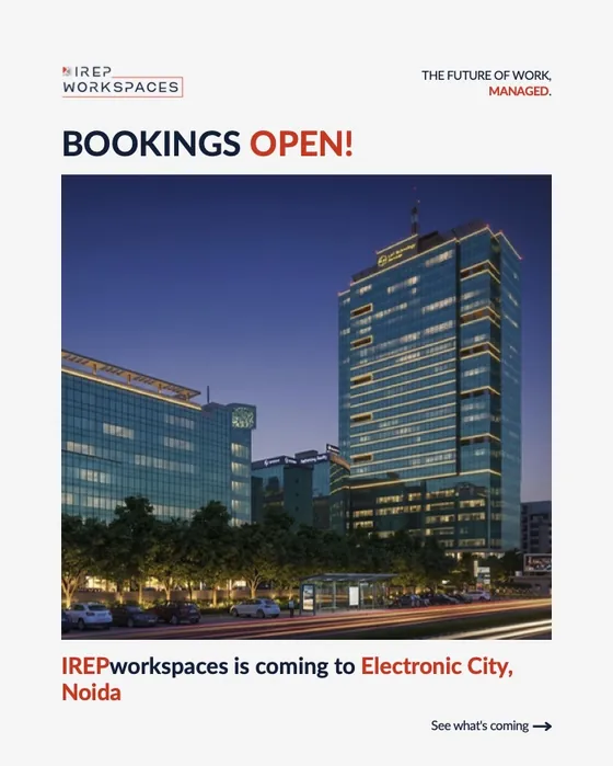 6 slides
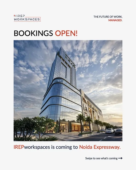 6 slides
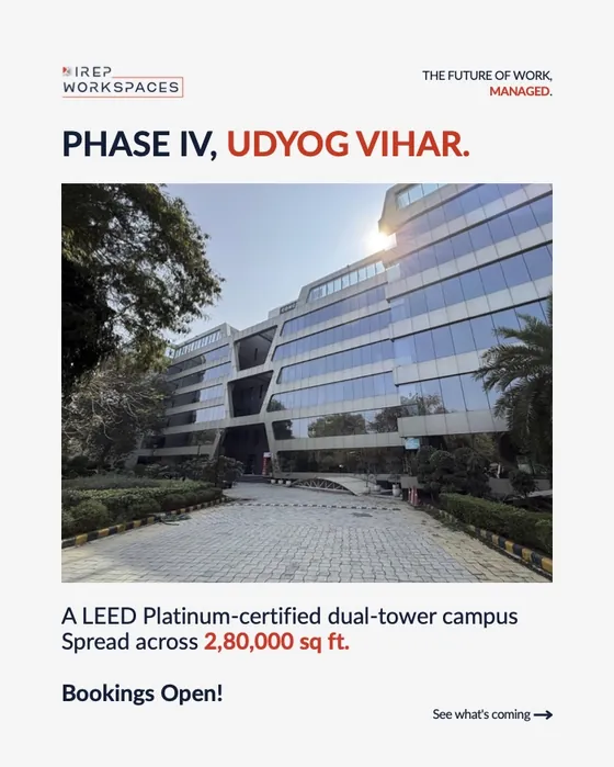 7 slides
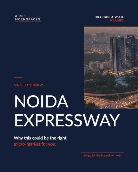 8 slides
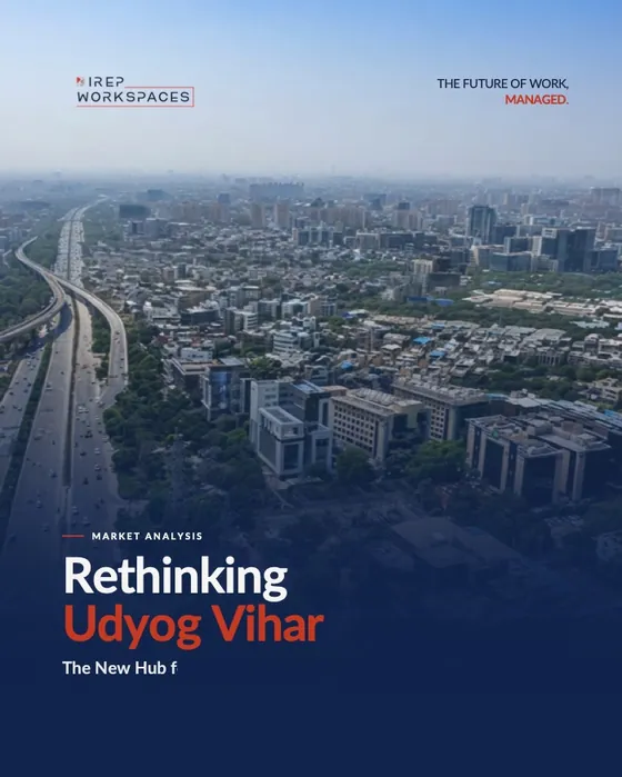 6 slides
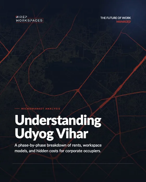 10 slides
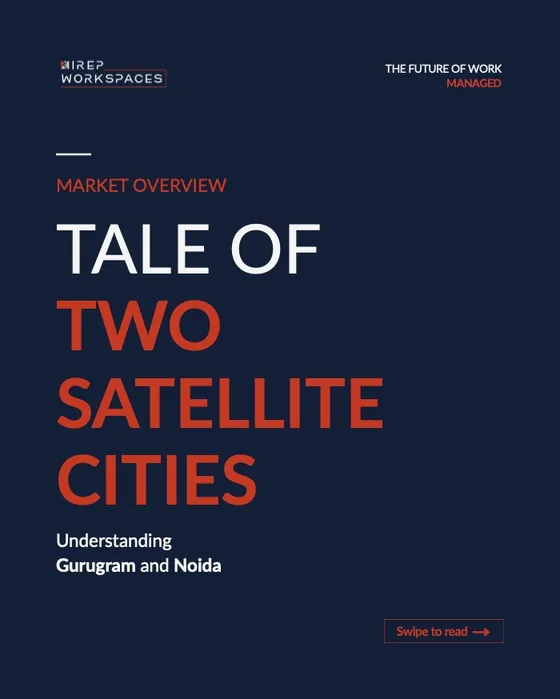 18 slides
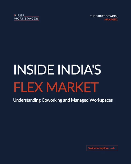 11 slides
 9 slides
 7 slides
 8 slides
 5 slides
 8 slides
 7 slides
 8 slides
 7 slides
 7 slides
 8 slides
 8 slides
 6 slides
 12 slides
 6 slides
 6 slides
 7 slides
 8 slides
 3 slides
 9 slides
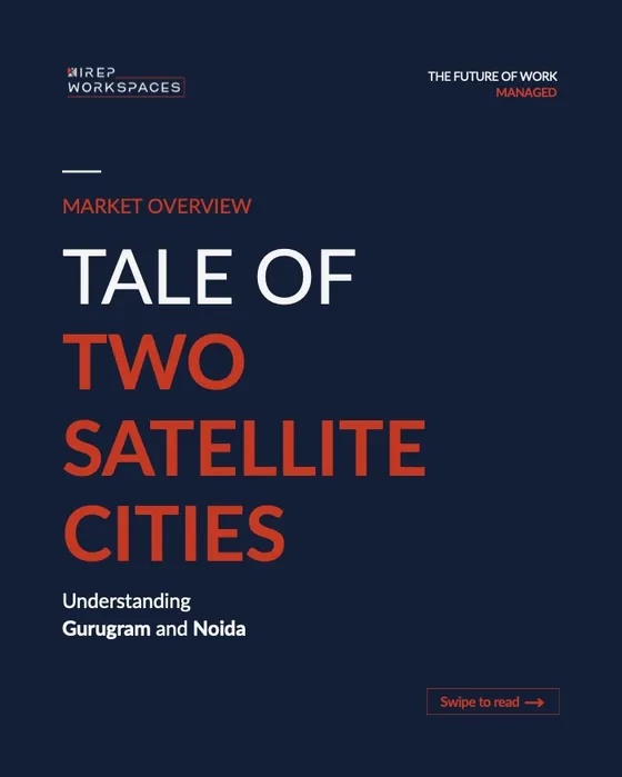
One carousel, start to finish
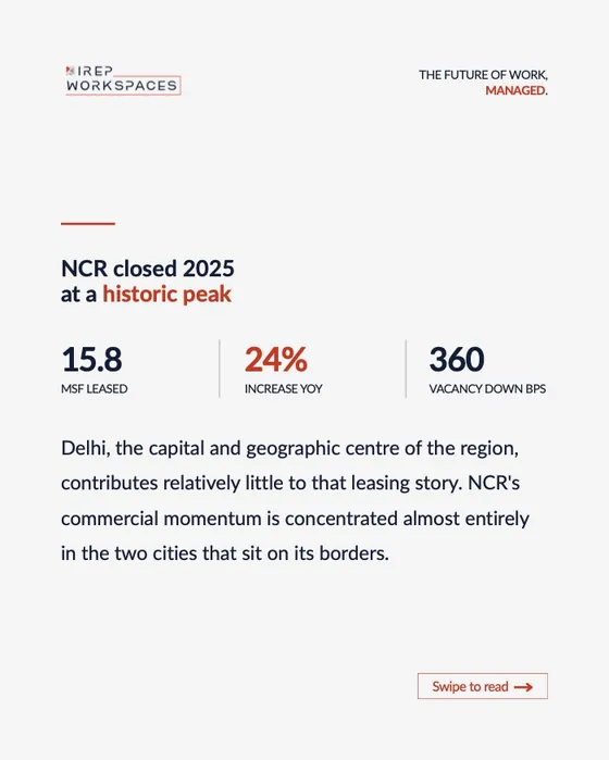
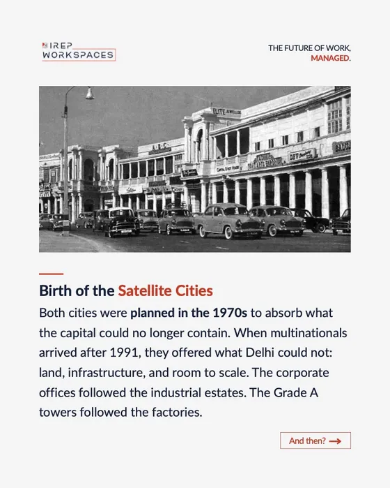
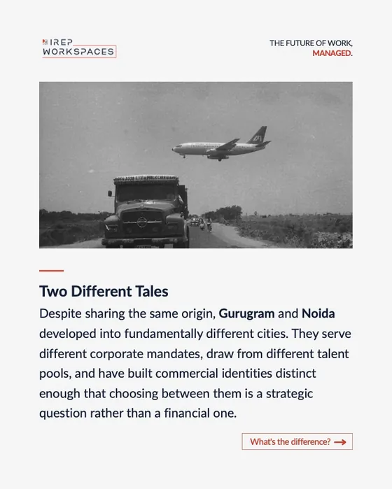
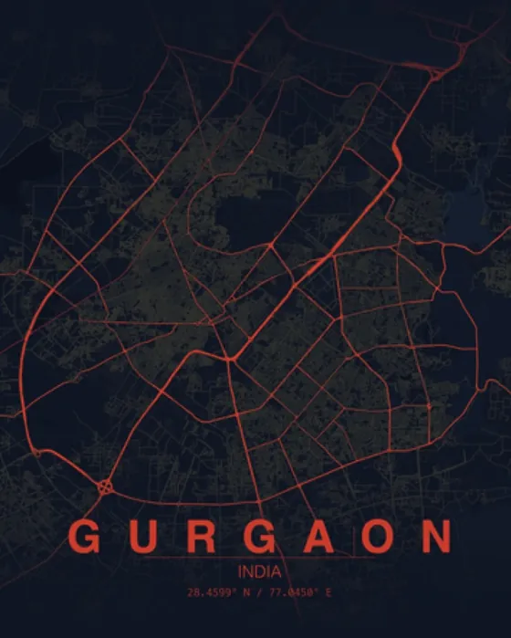
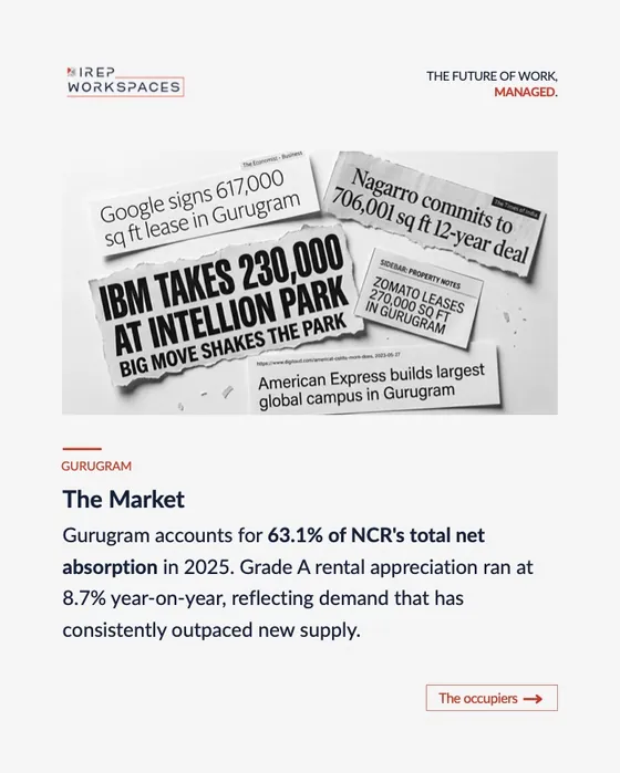
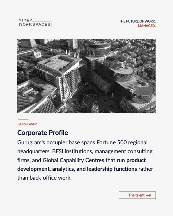
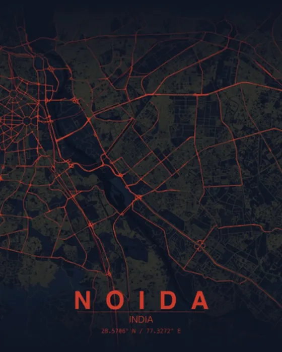
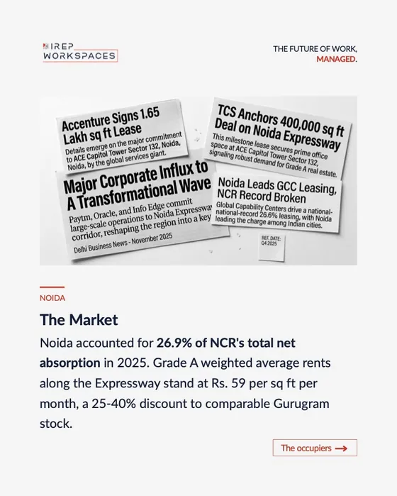
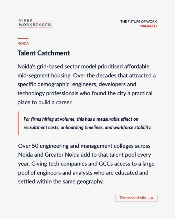
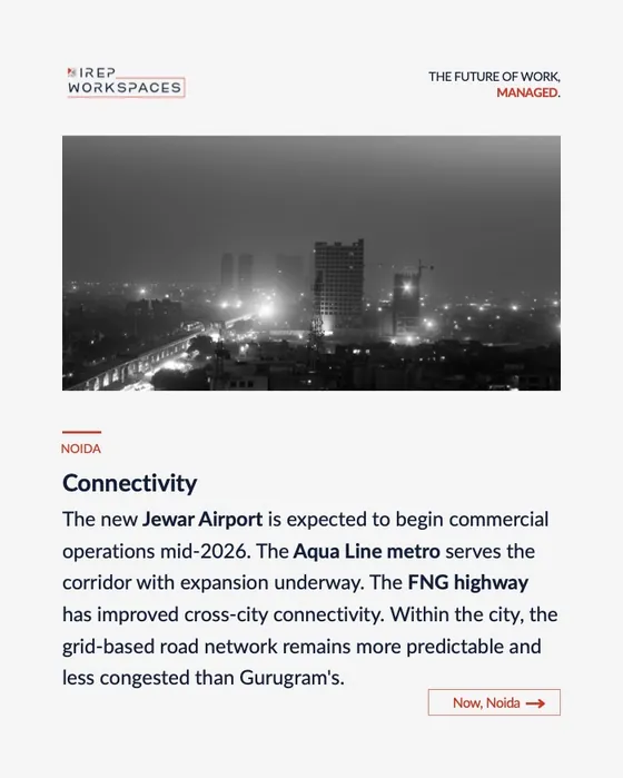
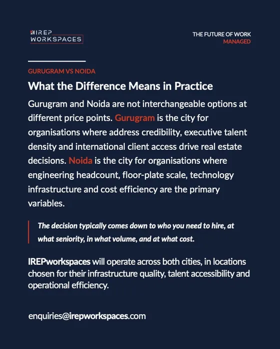
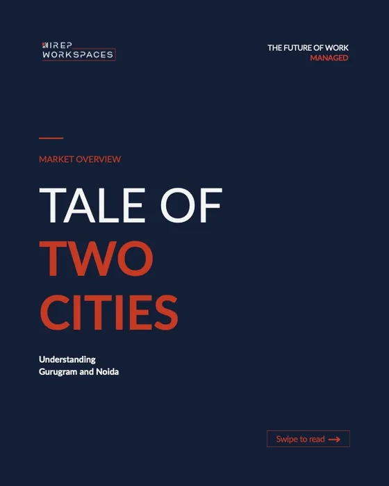
Tale of Two Satellite Cities, 18 slides: Gurugram vs Noida told with archive photos, city maps and data, ending on where IREPworkspaces fits.
What I did
Identity
Built the brand from zero: logo, colour, typography and a 15-page guideline.
Sales & investor documents
The 20-page company profile, the 26-page pitch deck, and a location sheet for every centre.
Brand kit & website
Stationery, cards and merchandise, and irepworkspaces.com (a refresh is on the way).
Social
30+ LinkedIn posts and carousels, from market explainers to location launches.