Quattro
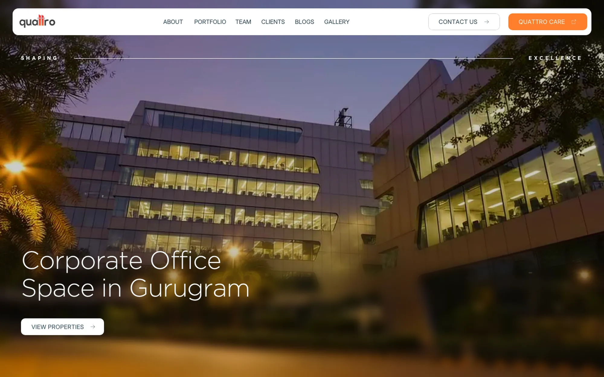
Website design for Quattro Spaces, a commercial real-estate developer and operator in Gurugram: a calm, architectural site that lets the buildings do the talking.
The brief
Quattro has been building and running offices in Gurugram since 2013. The site had to feel like its buildings: solid, quiet, well made.
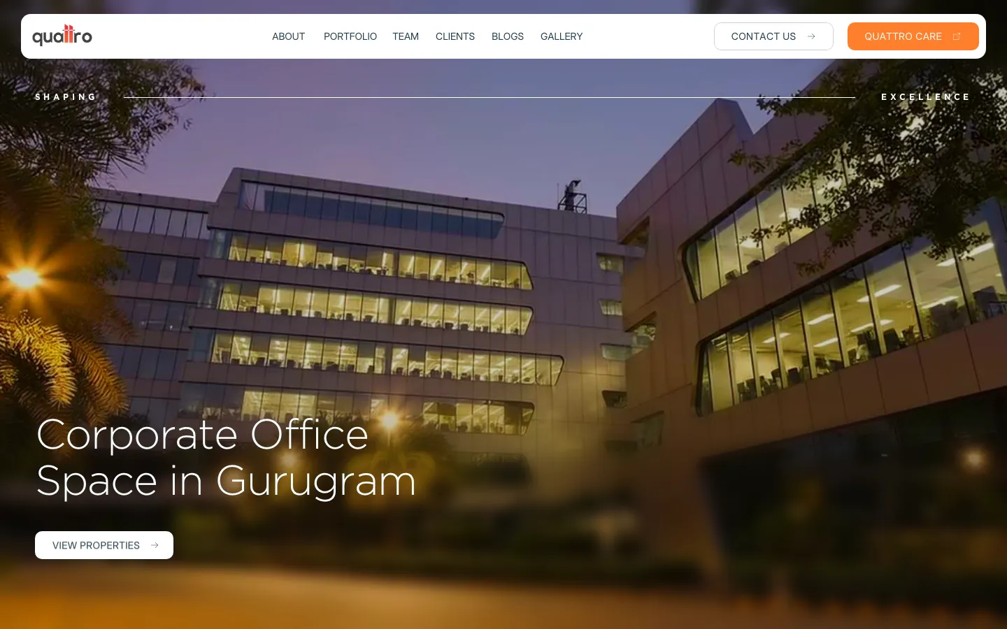
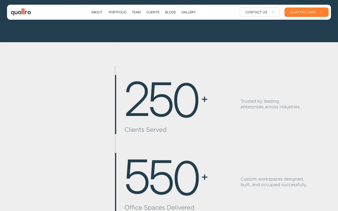
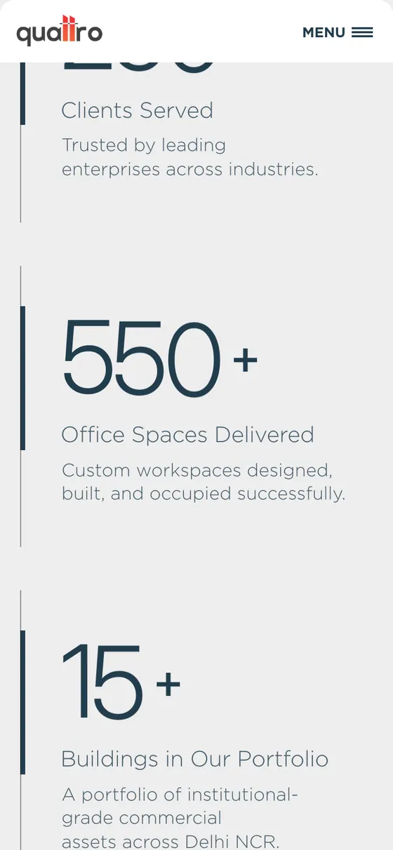
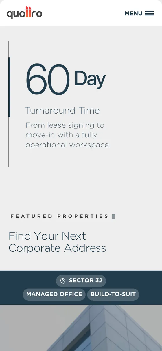
Full-bleed building photography, light oversized type, a slate-and-orange palette, and a page that moves from proof (clients, spaces, buildings, a 60-day turnaround) to properties to the one-lease promise.
The website, live
quattrospaces.com
The window below is the real site, so scroll inside it and switch to mobile. Saved screens are kept alongside.
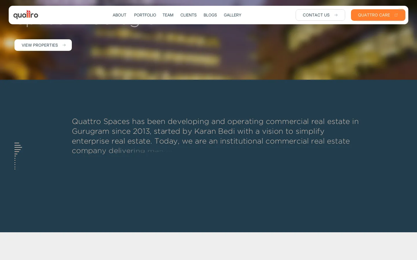
Saved screens · captured September 2026.
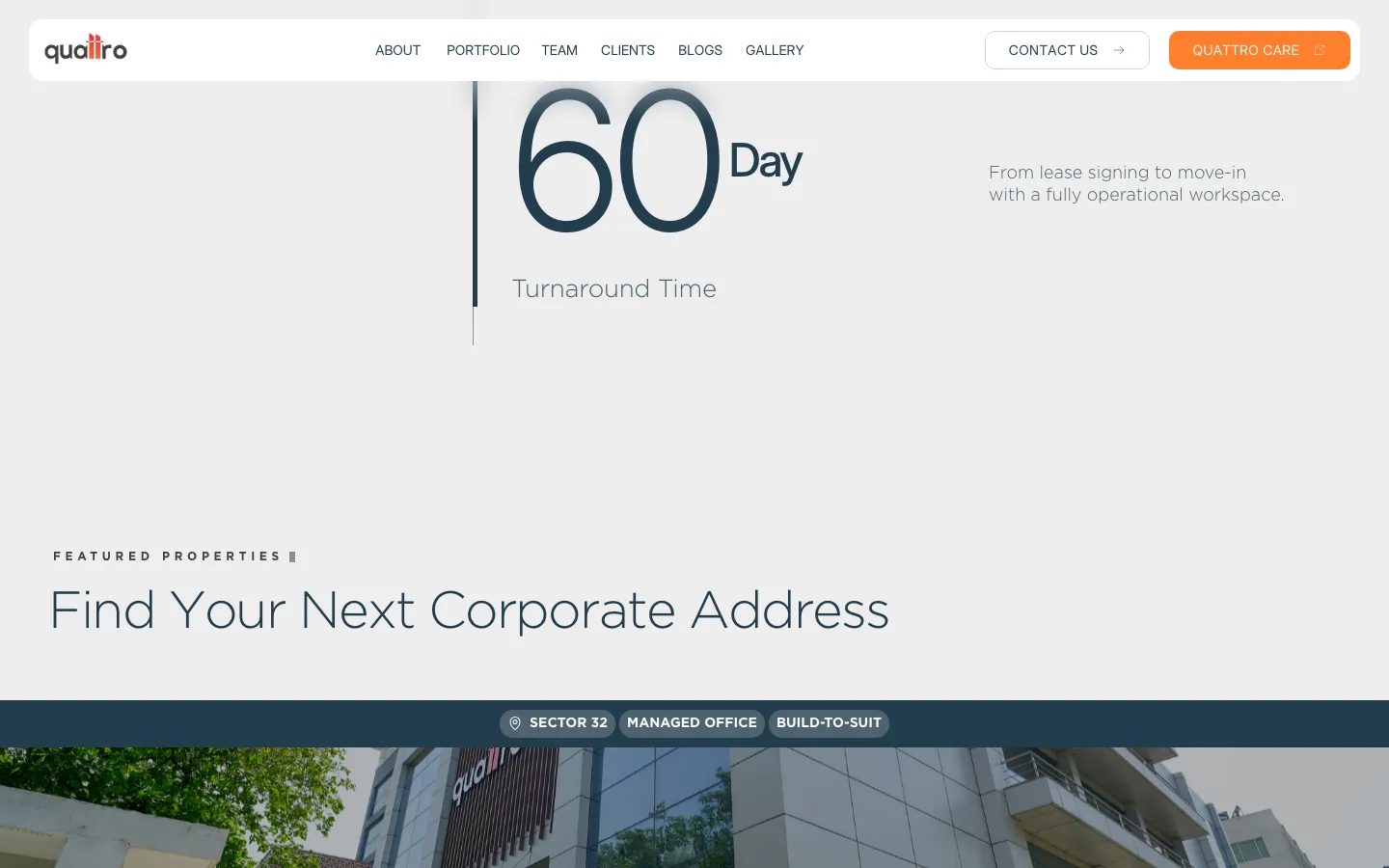
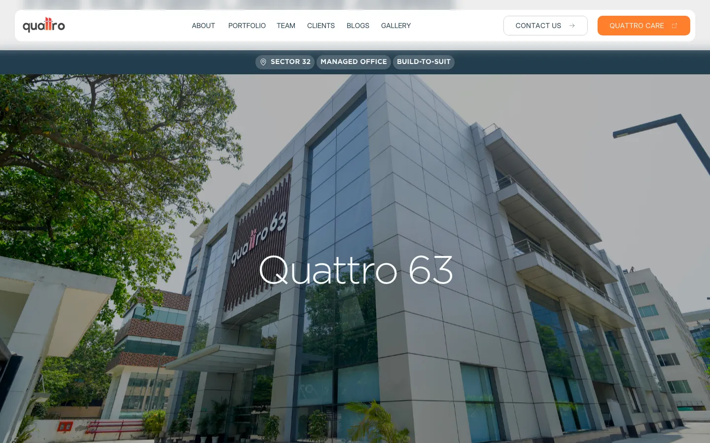
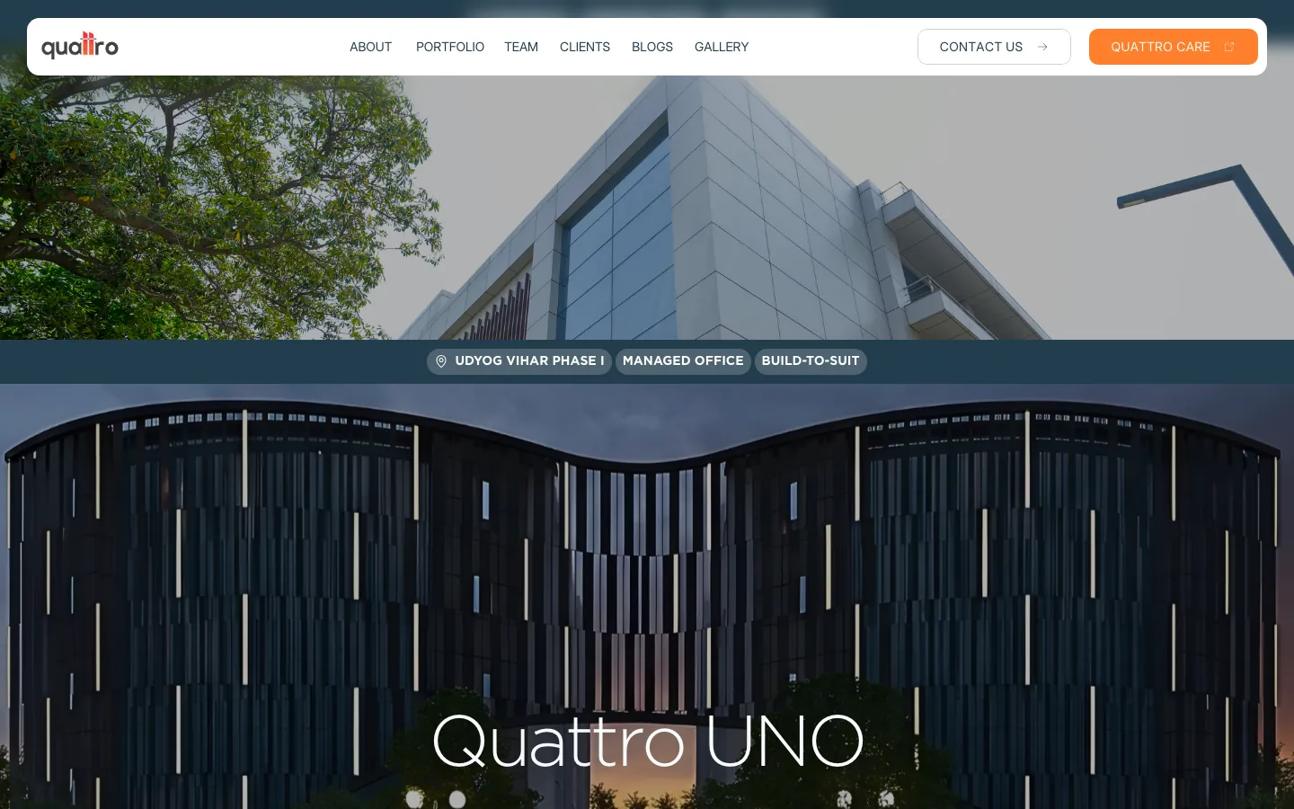
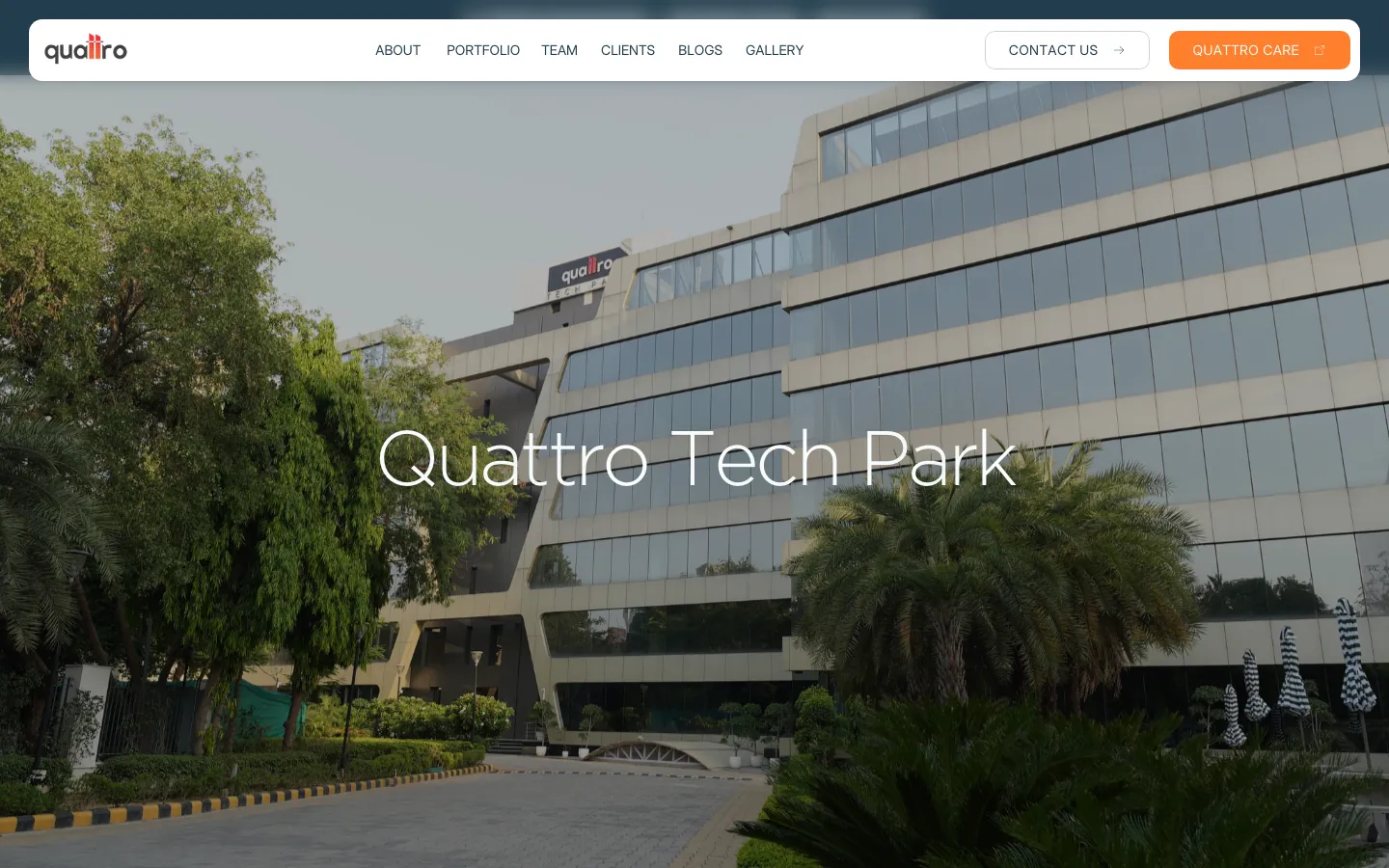
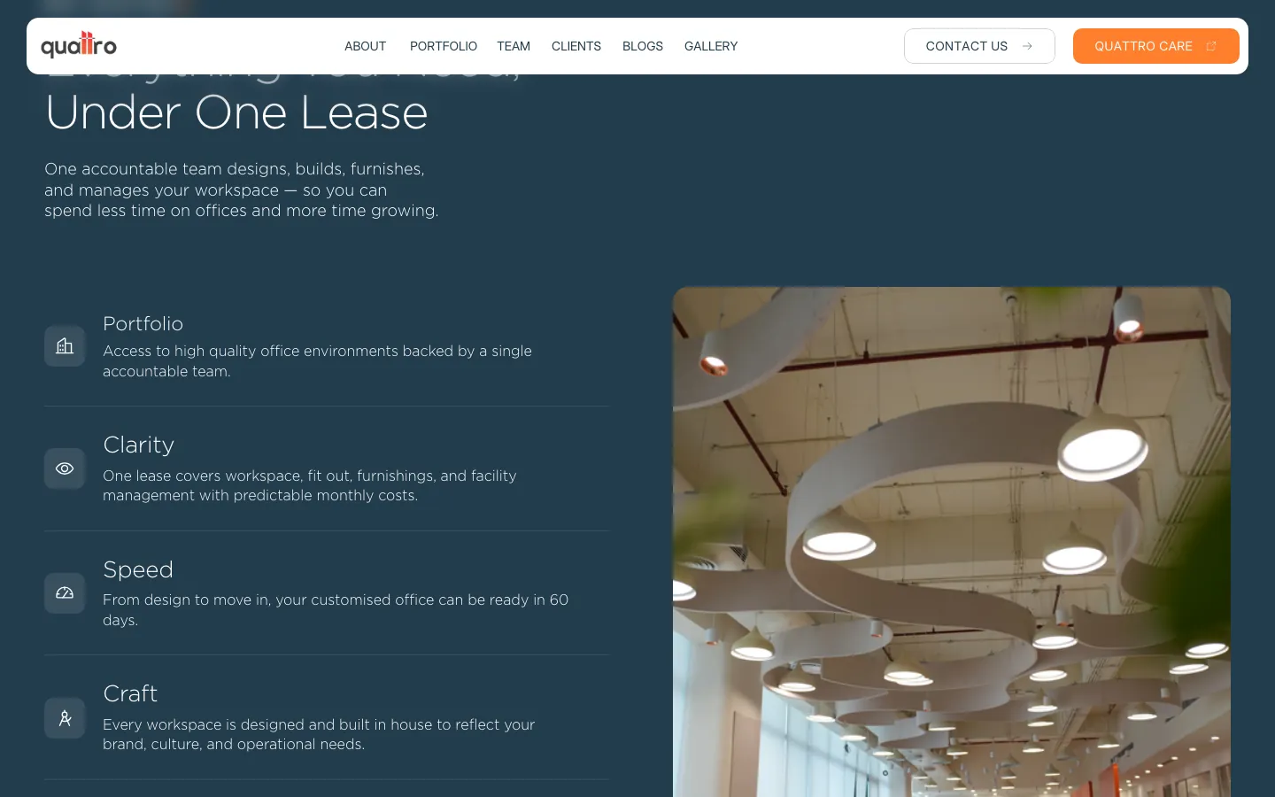
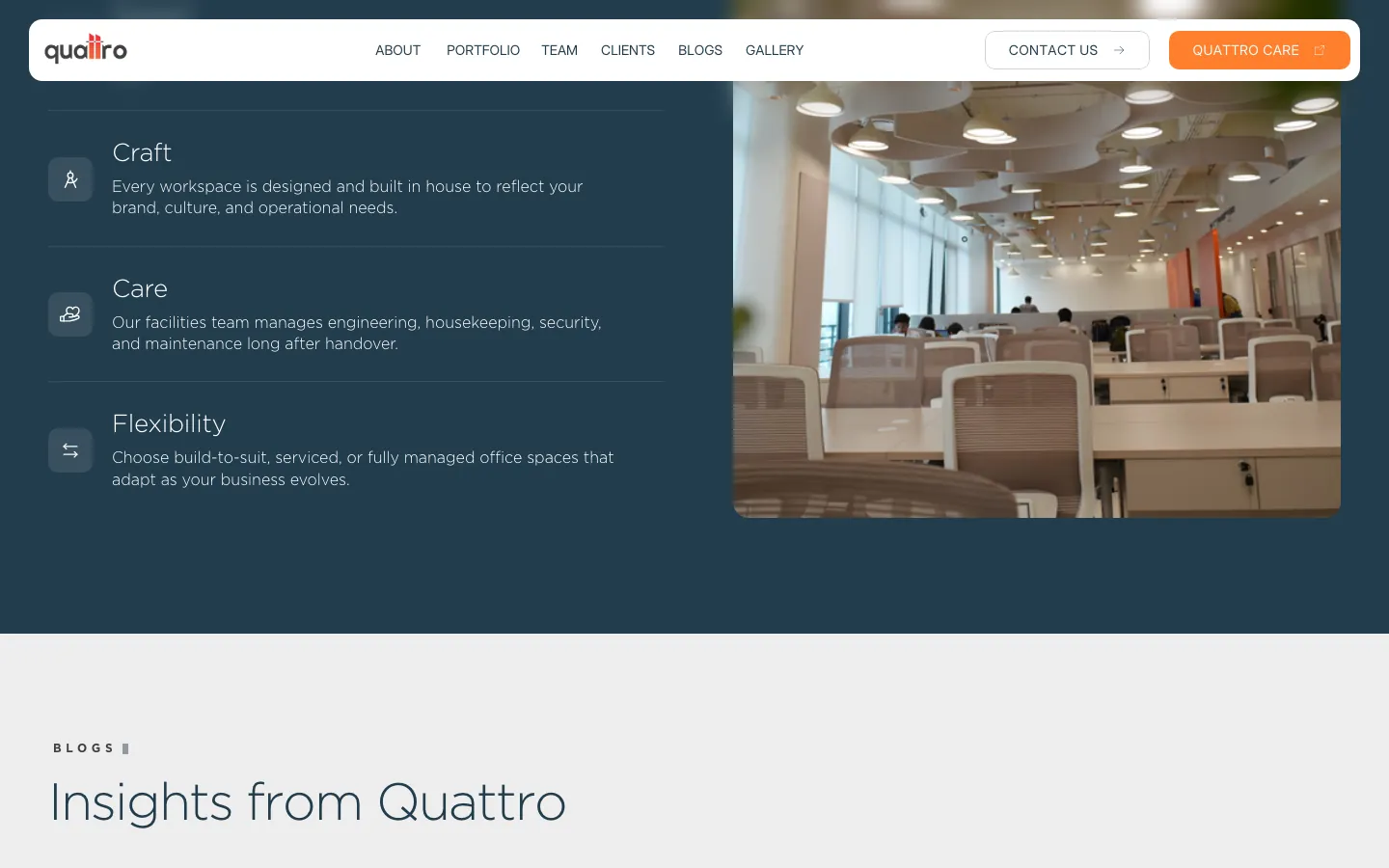
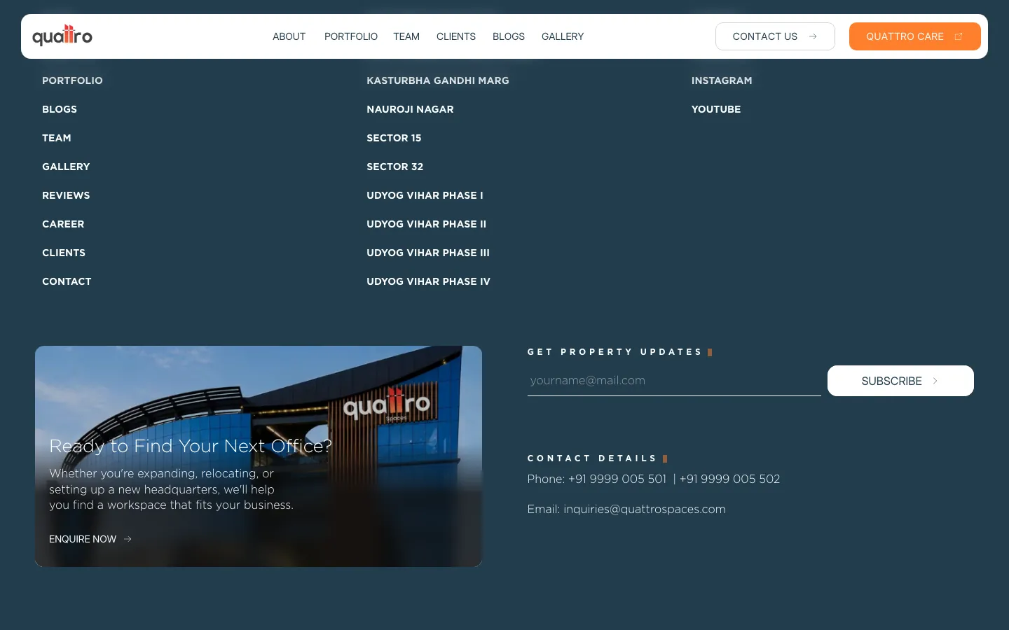
Home page · section by section
Proof, then place, then promise
The home page reads top to bottom as an argument: who Quattro is, the numbers behind it, the buildings, and why one lease covers everything.
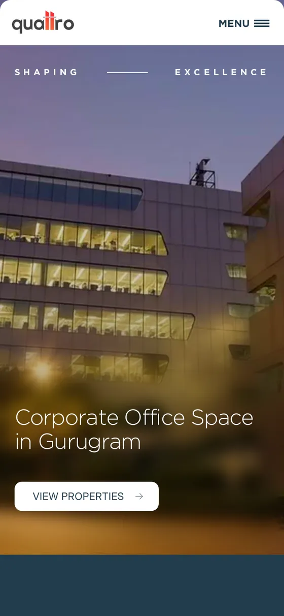
On mobile
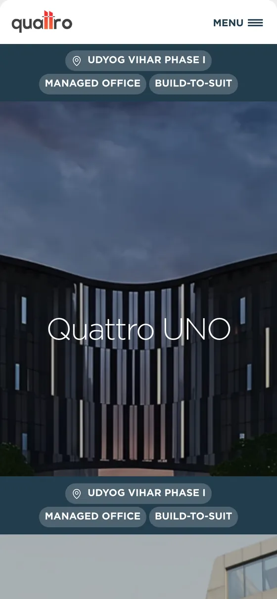
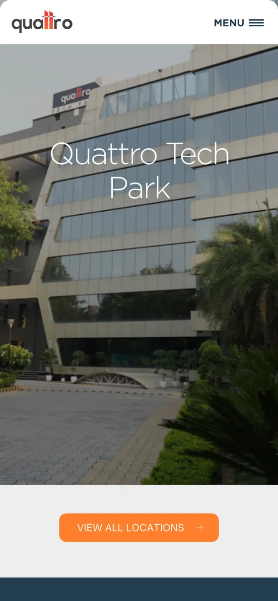
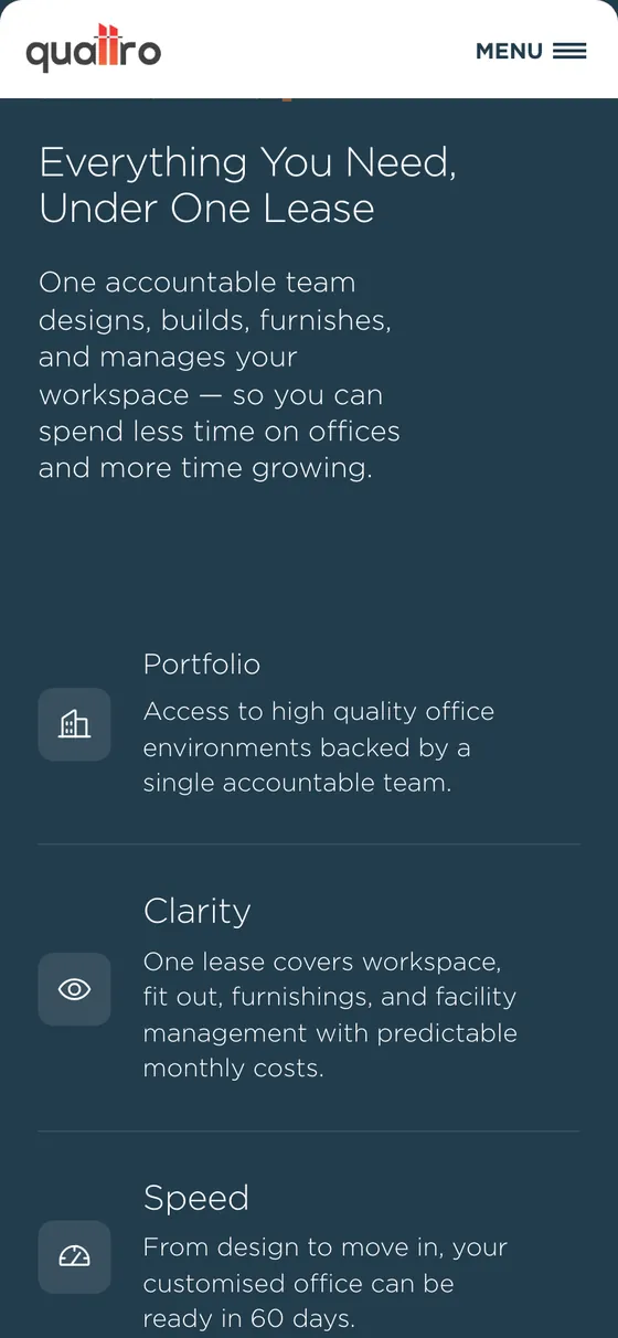
The same calm at phone width: stacked counters, full-height building cards and a thumb-friendly menu.
What I did
Page designs
The home page and its sections, from hero to footer.
Responsive layouts
Desktop and mobile versions of every section.
UI components
Property cards with location tags, counters, service rows and calls to action.
Visual direction
Light oversized type, slate and orange, and full-bleed architecture photography.