ISSC
Brand strategy and identity for India's scrap-recycling machinery specialist: a yellow-and-blue system taken from the machines themselves, carried through the company profile and a magazine ad.
The brief
ISSC builds the machines that turn scrap into feedstock for steel plants, recyclers and scrap yards.
Forty years of engineering behind it, and a market shifting to green steel. The brand had to move ISSC from equipment vendor to green-steel enabler: technically deep, sustainability-focused, and led by its founders' voices.
The identity
Safety yellow and industrial blue, straight off the shop floor, with a condensed headline face that stamps like a machine plate.


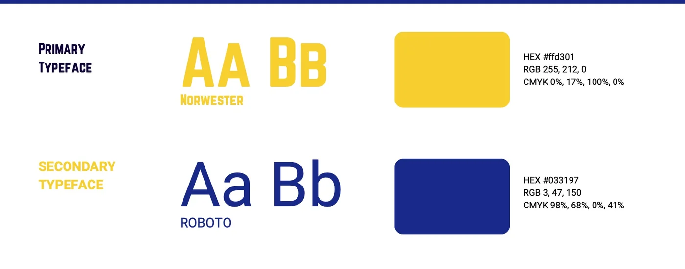
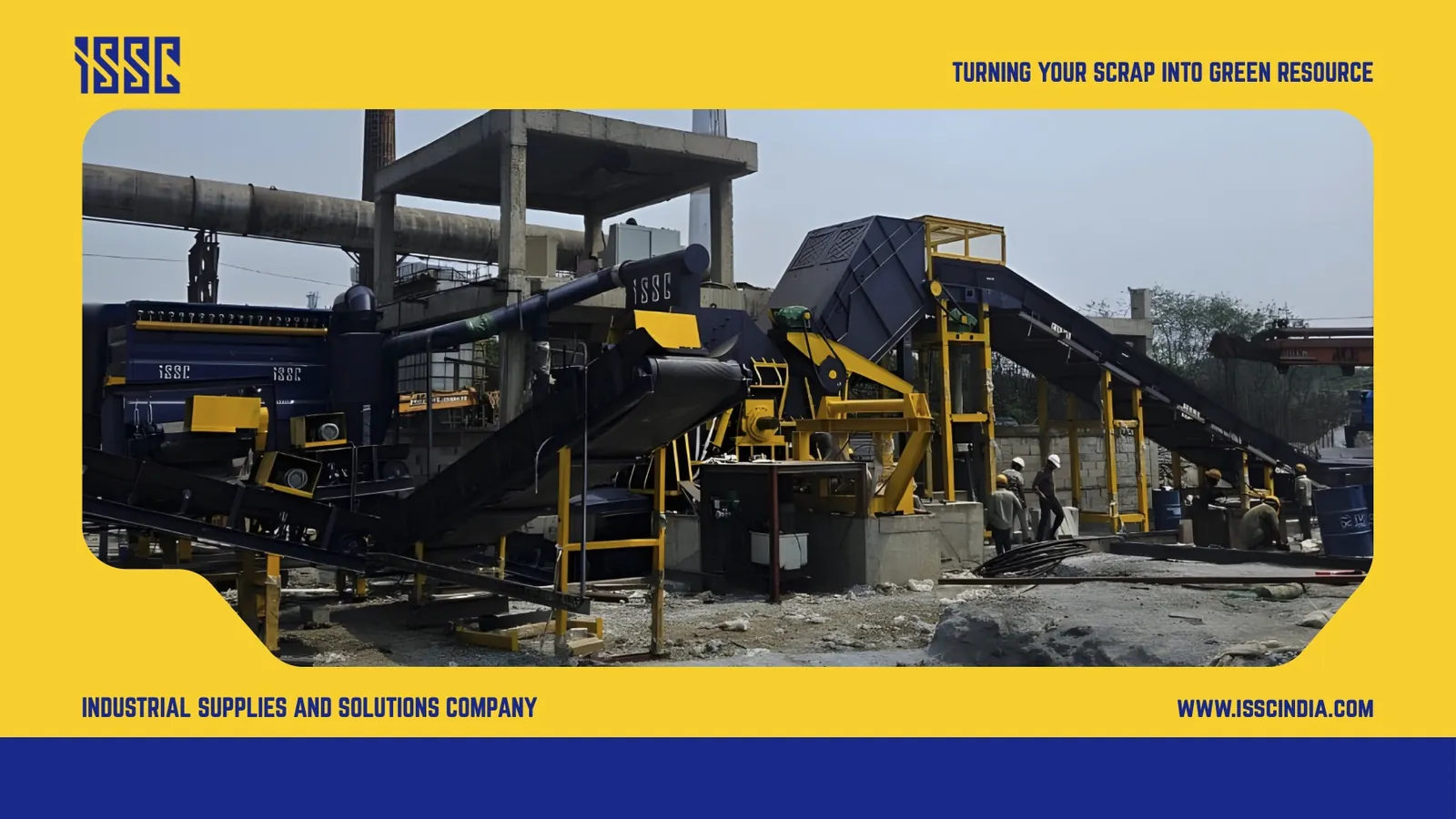
#FFD301#033197Turning your scrap into green resource.
Tagline on every pageBrand strategy · 19 pages
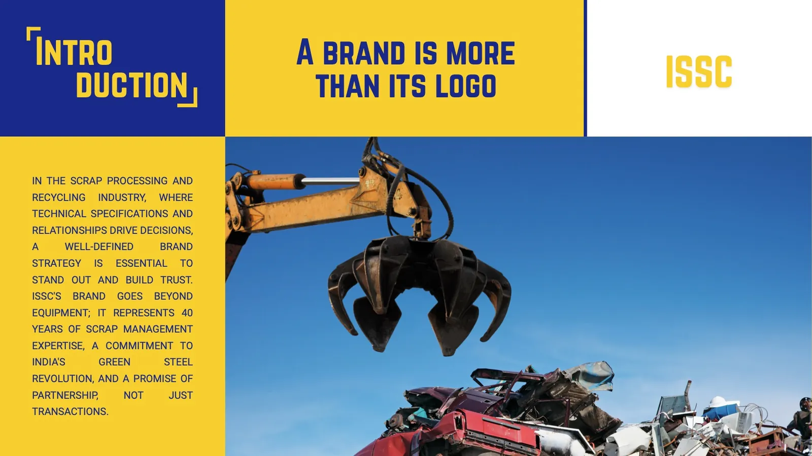
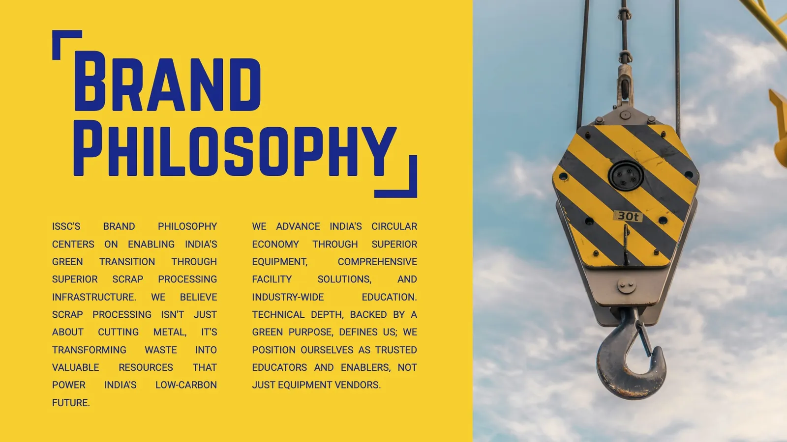
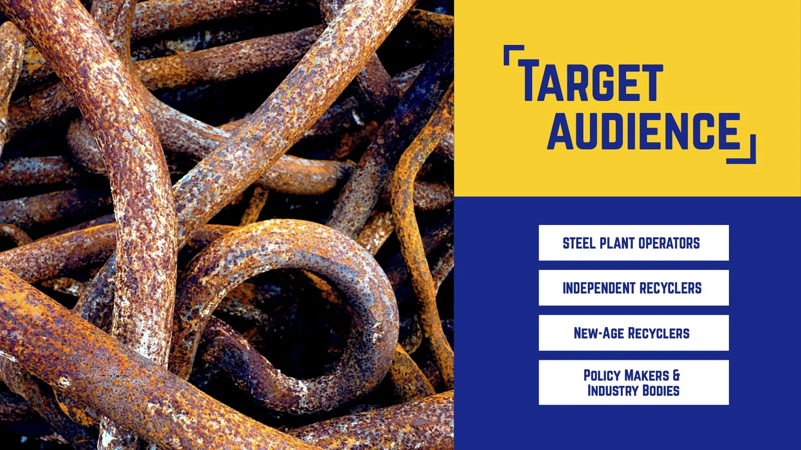
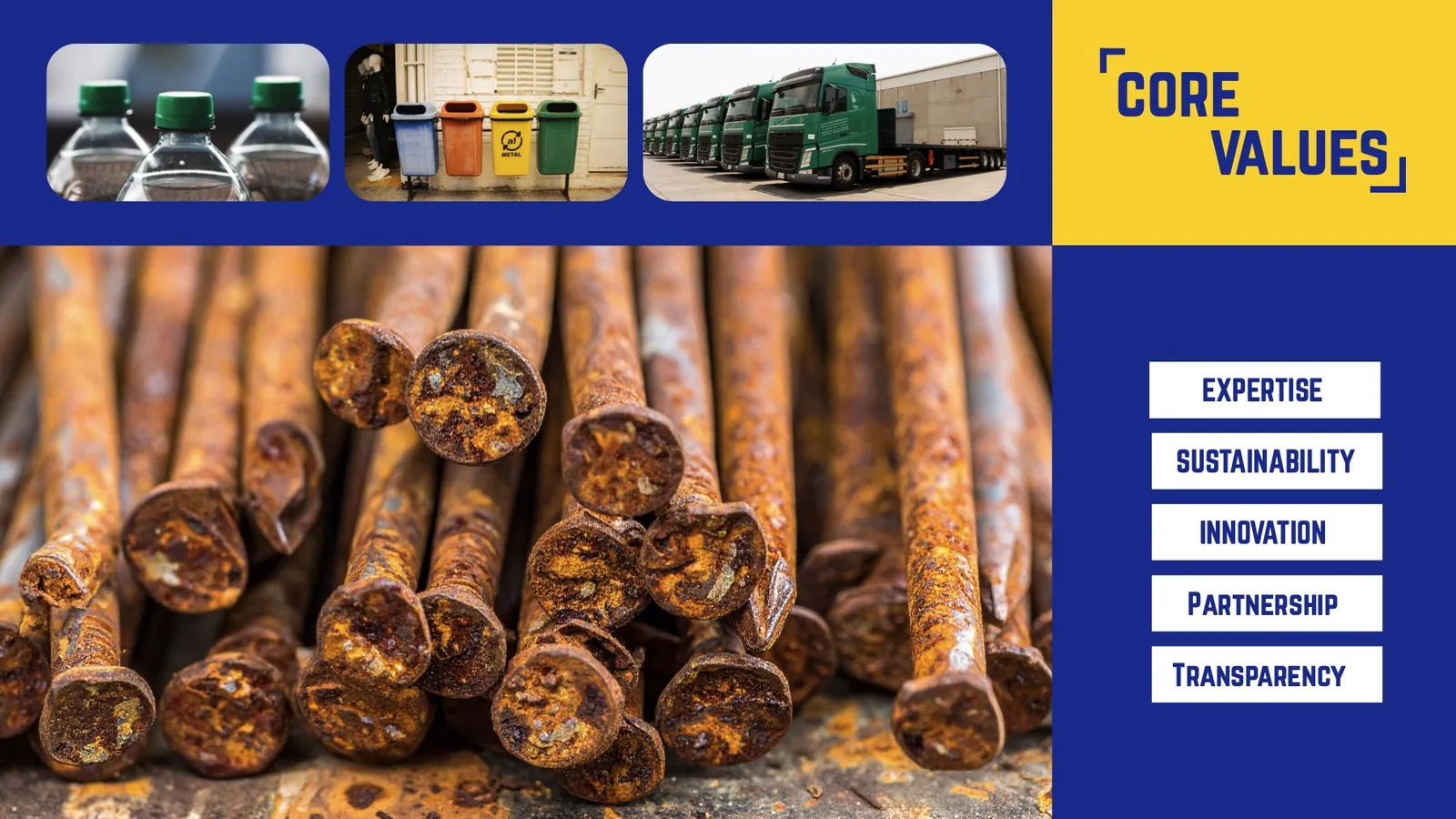
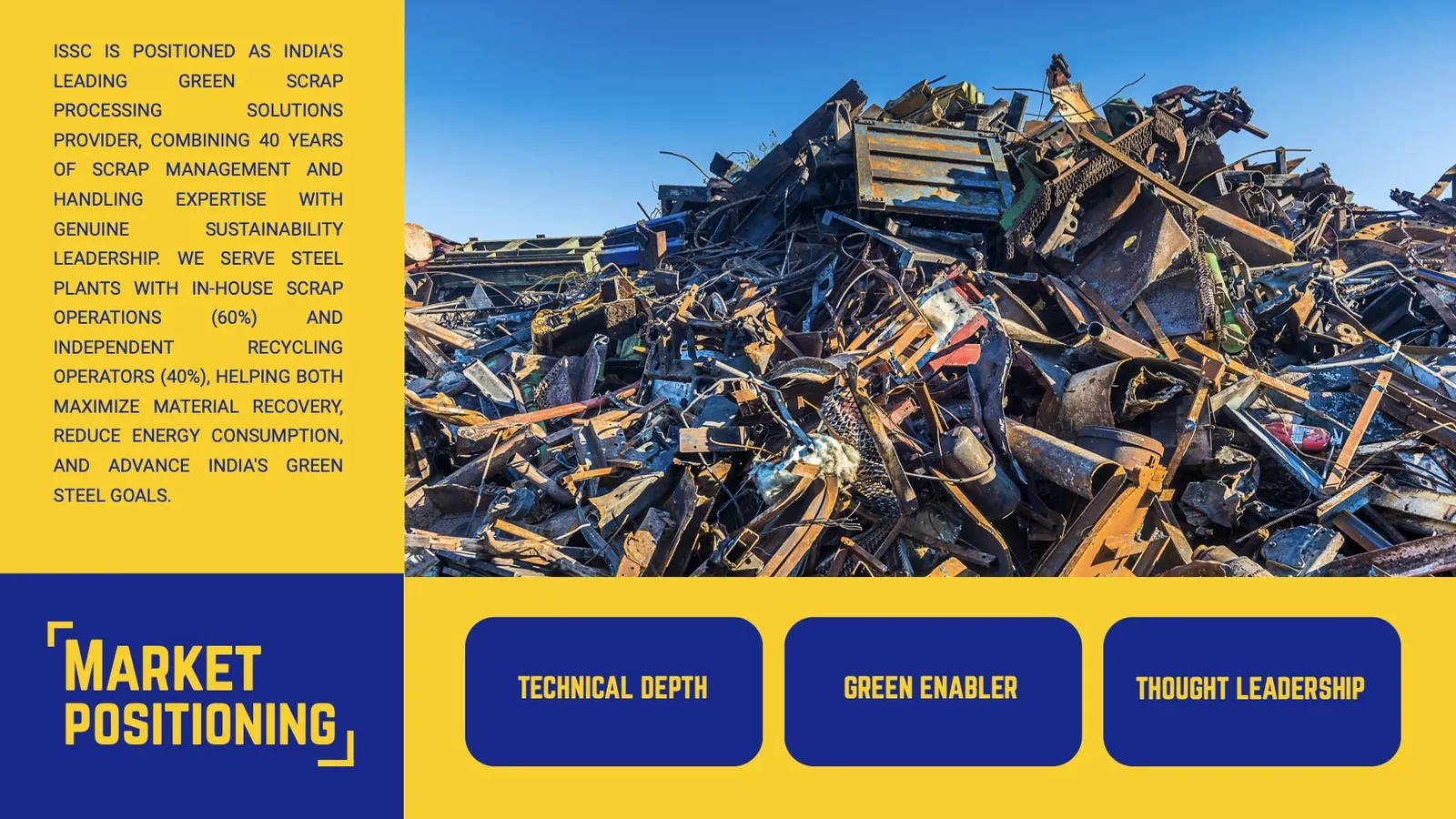
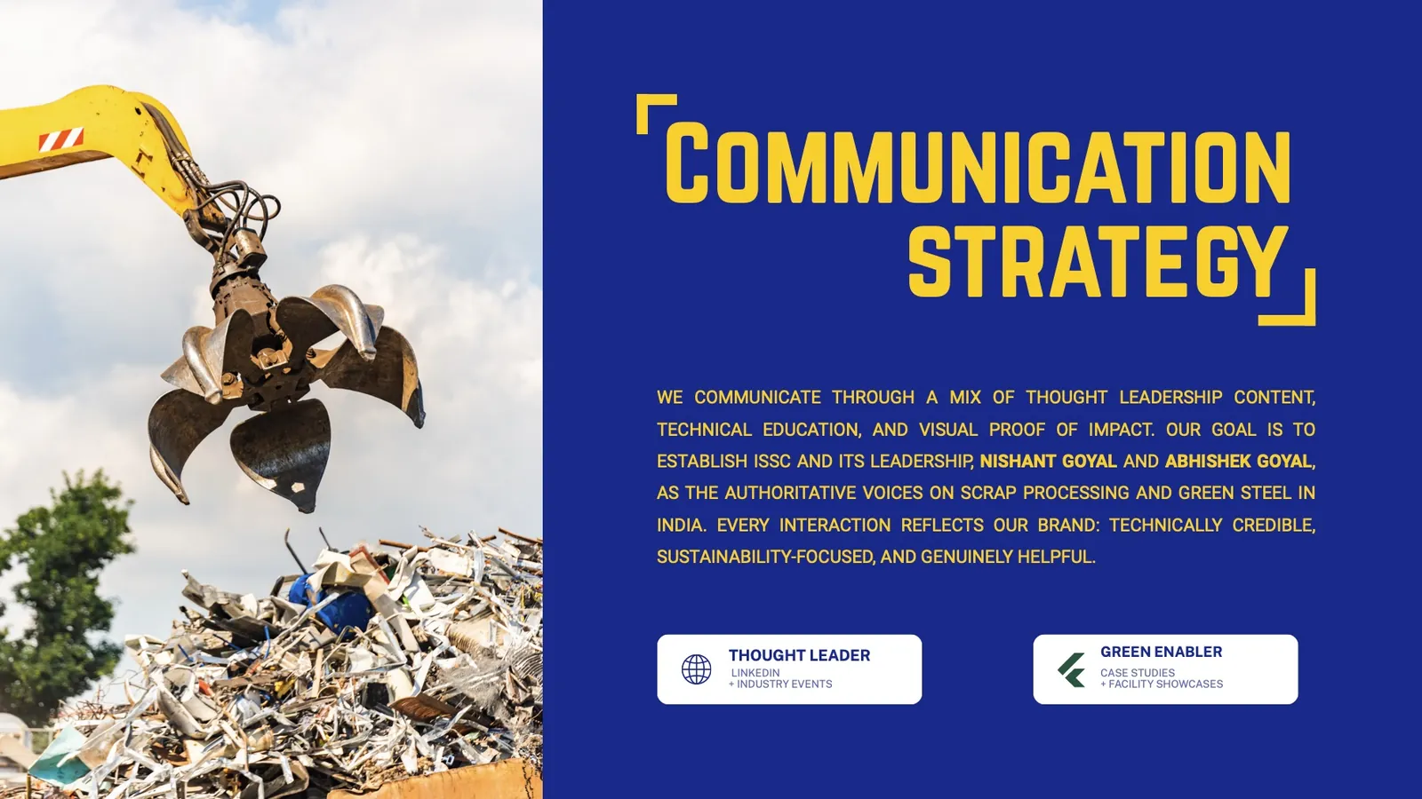
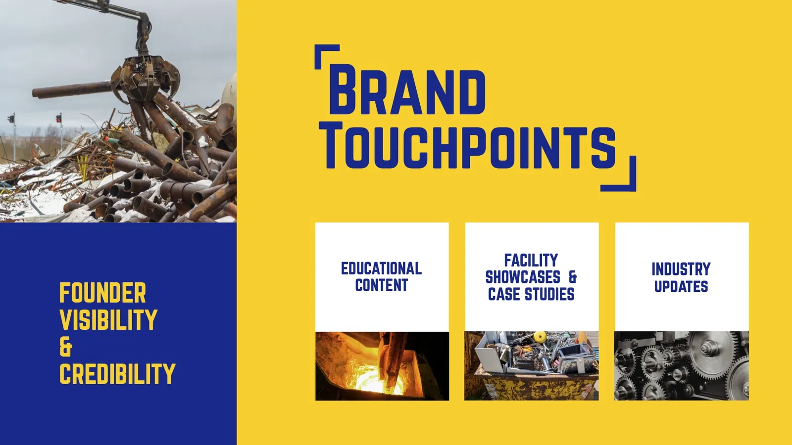
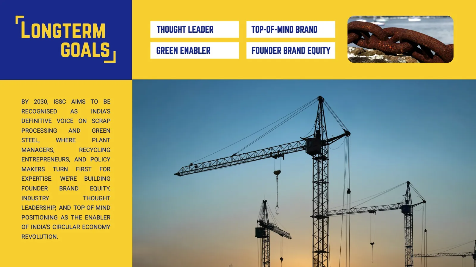
Philosophy, audience, values, positioning and a communication plan built on founder visibility, technical education and green-steel proof.
Brand in use
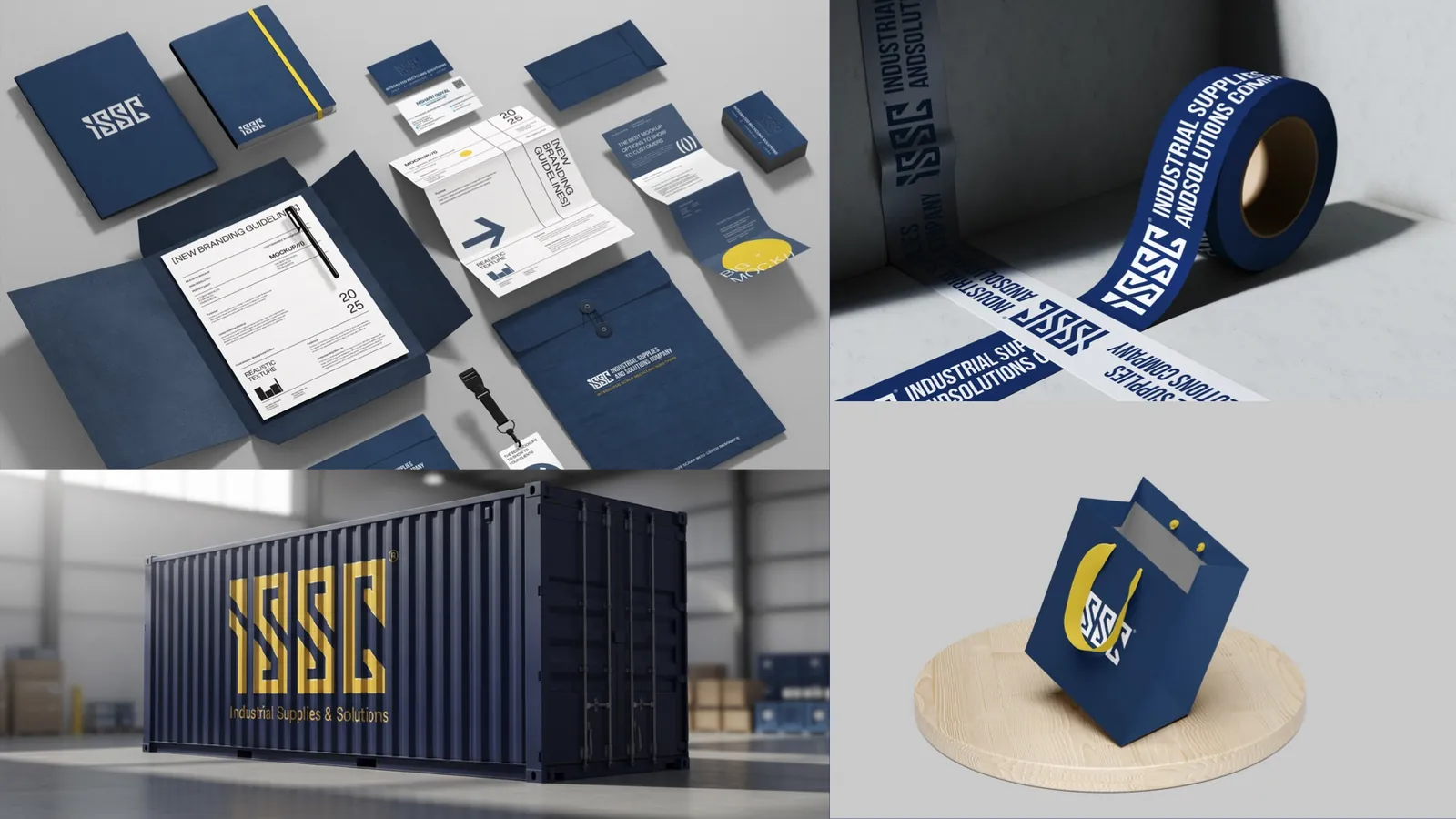
Stationery, tape, shipping containers and gift bags: the stripes and the yellow travel from letterhead to logistics.
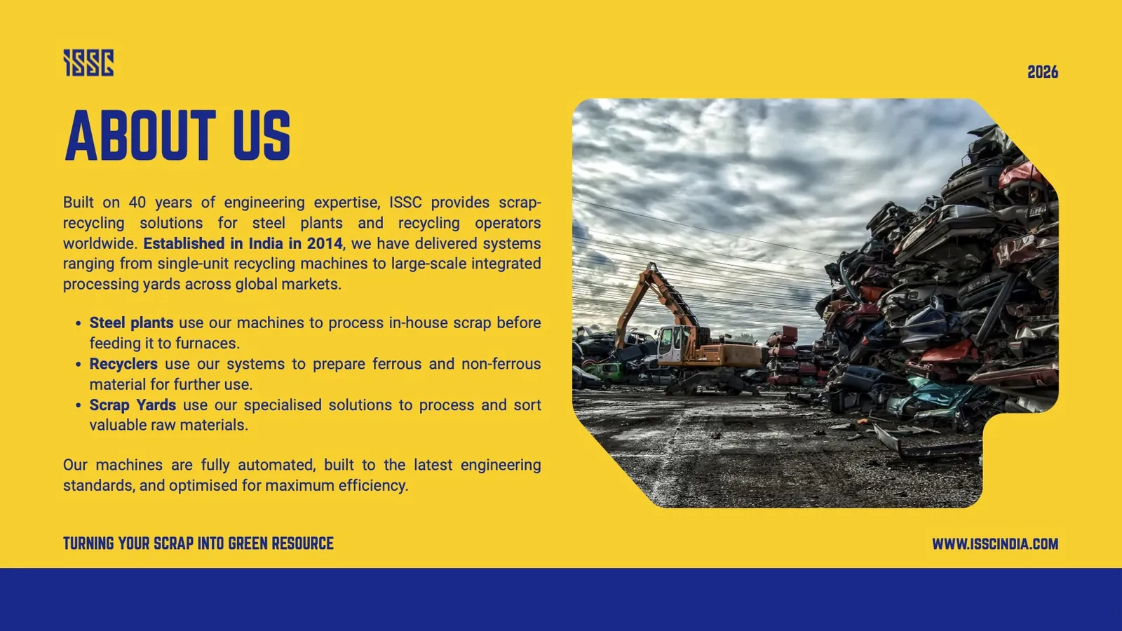
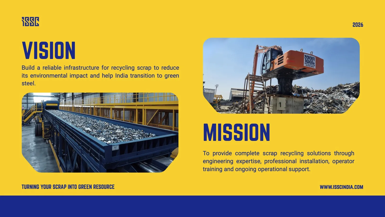
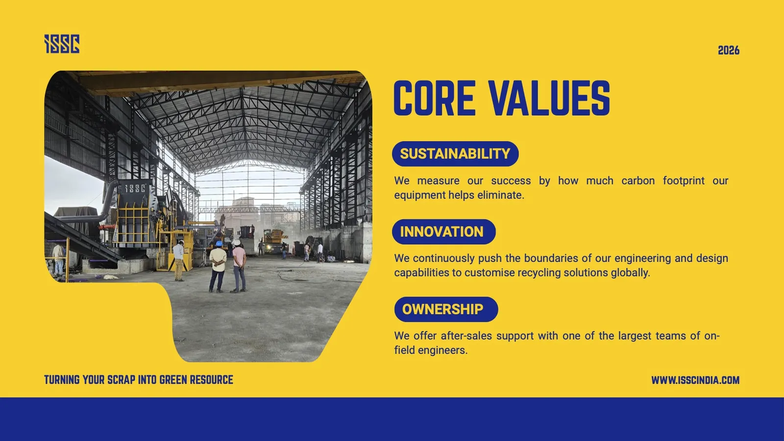
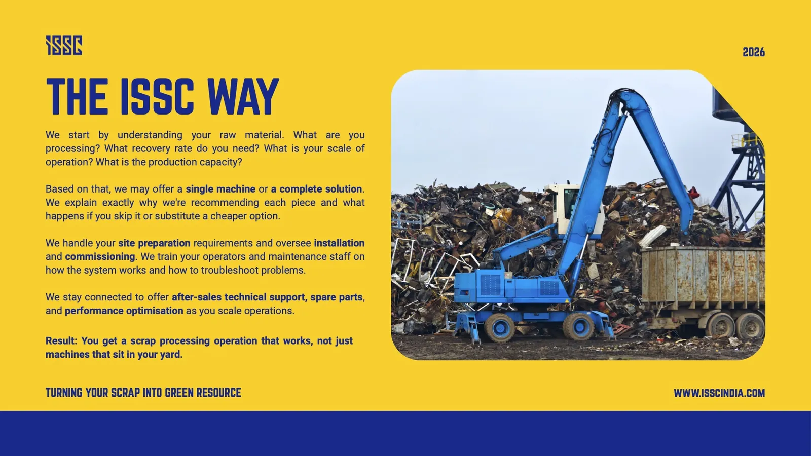
Company profile · 12 pages
Machines, made legible
Yellow pages, blue bands and cut-corner photo frames: the machines, the process and the people they serve.
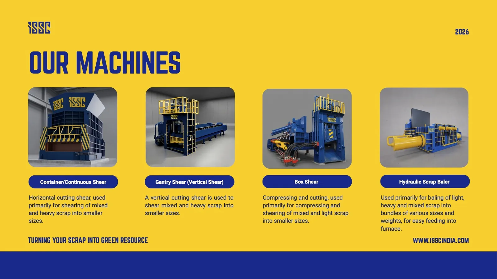
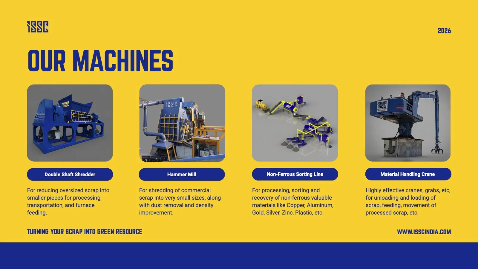
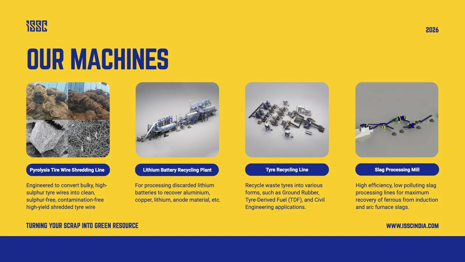
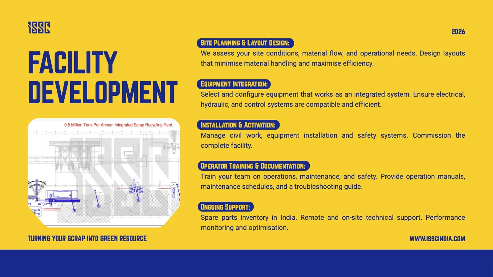

Magazine ad · June 2026
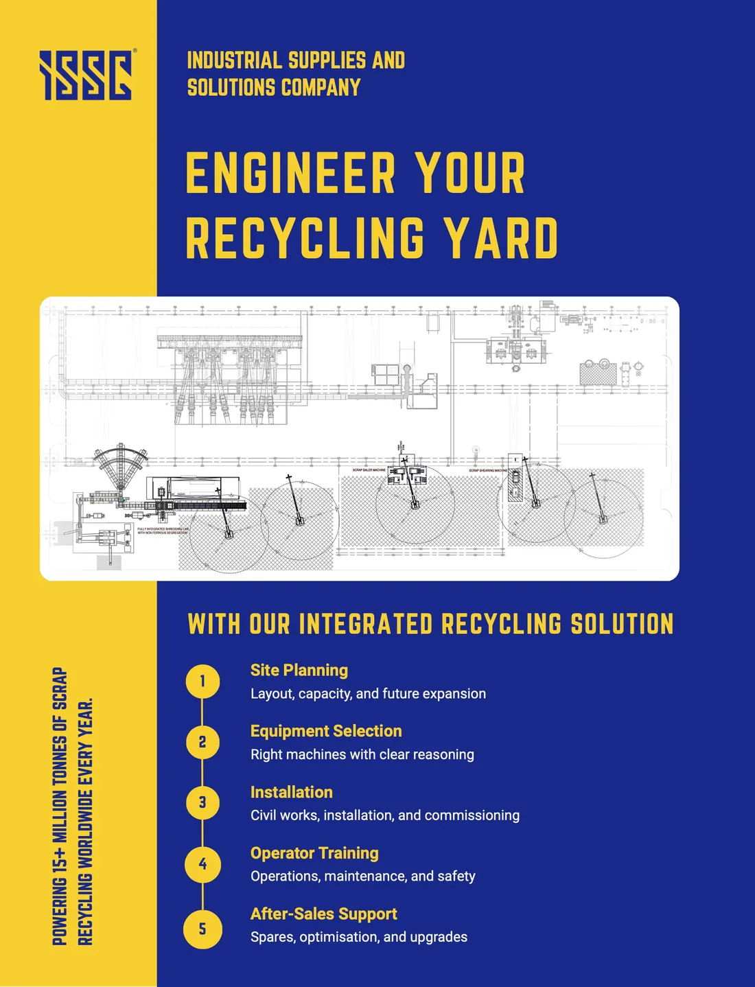
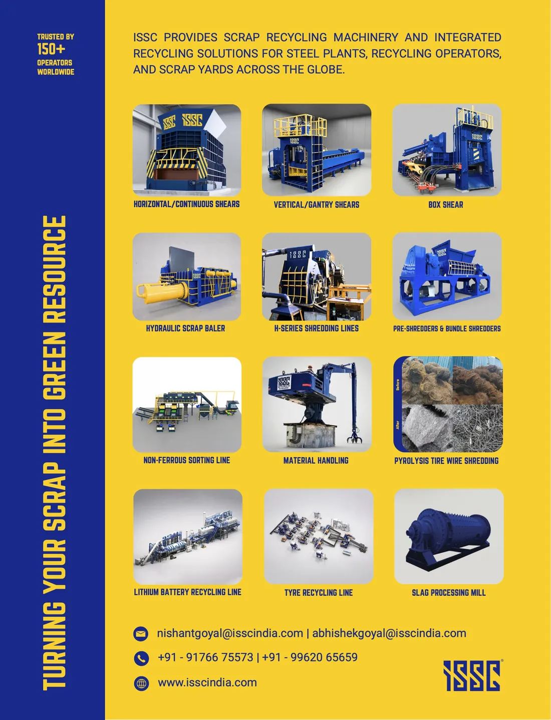
A two-page spread: the integrated recycling yard as a line drawing on one side, the full machine range on the other.
Website
In progress.
The new ISSC website is being designed right now. This spot will show it live, the same way the other case studies do, once it launches.
What I did
Brand strategy
Philosophy, audience, values, positioning and the communication plan, in a 19-page deck.
Identity
Logo lockups on blue and yellow, colour, type and brand touchpoints.
Company profile
A 12-page profile covering the machines, process and the industries ISSC serves.
A two-page magazine ad for the June 2026 issue.