(Case study 10/11)
studioMOrph
Brand studio · Website design and build · Design lead
The brand studio where I lead design. We build brands, not campaigns, and I designed and built the studio's own website. Twice.
- Role
- Design lead
- Services
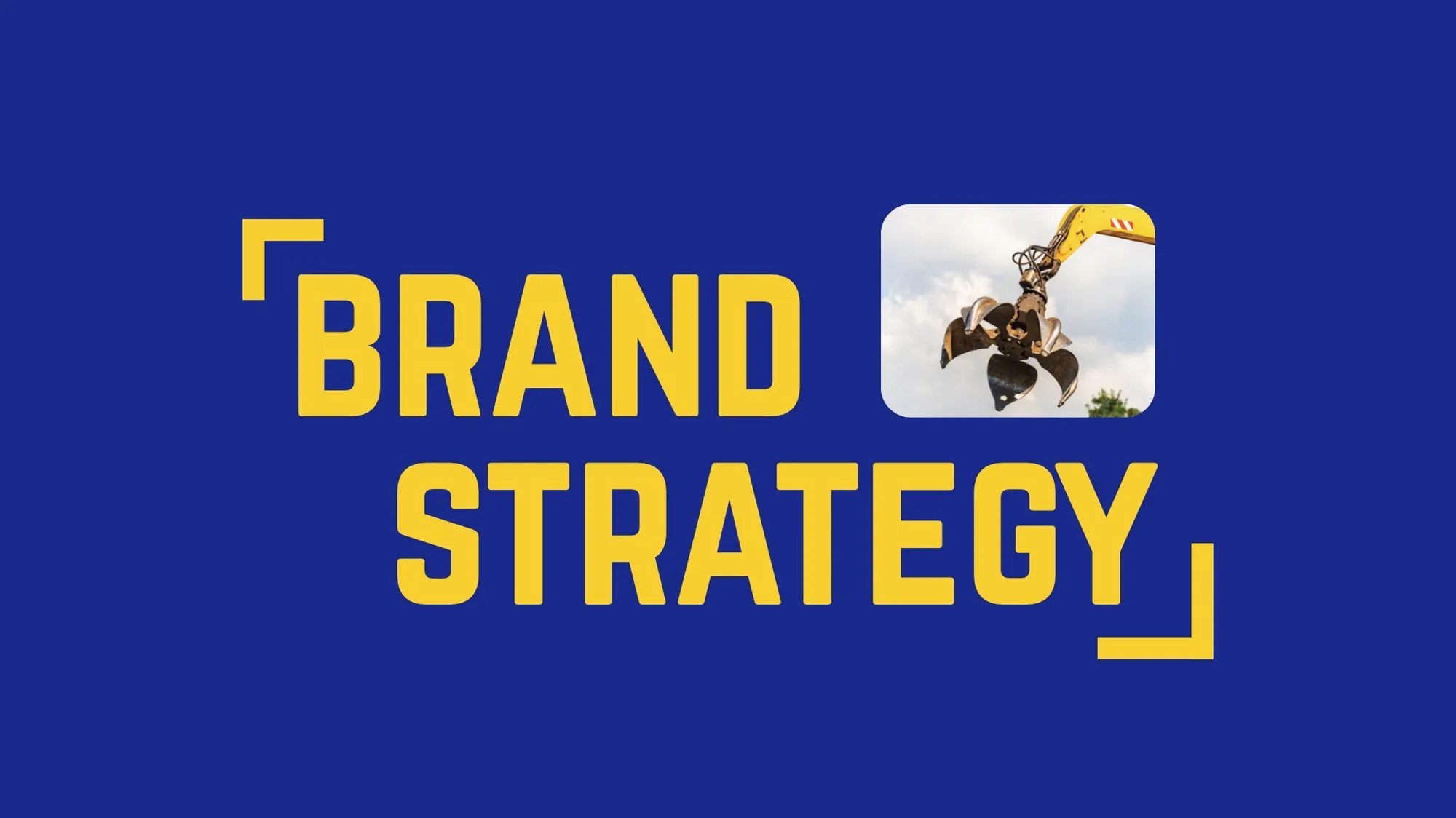
- Brand strategy, creative production, experiential branding
- Clients include
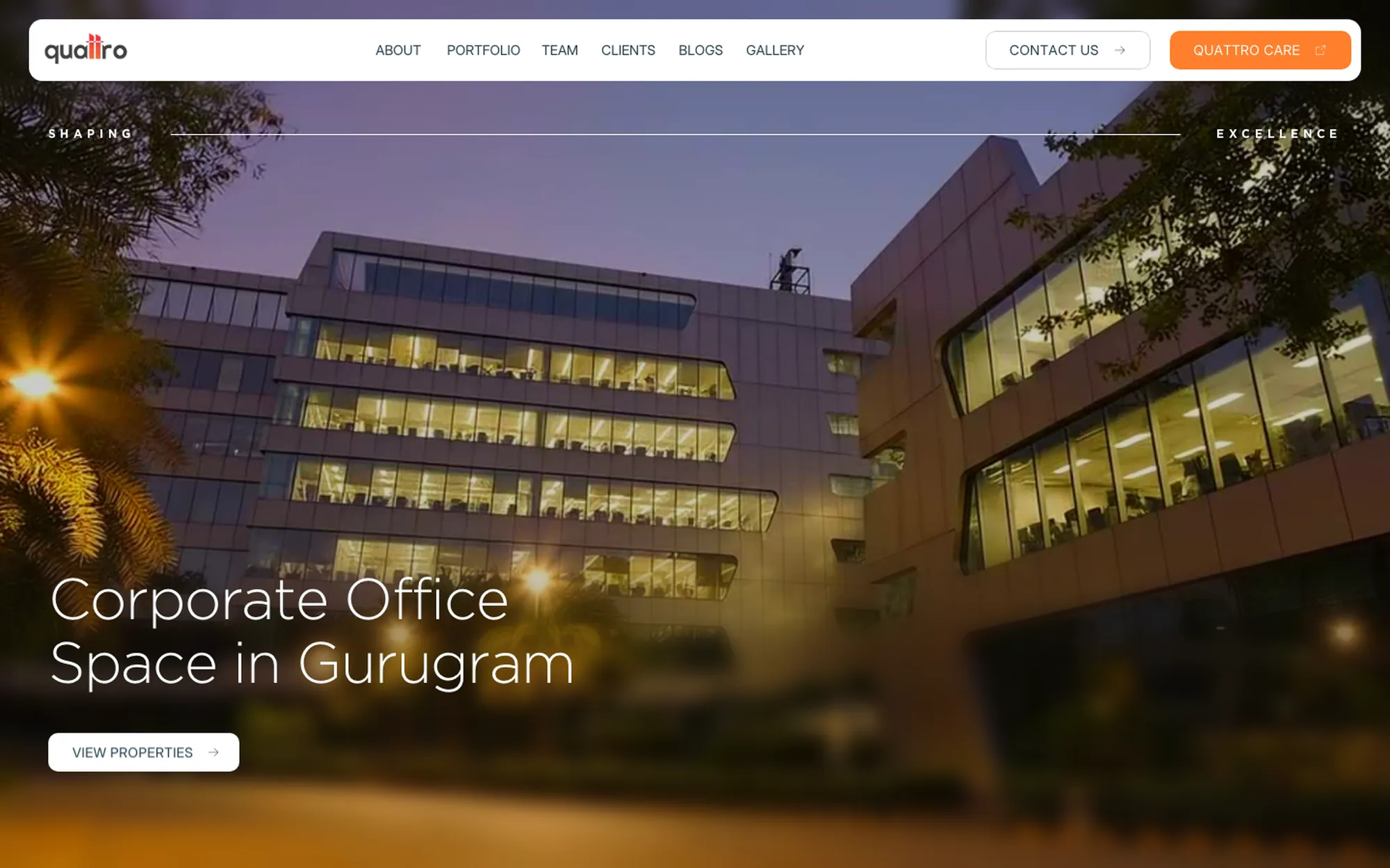
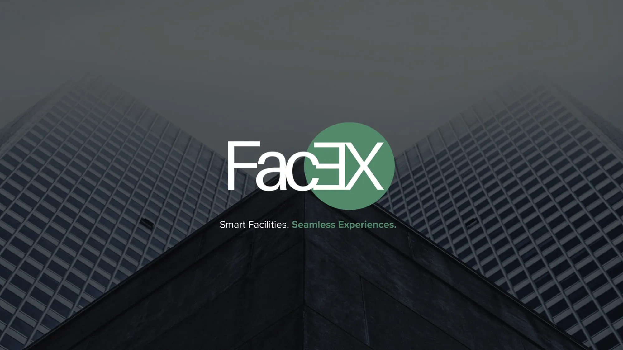
- ISSC · Quattro Spaces · FacEX · IREPworkspaces
- Website
- Version one ↗ · Version two ↗
Attention shifts. Loyalty sticks.
You can buy impressions and rent attention, but you can't buy trust. So the studio does the foundational work most agencies skip, because it's slow, strategic and hard to scale.
It's also the only work that lasts.
- 01
Design
Both versions, every page: home, services, work, eight case studies, about and contact, on desktop and mobile.
- 02
Build
Hand-written HTML, CSS and JavaScript with GSAP motion, a script that generates every case page, forms and search setup for the live version.
What we do
Three disciplines, one brand
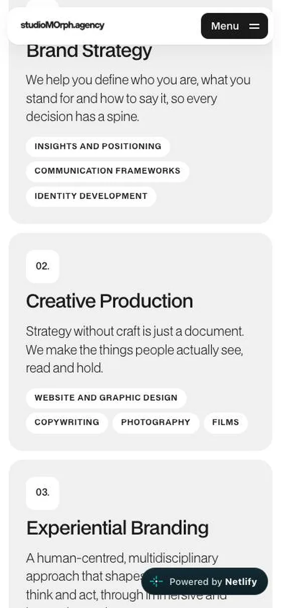
Brand Strategy
Who you are, what you stand for and how to say it, so every decision has a spine.
- Insights & positioning
- Communication framework
- Identity development
Creative Production
Strategy without craft is just a document. We give it a visual system, a voice and a lens.
- Website & graphic design
- Copywriting
- Photography
- Films
Experiential Branding
How people feel, think and act inside a brand's spaces.
- Spatial programming
- Branded environments
- Events & exhibition design
Studio work
Case studies from the studio
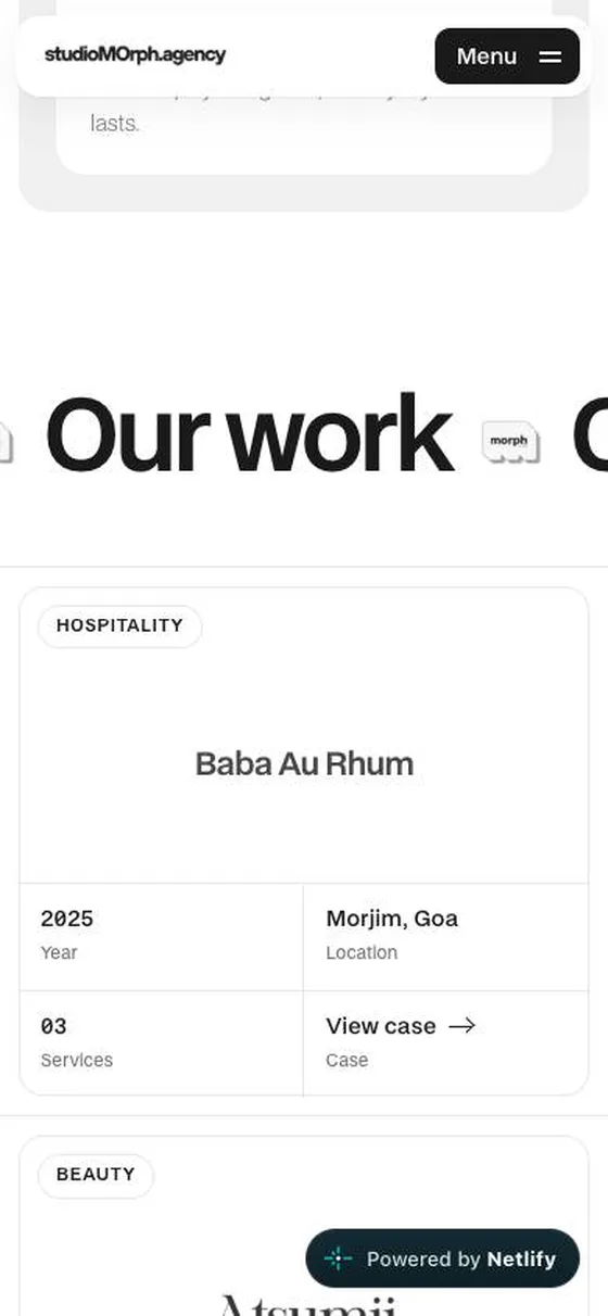
More projects, including Baba Au Rhum, Atsumi Studio and Amado Vistas, live on the studio's own site.
The studio's website
A bought template, replaced by the studio's own voice.
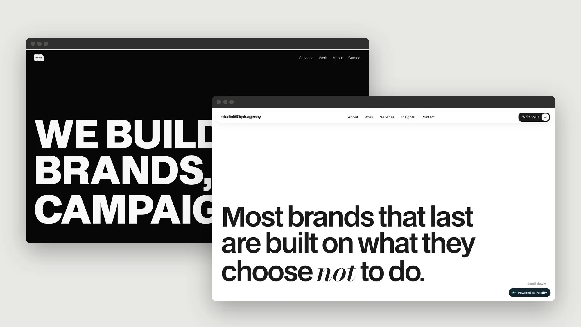
studiomorph.agency ran on a ready-made agency template. The rebuild started from the brand's own lines, "brands, not campaigns" and "Less is MOre", and one rule: build one page at a time, each modelled on a reference, then rewritten in the studio's words.
Plain HTML, CSS and JavaScript, no page builder. Every case study is generated from one script, so the work pages stay consistent as the studio grows.
Version one
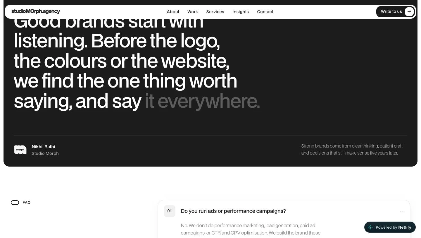
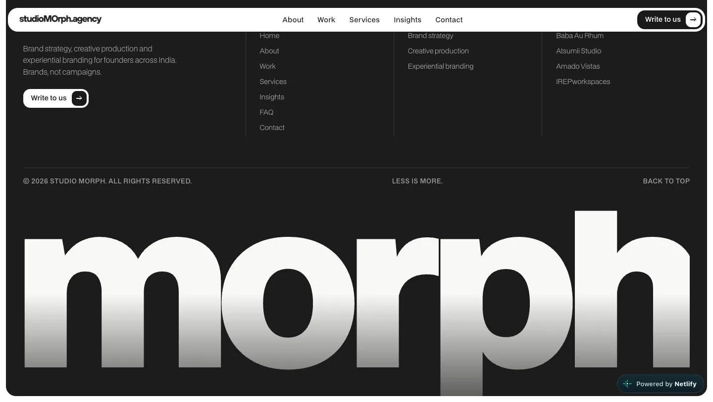
Dark, strict, black and white
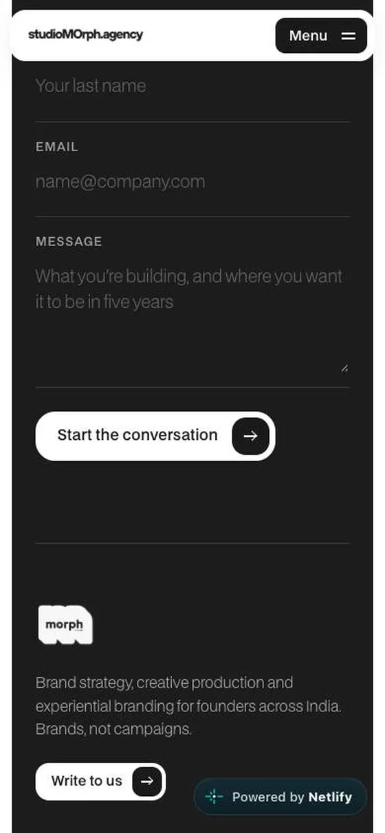
BDO Grotesk on black, with no colour anywhere except the case images. A white-to-black intro, three beliefs, the services, work on a white paper panel, straight answers and a contact form. Words arrive line by line and images wipe in, once.
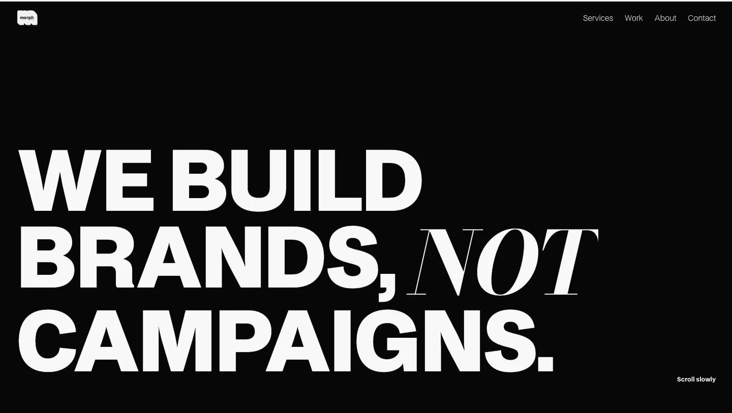
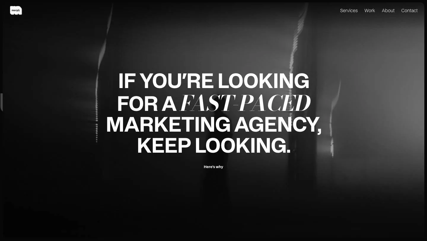
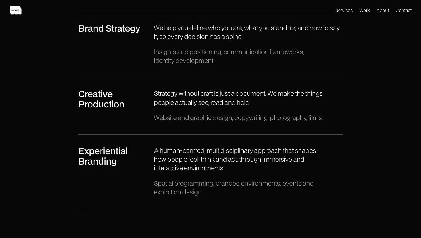
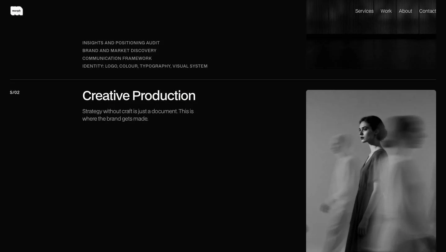
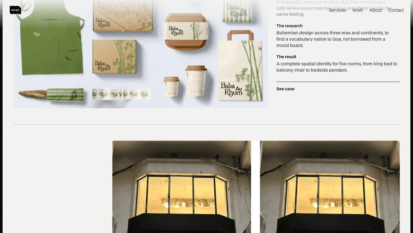
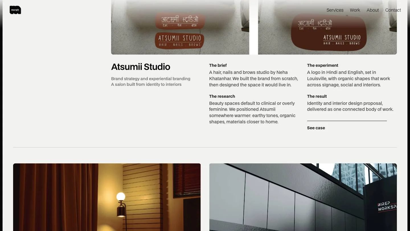
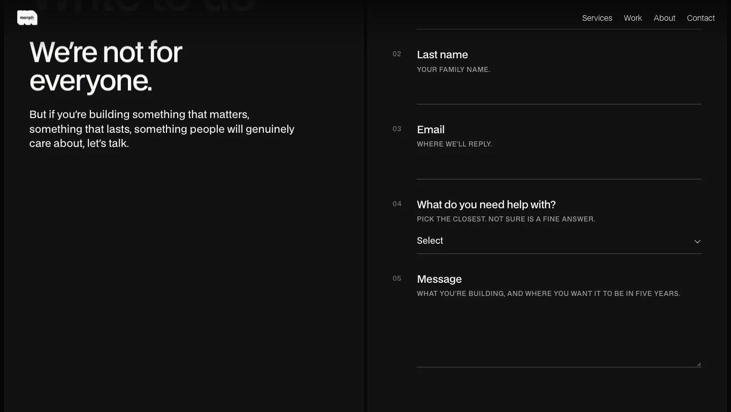
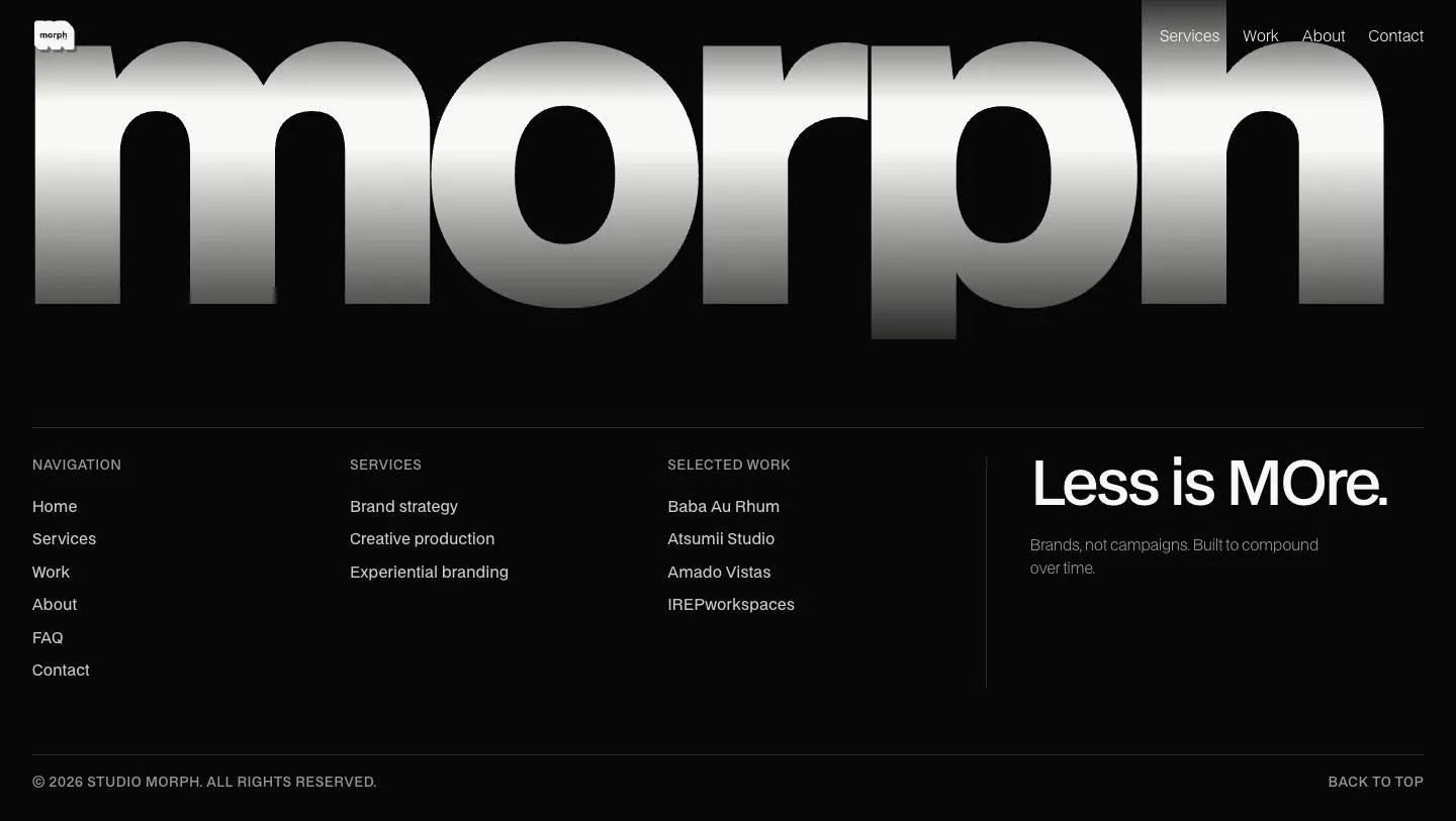
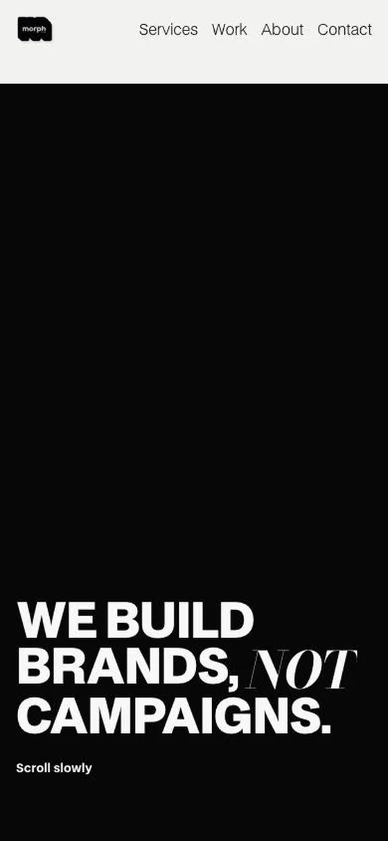
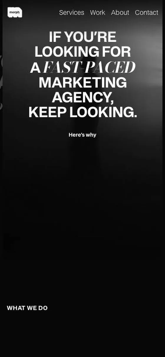
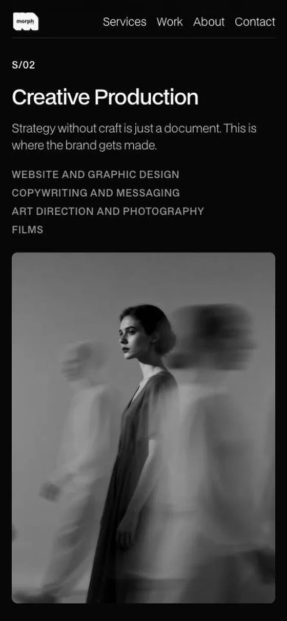
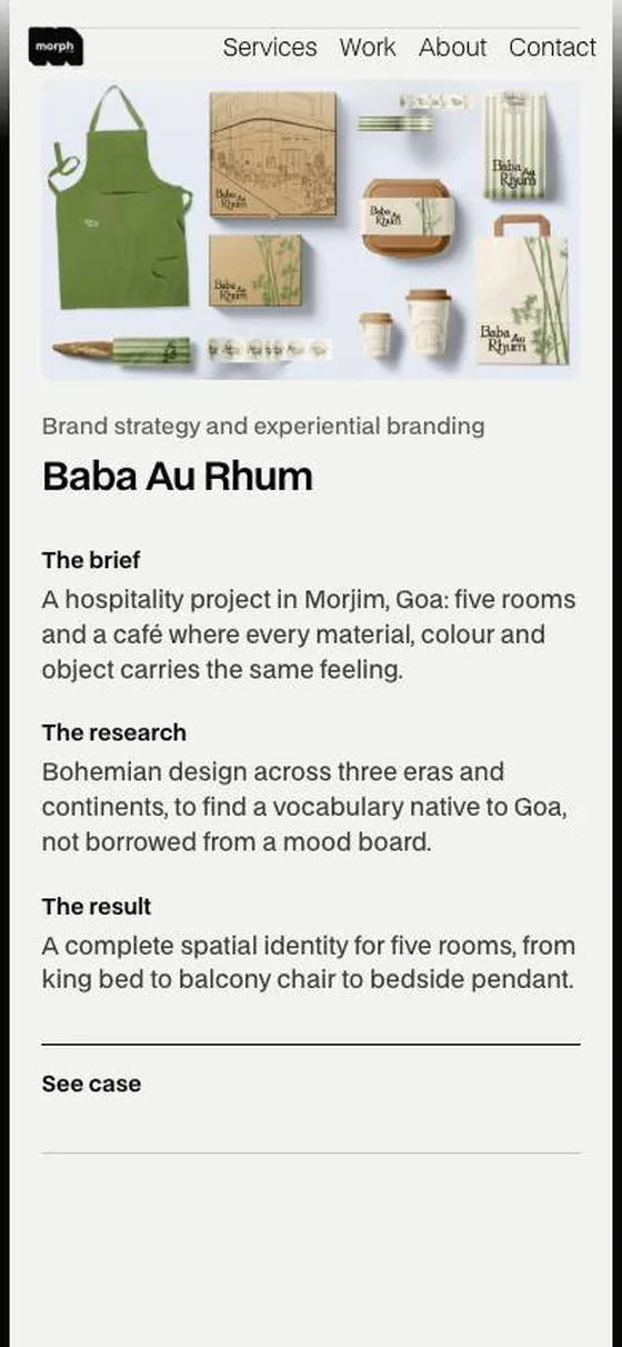
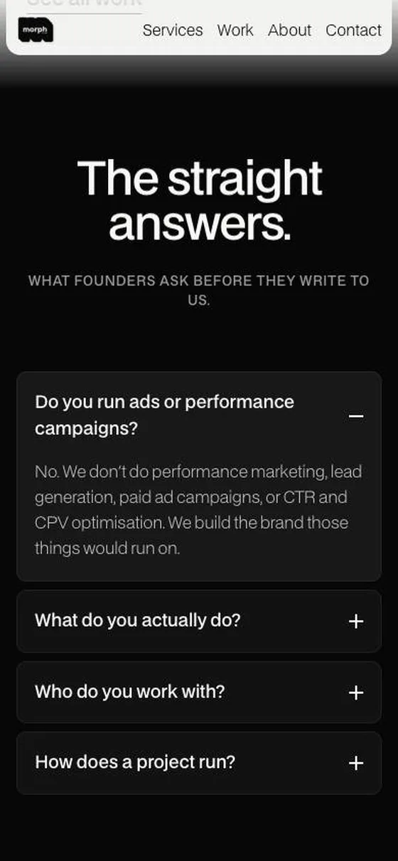
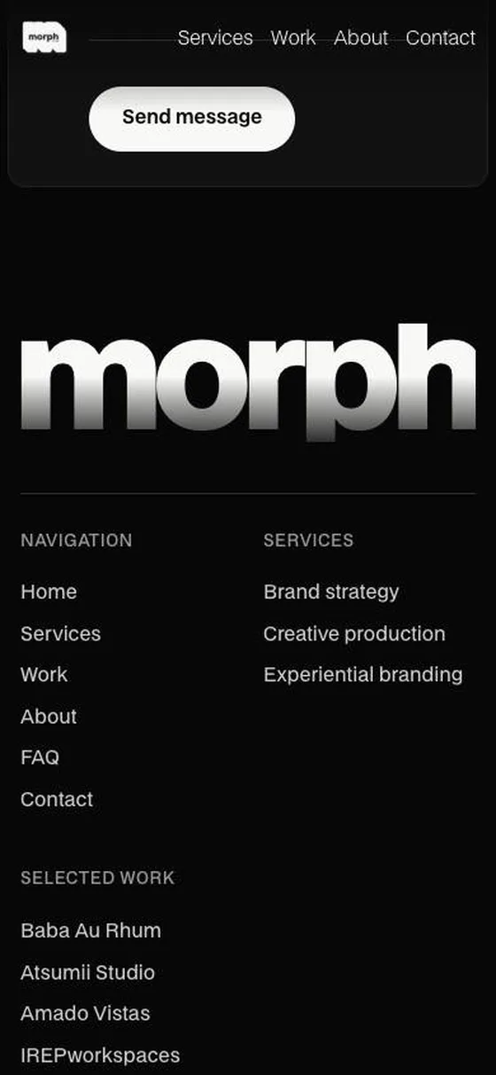
Saved screens, captured October 2026.
What changed
Same voice, a calmer room
Version one shouted, which suited the manifesto. For version two I wanted the studio to feel slower and more considered, so the ground went light and the type got room to breathe.
Version two
Light, framed, slower
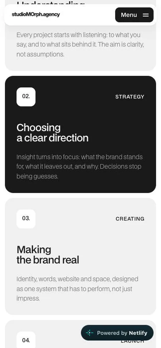
An off-white ground, a rounded frame around a black-and-white film, icon-tile buttons and bento cards. The hero line centres first, then slides into place as the first case card arrives. Version two is the studio's main site.
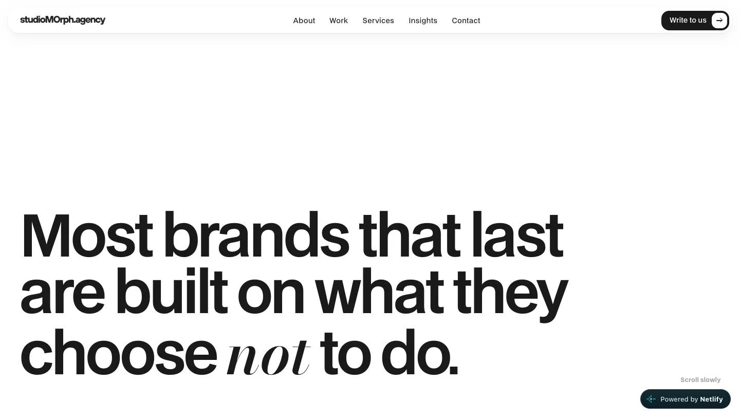
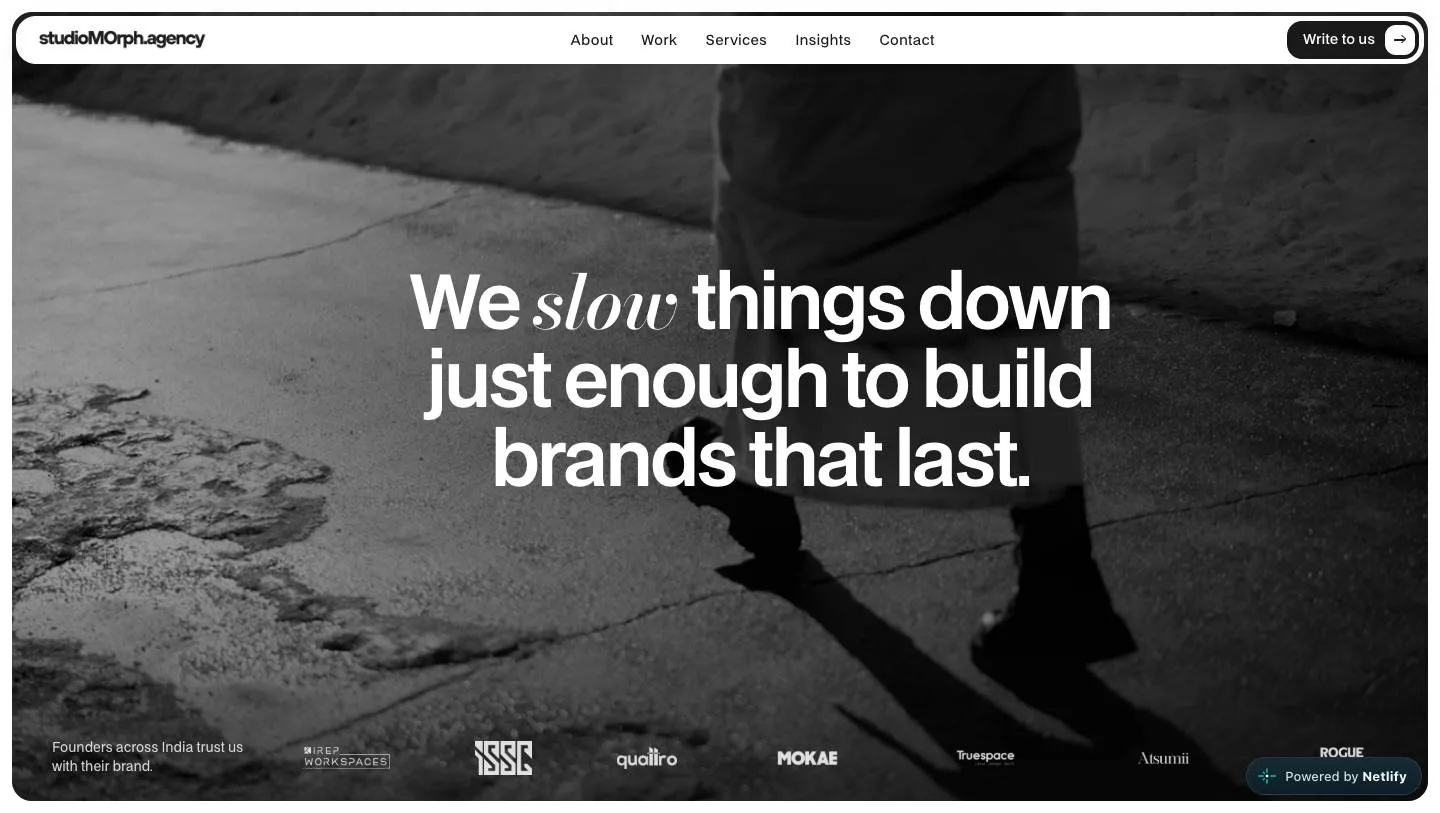
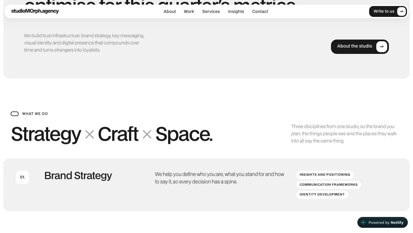
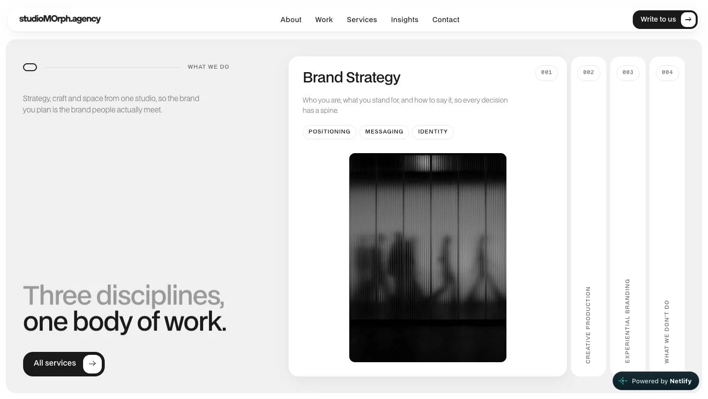
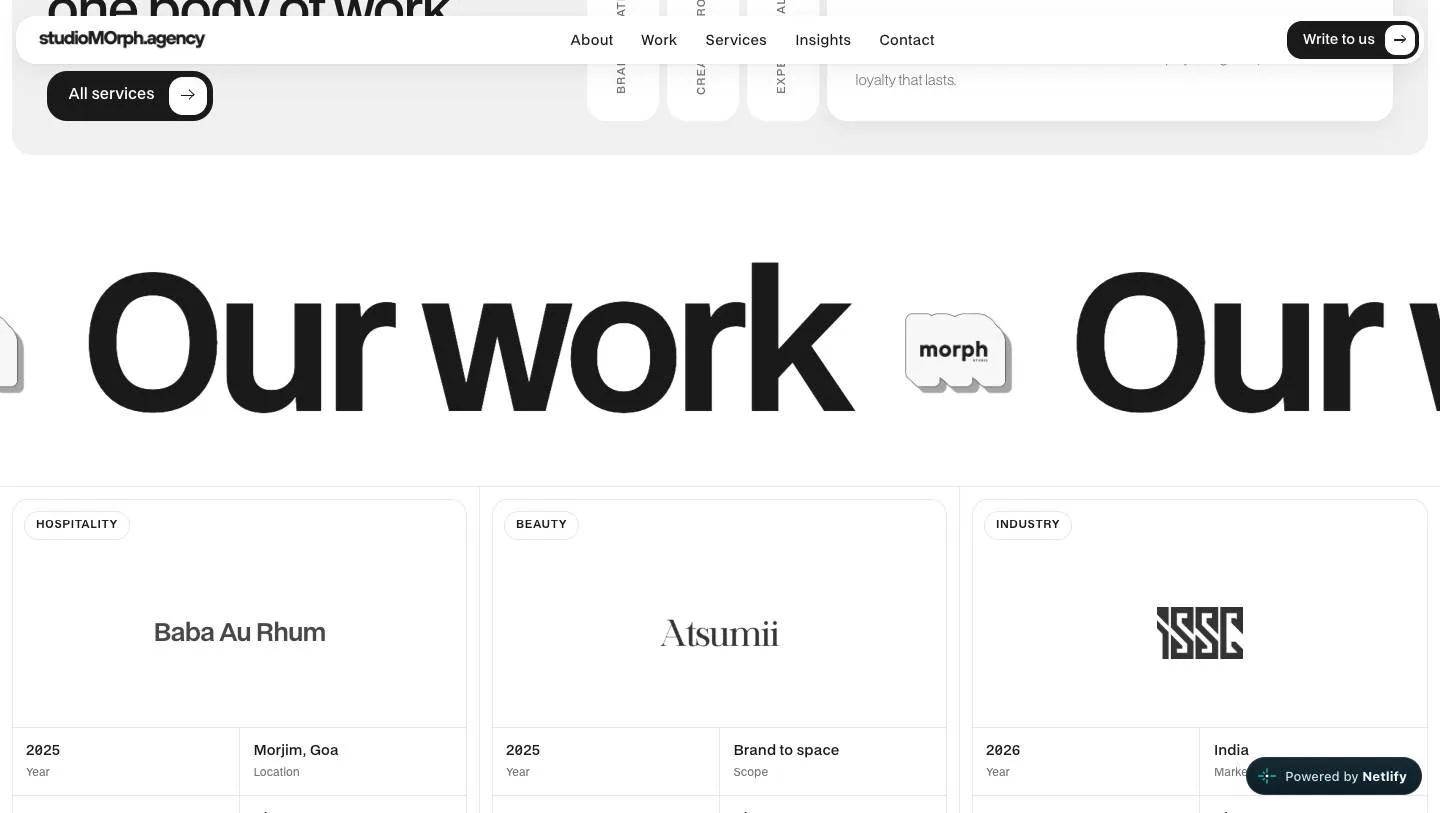
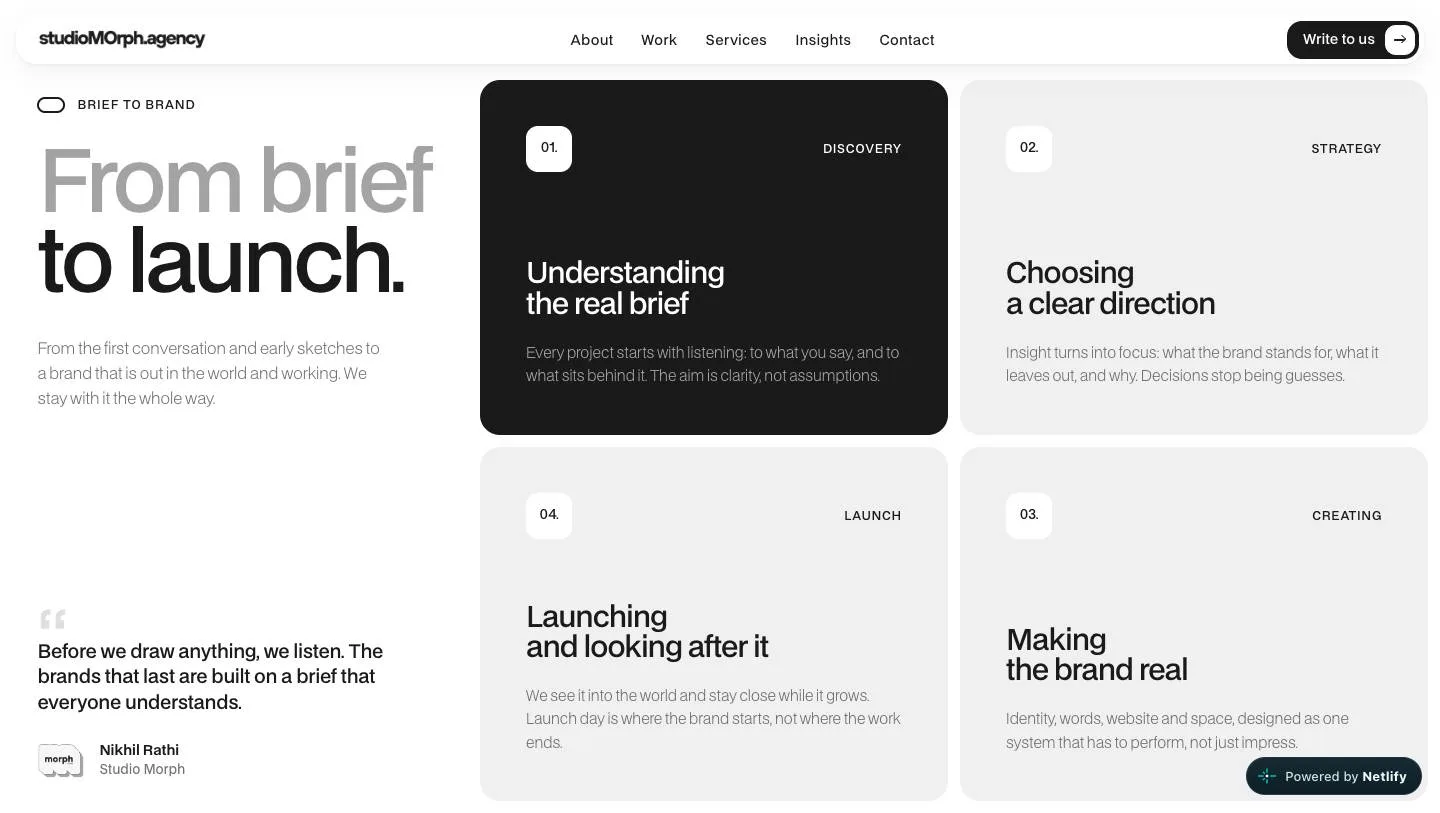
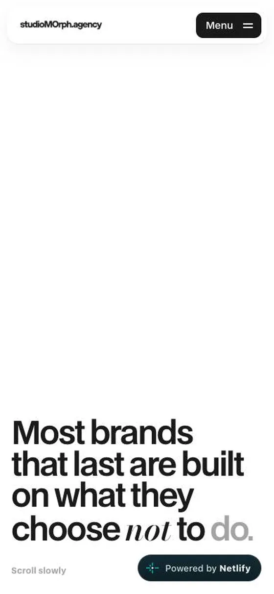
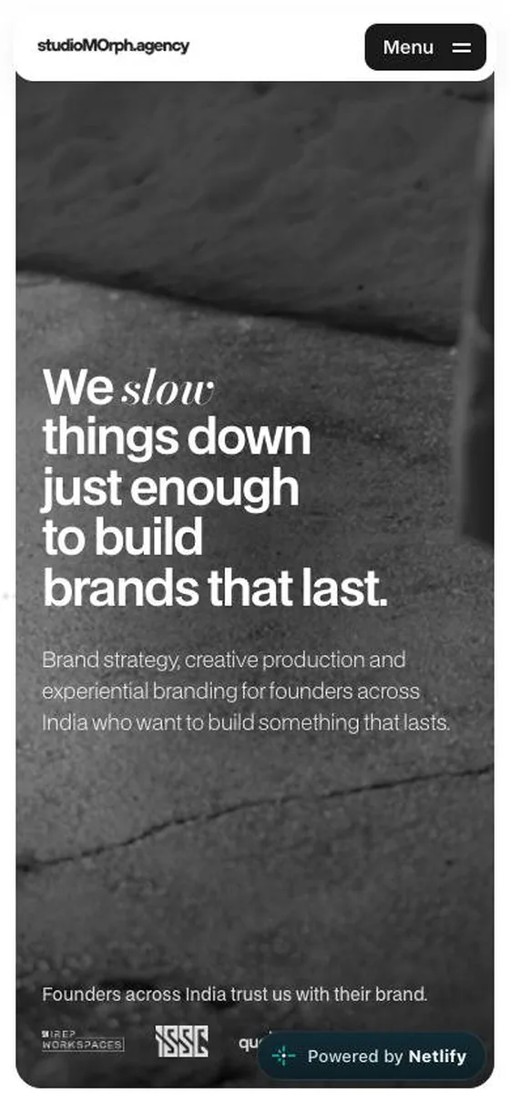
Saved screens, captured October 2026.
(Hire me)
Need something like studioMOrph for your company? Tell me what you're working on.
Hire Me